The Final Fantasy series has had unforgettable box art over the last few decades. And every main entry has seen multiple releases, allowing for the possibility that something beautiful will adorn these intricate games. Much of the time, American adaptations of the games will follow a pattern of lazy cover designs with only the title and logo. Most of these will be entirely ignored (especially the Super Nintendo releases we were graced with). Instead, prepare for nostalgia mixed with beautiful images you never realized were meant to be on the cover of your favorite games.
For this list, we'll be ranking the BEST artwork for every main entry in the Final Fantasy series.
Naturally, sentiment plays an unintentional part in any person's determination of these pieces of art, but it's often quite clear how iconic or forgettable a game's cover was. Too often, there are simple conditions required for a game's box art to be 'good' that just aren't met. This isn't limited to being judged solely on how pretty the games are; it should also be composed in a manner that accurately presents the characters, the setting, and the themes. Even the subtext in a character's stance or eyes plays a huge part in determining the quality of cover art.
Realistically, none of these games have a perfect cover (though that might not be the case for their Japanese releases). Even some of the most memorable Final Fantasy video game cases were hastily improvised by a localization team or arranged by simply copy pasting some of the concept art onto the game, and yet this doesn't always lead to poorly executed cover designs. Sometimes absolute gems are produced, that only further develop within the fanbase. Read on for the worst and best box art for Final Fantasy games.
15 Final Fantasy XIII

The cover for Final Fantasy XIII isn't just the worst among the Final Fantasy games, but possibly the worst box art of all modern games. Lightning stands at the forefront of nothing, holding her unoriginal blade. Lightning really could have been posed more dynamically. Some versions of the Japanese release portray her riding atop her steed, Odin, while wielding the Zantetsuken blades. But for American shores, it just looks like she's revealing her thigh to hitchhike, not readying for a fight.
This reveals the protagonist, her weapon, and too much upskirt. That's all. The listless stare is uncharacteristic; but perhaps because her usual scowl wouldn't have shown enough of her pretty eyes. It seems like the reason FFXIII is presented this way is purely to showcase graphical advancements. But that would still greatly benefit with anything from the game behind the main character. The white background doesn't come off as clean or classy, it comes off as plain. At the very least, FFXIII's box art is an accurate representation of how the game feels through; a lot of pretty graphics without much substance.
14 Final Fantasy II

'Yoshitaka Amano's artwork is amazing.' Well, this is true... but too little information is being given to the audience. If this face weren't the official interpretation of Firion's appearance, I'd have sooner believed this was Leila (a female pirate that temporarily joins the party) as there were no versions of Final Fantasy II that portrayed Firion this way in-game or in cutscenes for the first twenty years since its first release.. As they shouldn't: an orphan rebelling against the Empire probably wouldn't wear all these grand adornments.
In the foreground, Firion presents the infamous Blood Sword. Ignore the Warrior of Light fighting a behemoth in the background. The scene is there only because Final Fantasy Origins is a remastered PlayStation bundle of FFI and FFII; the original Japanese Famicom release for FFII only showed this image of Firion. If Final Fantasy II had anything from the game in its background, it would have ranked notably higher on this list.
13 Final Fantasy IX

Beginning with Final Fantasy VII, the Japanese releases for many games in the series showed only the title. As such, American localization teams had to improvise. Most of the main cast are placed in the foreground, in front of Lindblum. This wasn't originally a group picture; these are their character profiles mashed together (they don't even look sized correctly). They weren't even chosen based on their relevance to the plot. If they had, Eiko would probably have been there instead of Amarant.
It also isn't clear why Lindblum was used. There are several other locations just as central to the plot. And if FFIX intended to showcase any of its beautiful locale designs, this scenery is barely visible or recognizable. Perhaps a backdrop presenting a villain or an eidolon might better salvage this retouched nightmare. In FFIX's defense though, this box art is probably the only negative opinion I have from the entire game.
12 Final Fantasy V

This is a beautiful illustration. Bartz, Faris, Lenna, and Krile sit at the helm of an airship. As they sail across the skies, various flying beasts glide in the background. There really isn't much more to be said about this though. Not much of the plot is represented here. Perhaps it was only meant to show the spirit of adventure?
This artwork was featured as the box art for the PAL region's release of Final Fantasy Anthology, but for America's release, it was only in the instruction booklet. At the very least, this choice is a huge improvement from the box art depicted on the original Super Famicom Japanese release of the game, a rarity which has only ever been the case with FFIV and FFV.
11 Final Fantasy I

For the aforementioned Final Fantasy Origins bundle, the PAL region was presented with a different cover art that instead depicted the Warrior of Light. This is the same artwork that appeared on Japan's original Famicom release for the first Final Fantasy. This may be absolutely stunning artwork, but this character also looks nothing like his character in-game (though at least he bears resemblance to the Warrior shown in the opening cutscene).
This image does give us a little more information. The Warrior of Light brandishes his sword, Braveheart. In the background, we see the visage of Princess Sarah, the series' first damsel-in-distress for the heroes to rescue. Non-aggressive dragons are peppered into the scene, perhaps this is in reference to the race of dragons in the Cardia Islands, the king of these dragons being instrumental in advancing the heroes' classes. All in all, this is a classic image from which every cover art from a Final Fantasy game might have stemmed from.
10 Final Fantasy III

American shores didn't see Final Fantasy III for a long time, so it's probably the least recognizable game of all the main entries to the FF brand. The original Japanese Famicom cover image of the protagonist has since become its logo. All four of the main cast have been reimagined with their own personalities and distinct features, when before they were practically identical.
The party ventures through a land shrouded in dark mist. It's majestic and mysterious, but another thing to note about this particular box art was that it was only used for the European and Japanese releases of the DS remake. For North America, all we actually got was the title and logo centered over white space. Perhaps this placement in the rankings isn't fair. If I'd stayed true to either the original cover or America's DS remake, this would have been dead last.
9 Final Fantasy VIII

This is a perfectly average cover design. It has the bare minimum of acceptable features. The game's early love triangle between the protagonist, the rival, and the heroine in the middle can be inferred. Their expressions are fair representations of their (limited) personalities in-game. In the background, a major antagonist spreads her arms wide. Edea looks ominous but listless, as she's not in control of her mind.
Here, Final Fantasy VIII's localization team correctly accomplishes what Final Fantasy IX did wrong. It is just as much of a mashup of images as FFIX's box art, but uncomplicated and simple while retaining all of its beauty. Nobody is here that shouldn't be, and nobody that should be here is missing.
8 Final Fantasy XII

This was originally much higher on the list, but no matter how pretty the graphics are, it's hard to ignore the weaknesses this meaningless box art. Though perhaps if they had presented only the plot-relevant characters, Vaan the protagonist might be omitted from the cover altogether.
Perhaps the best feature of this cover art are the airships flying across Kingdom of Dalmasca. Although airships are a staple for most Final Fantasy games, here it's central to the plot and the game's theme of freedom. It's the artwork on Final Fantasy XII: Zodiac Age that takes the cake (and probably would have gotten to the top 3). With an expected release in mid-July this year, this remastered FFXII for the PlayStation 4 keeps its beautiful artwork on the inside of its reversible cover or on the Limited Steelbook Edition.
7 Final Fantasy XI

As Final Fantasy XI is an MMORPG, it's difficult to pick which artwork to represent the game among all the bundles and expansions. Half of FFXI's cover designs are sparse, with little more than a title, and most of the rest are the ambiguous workmanship of Yoshitaka Amano. Don't get me wrong, his works are better illustrated. His poetic drawing style hearkens back to Renaissance ideals of beauty. It's flowery and elegant, like a painting. But illustrations so ineffable and highly stylized leaves too much to interpretation.
Here, all I was hoping for was an image that best communicates facets of the actual game, not just whatever concept art was pretty. It's not amazing, but it's a good middle-ground, averaging out FFXI's mass of different box arts. Most importantly, it's clear. A party of adventurers showcases different jobs, races, places, and monsters. These are the things that Final Fantasy XI is all about.
6 Final Fantasy X

Tidus holds the Brotherhood and looks off into the distance with cavalier eyes. Due to the upgrade in graphics seen in Final Fantasy X, this cover design is well-loved. It has its charms; along the Besaid shore, ruins can be seen in the background, touching on both the aquatic and fantasy dystopia themes of the game. Pyreflies that float around Tidus, the game's spirits of the dead.
Although this is a classic box art, it just doesn't do justice to one of the best Final Fantasy games of all time. The international version shows Tidus and Yuna at the beginning of the infamous kissing scene in Macalania Woods. As this is probably the most emotional scene in the game (or series as a whole), and its graphics are better rendered, it's an excellent choice, much better than the image used for the remastered edition for the PlayStation 3.
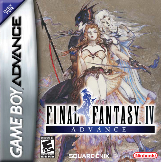
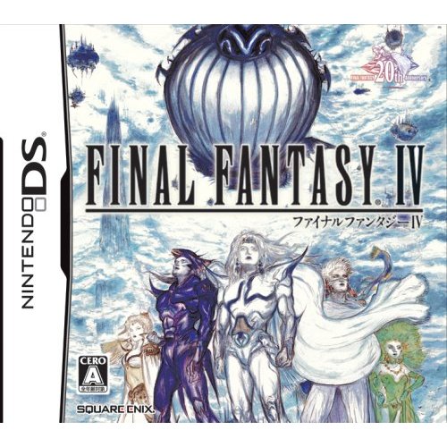
5 Final Fantasy IV

Out of all the Final Fantasy games, perhaps Final Fantasy IV has been ported to other gaming systems one of the most. So, there were a plethora of options. The artisanal box art for the Gameboy Advance release was similar to FFVIII's cover design, perhaps an early inspiration for a love triangle arrangement. Meanwhile, the box art for Japan's Nintendo DS port shows all the characters that are in the party at the end of the game. However, most American releases of FFIV followed the minimalist, 'logo only' trend.
Japan's very first release of FFIV for the Super Famicom had terrible box art, which is quite atypical. Perhaps it was in realization of this that the first PlayStation remake in Japan was given a cover this absolutely slick. It was as though they immediately went 'back to Amano' after the first release of FFV. In the above image, Cecil as a Paladin stands behind the crouching figure of his darker side, a physical manifestation of his own hatred that he literally has to face early on in the game. Although it doesn't quite meet up to all the standards necessary for box art, it's still beautifully illustrated and relevant.
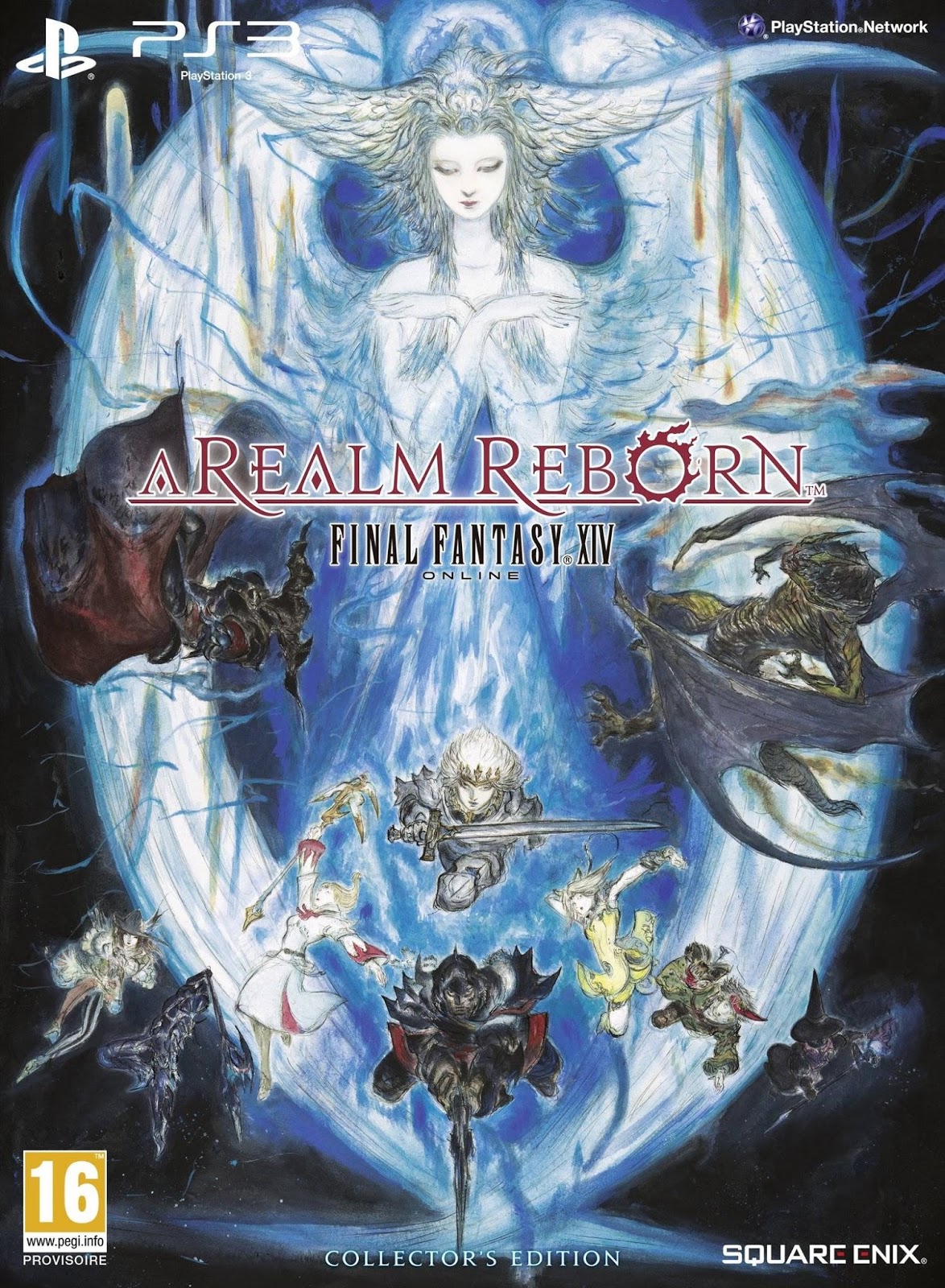
4 Final Fantasy XIV

Final Fantasy XIV was the most difficult to rank. The different cover designs ranged greatly in their aesthetic sense as well as their relevance to the game. This, like FFXI, had simple cover designs as well as Amano box art. Then, FFXIV was overhauled into A Realm Reborn. Its releases for the PlayStation 3 had completely different box art depending on the region. I planned to use either the Japanese release or the Collector's Edition of the game but ultimately decided to focus on the most recent re-releases.
The scene above exquisitely illustrates adventurers participating in a FATE against a Behemoth. Other than the above image, all of the other designs were shallow; beautiful but not depicting more than one character or much of the plot. The first cover design for the PS4 release only featured a black mage. The first expansion, Heavensward just focused heavily on dragoons. Sadly, the Stormblood expansion (to be released in the next month or two) seems devolve further into a more disappointing, unclear cover.
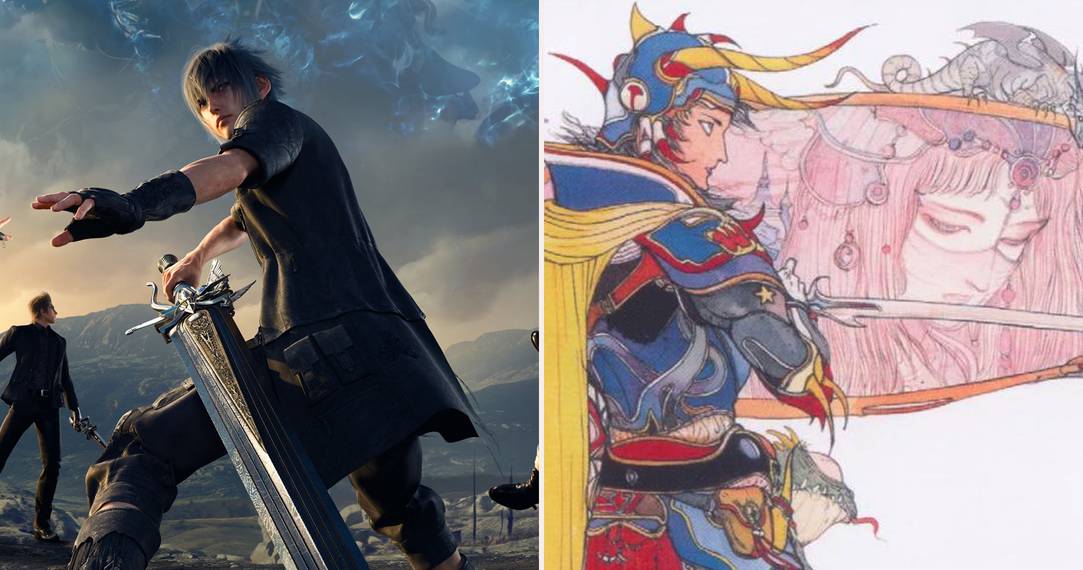
3 Final Fantasy XV

The cover art for Final Fantasy XV's American release (shown on the left) is just okay. Noctis and his cohorts wield their weapons with no enemy in sight. In the sky, the (barely appearing) past kings of Lucis watch over the young prince. Perhaps the image was meant to show liveliness and peril, but... it may be better to reverse the cover for just the title over a black background, at least that way you get the logo. So why then, would FFXV get such a good spot with these grievances?
I wanted to rank this entry even higher (perhaps first), solely for the Japanese box art (shown on the right). This original rendition is a sentimental and concise portrayal of the most strife-filled, 'bro' road trip of all time. With only body language, the scene perfectly portrays each man's role within the group as well as the bond they share before everything in Noctis' life has completely gone to hell. It can even bring tears to my eyes (for plot-related reasons). I don't feel that even Yoshitaka Amano's artwork used for the Final Fantasy XV Deluxe Edition compares to this Japanese cover.
2 Final Fantasy VII

Out of every main entry in the Final Fantasy series, Final Fantasy VII boasts (and promotes) the most well-remembered characters of them all. And FFVII's box art is just as iconic. Cloud stands at the forefront holding the giant Buster Sword to his back; directly opposing Shinra Headquarters. Within the logo to the upper right, meteor heralds unknown destruction. We don't get to see Cloud's face.
Not only is this box art a good representation of major themes in the game, but it's just cool. Before FFVII was released, the wardrobes for all Final Fantasy characters were lavish and ornate. This teases a grittier style; dark clothes, gloves, and screws in Cloud's pauldron and bangles. The architecture of the Shinra building indicates that the setting is more modern than all of the previous installments. This box art is also a good indication of FFVII as a whole; overrated but skillfully memorable.
1 Final Fantasy VI

Lo' and behold Final Fantasy VI. Not only is it lauded as the pinnacle of Final Fantasy games, but it also has kickass box art. Terra rides the Magitek armor, something she can do better than anyone else. However, her face and posture are dull and vacant due to the effects of the slave crown controlling her mind (probably one of the few cases where the faces Amano draws appropriately lulling and musing).
This victory is a little bittersweet, as this cover design is slightly lesser to its Japanese predecessor for the Super Famicom. In the original, Terra halts the Magitek armor at the edge of Narshe. Perhaps this is the immediate beginning of the game, and an unseen Biggs and Wedge are chattering about Terra as she looks listlessly at the scenery. Regardless, the artwork for FFVI is incredible. All in all, it's able to overshadow other installments in the series.