Console designs have changed radically over the past few decades, and certainly for the better. What were once bulky, beige, and fairly ugly monstrosities that sat on the floor next to the television set have evolved into sleek and modern designs that can proudly be displayed on our entertainment centers. Consoles look better than they ever have and for most systems, there seems like little reason to redesign them... but that might not stop people from trying.
Customizing your video game consoles is hardly a new concept and it's something that has gotten increasingly popular over the years. Heck, systems have even given us the option of decorating our controllers with themed stickers or our consoles with blinged out faceplates, but nothing really matches what the console modding community have achieved over the years. Sure, even our current consoles could be customized to our liking, but we then run the risk or voiding our console's warranty.
Retro console mods, on the other hand, come at a much smaller price and with little risk. Plus, there is no denying that older generations of consoles are less appealing to look at in general, so there's usually no harm in spicing them up a little... usually. While some console mods leave us stunned by the amazing craftsmanship or creativity, others leave more to be desired or are actually just plain ugly. Sure, the Nintendo Entertainment System launched over thirty years ago, but it's great to see modders still giving the system some love with custom designs. Here are some of the best... and some of the worst NES console mods that we've seen across the net.
20 An Interesting Design Choice (Terrible)

I have to give the designer props for trying out this design. There's a lot of good ideas at work on this NES, but the execution seems somewhat off. Rather than going with a video game-themed design, the artist chose to depict a traditional Japanese zen garden. This design has the potential to actually look pretty cool, but it seems like there were a few cheap artistic decisions made. The shrubbery surrounding the landscape looks like cheap, plastic cake toppers while the koi pond is just a cheap sticker plastered to the top... the art style for it also kind of clashes with the rest of the scenery. Also, not doing much with the vent on top seems like a missed opportunity. It's a clever 3D design and the Pagoda looks pretty great, but ultimately, the whole design just looks kind of cheap overall.
19 Fifty Shades Of Pink (Dope)

Truthfully, most custom NES mods look best when they go for a minimalist design. Unlike the zen garden above, some of the best designs don't try to impress with over the top 3D visuals and parlor tricks. This color scheme and pattern would scream out Kirby even if it didn't have the 20th anniversary logo plastered to the top... and while sometimes logos tend to make a great console mod look a little cheap, the circular image of Kirby's face with pink stars streaming from it looks great on this console variation. And who says that pink is just for girls and the Princess Peach's of the world? I would have absolutely loved having this as a kid... if my parents would buy me a pink console, anyway.
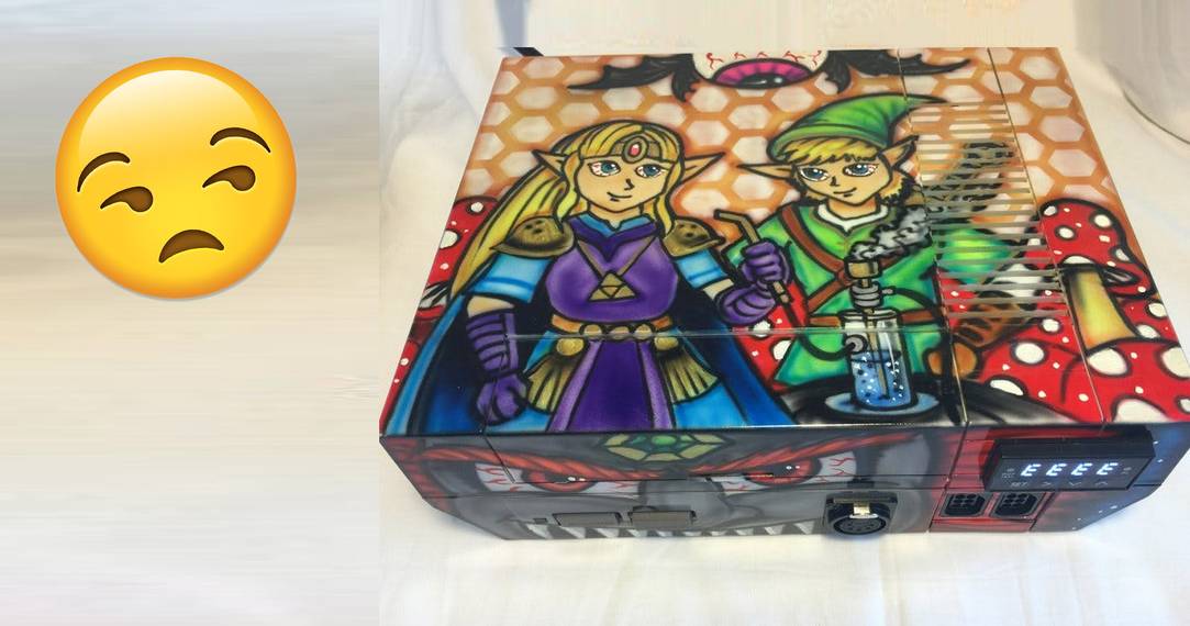
18 No Reason To Defend This High-Rule (Terrible)

There's a good chance I can't appreciate this console modification just because I probably don't fall under the lifestyle that it's trying to appeal to. I guess I could find the art somewhat funny crossing it across the web, but putting this image on an NES mod just looks so ugly. The idea of Link and Zelda getting phased out of their minds (along with their nemesis Ganondorf for that matter) just looks silly and does no justice to the series. Maybe if it bothered to work with a better color scheme (Zelda's dress and Ganondorf's skin tone is whack) and better resemble Hyrule, but this is one mod I just can't stand behind. I have to give it props though. It looks like some extra modifications were placed on the front for... other uses.
17 This Diorama Is A Knock Out! (Dope)

I'm usually not a big fan of 3D console mods as they often look way too clunky and cheap. That said, I think this Punch-Out!! NES console mod gets it right on the money on how to make a cool looking 3D modification. The design is actually super simple, simply taking the top of the NES and transforming it into a boxing ring. It doesn't really try to go over the top realistic either and uses the game's classic 8-bit sprites instead with Little Mac fighting some of his most popular foes, including Mike Tyson... or Mr. Dream, if you really prefer. Sure, it may be a bit big as it looks like the NES is pretty much tripling in height (thanks, King Hippo) but it looks cool enough that I wouldn't mind having it sitting on my entertainment center.
16 1998 Called. They Want Their Gif Back. (Terrible)

For people who grew up in the nineties and remember when the internet really first started becoming mainstream, you might remember a bunch of amateur websites that popped up on the web, usually created by teenagers who posted a short biography and a bunch of crazy jpegs and animated gifs that took the dial-up internet five minutes to load. This NES looks like it was thrown back in time and through an Angelfire internet server while getting one of those tacky animated gifs stuck to it, which we probably thought were totally rad at the time. I get that there's pretty much a whole section of Spencers in the mall that caters toward these types of designs, so someone has to be into it obviously... but I can't say I've ever met one as this type of style is generally considered to be pretty tacky.
15 Everything Looks Better With A Glow (Dope)

It's pretty uncertain where Disney's Tron franchise is headed after the 2010 film Tron: Legacy and whether we'll actually get another sequel in the popular sci-fi movie. Despite maybe not having the biggest fanbase, I think it's pretty safe to say that most people agree that the art style for the movies is pretty darned cool and that everyone can get behind some Tron themed console modifications. This NES design is fairly simple, only illuminating the top portion of the NES and the system's power and reset buttons, but it looks like a computer console that came straight from the movies. It might not look like much when the power is off, but it certainly would look cool during those late night gaming sessions.
14 A Terribly Uninspired Design (Terrible)

This design might appeal to maybe the biggest Metroid fan, but I can't help but let out an incredibly long yawn when looking at this console design. Let's face it: it is extremely uninspired. Rather than taking the source material and doing something clever with it, a screenshot from the game was pretty much painted on top of the system and then the artist called it a day. Sure, the paint job is well done, but 8-bit graphics don't tend to necessarily look that stellar and tend to be rather boring screen captures to look at. Not to mention, it just feels like there is too much going on. Sure, it might be one of Samus' most epic battles, but I feel like this bounty hunter deserves a little more effort put toward her own special console.
13 So Simple, But So Classy (Dope)

There's just something about that Legend of Zelda gold that is just so appealing to the eye. This is probably one of the simplest console modifications on this list and probably one of the easiest ones to make, save for getting that Triforce emblem inserted on the top. So why is this one of the best looking Zelda consoles I've seen? Sure, a gold console might look a little gaudy on an entertainment center, but people love their blinged out Zelda themed consoles as Nintendo has proven time and time again whether it was through the gold Nintendo 64 or the limited edition gold Wii-mote. Even if you're not a fan of the all gold look, you have to admit that it looks way better than that boring grey that the system originally comes in.
12 A Bloody Mess (Terrible)

Kill Bill might not seem like it is the best fit for a Nintendo themed console considering the movie has nothing to do with the system and it came out about twenty years after the NES was originally conceived. This console would give me more construction worker vibes if it wasn't for the blood splattered across the console, but mix that in with the iconic colors of Uma Thurman's costume from Kill Bill Vol. 1, you've got a console modification fit for a bride... or maybe not. Even if you were a fan of the color scheme, the fake blood covering the console just makes it look dirty. Blood is actually a pretty common form of decor in console modifications, especially in ones themed after gory games, but it's just never really looked that great in the grand scheme of things.
11 Capturing Years Of Nintendo (Dope)

Nintendo has one of the more extensive game catalogues compared to other systems due to it being one of the pioneers of video game and dating their consoles back to the eighties. This console modification pays a homage to some of the greatest games to hit Nintendo consoles with a collage representing the covers of some of Nintendo's most iconic games (though I personally wouldn't mind the absence of Jaws, however). Sure, the collage also depicts several Nintendo 64 classics, but I can't say I necessarily mind them making an appearance on this NES mod due to their popularity. Also, the transparent top showing the inner workings of the console give it a more sleek and modern look compared to the original model.
10 Does Anyone Like The Game This Much? (Terrible)

Most gamers growing up with the original NES probably have very fond memories of the original Contra. It was one of those games that if you didn't own it, you certainly had a friend who did and you probably spent countless hours trying to beat the game (at least until you discovered the Konami code). I'd love to get behind this console mod since the controllers look pretty great and the sleek black looks nice on the console, but the truth is that overall, it's just kind of boring and really doesn't do much to capture the spirit of the game. I've already discussed how I felt slapping a screenshot on a console was uninspired... slapping a game's logo on it? Even more so. I'd actually prefer this custom mod if we got rid of the Contra theme altogether.
9 A Console Fit For A Princess (Dope)

It probably isn't much of a surprise that there are multiple The Legend of Zelda console modifications on this list. When you become one of Nintendo's most iconic games, fan art for it tends to become pretty widespread and console modifications are no exception. This console modification does just enough to capture the essence of the game without going too overboard. The base of the console and the controller are colored in the series' signature gold, which looks great, yet the top has the appearance of the decaying stone walls of either Hyrule castle or temples across the land of Hyrule. The detail to the stones being cracked (and props to showing the inside of the machine in them) or the moss growing on them also really make the console pop.
8 Why Would Anyone Want This? (Terrible)

If you played games back in the NES era, you might remember a small video game company called Tengen, which produced unlicensed games for the original Nintendo. Then again, there's a good chance you might not remember. This console mod actually doesn't look terrible compared to some other ones... but the truth of the matter is that Tengen just wasn't a popular enough video game company to warrant their own console. Not to mention the fact that Tengen's color scheme is fairly ugly. It's hard to believe that anyone could have been that big of a fan of the company either. This isn't Capcom or Sega we are talking about but rather a company that made games such as Pac-Man or Paperboy. But apparently, someone was quite the fan.
7 Sometimes, Minimalism Is Best (Dope)

It may seem like Capcom all but abandoned Mega Man over the years, so it came as a big surprise when they announced the upcoming Mega Man X Collection and Mega Man 11. If it weren't for the fandom across the web, we might have never seen these games come to light. This console modification is like a love letter to the blue bomber and is something I would have loved to have had on my shelf as a kid. It even could have done without Mega Man's pixelated image gracing the cover and just have gone with the blue and black color scheme. The coloring on it is so perfect that you'd recognize that it was a Mega Man themed console with or without the titular character gracing the top. The multi-colored controllers are pretty great too, making us wish that there was a Player 2 option to be Protoman.
6 It Looks Like A Five Year Old Designed This (Terrible)

This is something I could see myself doing to a console at a very young age, thinking I was customizing it to make it look unique and my own, but I was actually just making it look ugly and gaudy. Remember when you were a kid and got a pack of stickers and you would just place them everywhere thinking you were making something look extra cool? You weren't, and that is what this console reminds me of. It looks like someone's aunt gave them a Mega Man sticker pack for their birthday and they just went to town on their old NES system and the blue bomber definitely deserves a little better than that. I don't even know what to say about that metallic finish, but the way the light shines off of it just makes it look tacky.
5 I Would Have Loved This As A Kid (Dope)

Teenage Mutant Ninja Turtles had a pretty rough start on the original NES. While their first title was pretty much an impossible mess, the series really shined after releasing their arcade style beat 'em ups later in the Nintendo's lifespan. Good or not, the popularity of the turtles made these games popular regardless, and if this system were actually available back in their height in the early nineties, it would have sold incredibly well. The color scheme matches the show's persona perfectly and the shell's hand painted design on top embossed with the show's logo looks beautiful. Getting all four turtles on the controller was a pretty nice touch as well. If only the NES had four controller ports so we could designate one turtle for each controller.
4 Trying To Make Custom Designs Scary (Terrible)

I've already kind of touched on how I feel about gory console modifications earlier in the list with the Kill Bill custom mod for the NES. I think it looks tacky and gross and has no place on an entertainment center, but it seems that a lot of console modifiers don't agree with me. Friday the 13th may have set a gold standard for the slasher genre back when it first debuted, but it certainly didn't set a standard for how to make a game based off a movie. Only the most die hard Friday the 13th fans could probably get behind this redesign of the NES. Sure, it's got Jason's iconic mask and blood splattered across a smaller version of Crystal Lake, but it still manages to look kind of cheap overall and doesn't do much for the series.
3 A Masterpiece Of A Console (Dope)

Now this is how you make a The Legend of Zelda console modification! This is a console that would look nice as a decoration piece almost anywhere in the household, not just on the entertainment center. At first glance, you probably wouldn't even be able to tell that this piece of art has a practical use as a game system over it just looking like a spectacular treasure chest from the series. The fact that the chest opens to reveal a glowing Triforce just makes it all the more appealing. You can tell so much time and love was put into this console's custom design and it manages to capture the essence of the game without being forced to plaster the game's logo or character's image anywhere.
2 I'll Give It An "A" For Effort (Terrible)

You can tell that the artist of this console put a lot of time and effort into designing it. It's unfortunate, however, that the design kind of falls flat in it's execution. I think 3D console mods are kind of a tricky thing to tackle and it's hard to get it just right without making it look too gaudy. It was a clever idea having Michelangelo's head peeping out of the sewer trying to get that last slice of pizza, but his head looks like of disproportional to the manhole and the whole console design looks like it's one giant fondant cake for an eight-year old's birthday party. The ripped newspaper article right next to the Teenage Mutant Ninja Turtles logo isn't doing the console any favors either and just makes it look a little tacky as it clashes with the rest of the design.
1 Cowabunga! (Dope)

Growing up with the Teenage Mutant Ninja Turtles has obviously affected this list as we've got yet another turtles themed NES on the list, yet this one packs quite a nostalgic punch as well. I've definitely stressed that less can often times be more in terms of console design, but this modification pretty much flips that theory on its head. If you grew up during the height of the Teenage Mutant Ninja Turtles' popularity, you likely had an assortment of toys to go along with your fandom. This custom design takes the turtles' original party wagon toy, guts it, and turns it into an actual working Nintendo console. Sure, not much was changed on the toy's design, but the fact that it has combined two of my favorite childhood toys into one is enough reason to celebrate this console modification.