GameStop is a magical place. You can find thousands of games, right at your fingertips. They've also got a variety of video game-themed collectibles and are deeply rooted in the Geek culture. However, there's also a darker side to GameStop. Take for example all of the horrible secrets they keep from the general public. Many of you have also experienced the terrible trade-in values for your used titles, forcing you to part ways with beloved games for a fraction of what they're truly worth.
They also sell games with customer-made or hand-drawn cover art. Okay, so that one isn't particularly dark. In fact, it's actually pretty hilarious. You'd be surprised how much amateur artwork is hidden at GameStop. This isn't exclusive to the United States of America either, there are GameStop stores found in 14 different countries, giving us a global array of artistic creations and hilarious covers.
If you're an avid reader of TheGamer, you know the drill by now. We combed through the internet to compile a list of the most hilariously bad and simplistically awesome hand-drawn boxes we could find. You might want to wear eye protection for this one, some of these covers are downright awful. That won't keep you from laughing though, especially at number one.
15 Harry Potter And The Cannibalistic Bird

You're a cashier Harry! You know it was coming, but there's simply no other way to begin a paragraph when presented with amazing box art like this. A lot of the artwork featured on this list is rushed and uninspired, but this creation is eye-catching.
Whoever crafted this beautiful visual pun put a lot of time and effort into its creation. Okay, it's not Van Gogh, but we think it's hilarious. Harry Potter and the Order of the Phoenix wasn't a particularly amazing game. In fact, none of the Harry Potter games were. That said, I think I speak for everyone when I say I would legitimately pay eleven dollars and change for this box art alone.
14 We're Far-Crying From Laughter Over This Cover

Oh Vaas, what have they done to you? Far Cry 3 was an emotional journey, filled with solid open-world action and slick gameplay mechanics. It also featured a rather engrossing story (although it was a bit anti-climatic at times).
When you first arrive on the Rook Islands, you're "greeted" by a temperamental man named Vaas Montenegro. He serves as the primary antagonist for the first half of the game and is herald as one of the most entertaining video game villains ever created.
In the photo above, we see two versions of Vaas. The depiction on the left is a dangerously insane man, bent on ruling the Rook Islands with an iron fist. The depiction on the right is just, insanity. We give the artist a ton of credit for attempting to copy this box art line-for-line, but the finished product has a much-beloved antagonist looking like a reject Wario.
13 Beware The Dread Dragon-Chicken

Imagine scouring shelves at your local GameStop and coming across this beauty? Sure, the original Elder Scrolls V: Skyrim box art has a sleek look about it, but this artwork really captures the true essence of this iconic game. What is that creature in the sky? Is it a bird, a dragon, or a winged coyote? Whatever it is, it has quite the beer belly. Perhaps it munched on some bandits along the way.
This is a gem among hand-drawn box art. Just look at the Dragonborn's stunning physique. What cracks me up the most is the super-generic "Skyrim" scribbled across the top of the case. This is easily one of my favorites. Elegant yet simplistic. I vote this as the official artwork for the Nintendo Switch edition of Skyrim.
12 Hand-Drawn Cow Simulator 2011

I'm going to level with all of you, I've never played Agricultural Simulator. In fact, I've never once thought about playing Agricultural Simulator. That is until I saw this glorious hand-drawn box art. At least, part of it is hand-drawn. I'm having a hard time understanding why someone would print out a logo and then hastily draw a cow. Couldn't you just print out a cow as well?
Although, I suppose it's possible that this is an artistic freedom. Perhaps the artist wanted to show the stark difference between the sleek logo and the green-whiskered cow (it's supposed to be grass). Sadly, we'll never know. That's the real issue with hand-drawn box art, we rarely ever discover the artists behind these amazing creations.
11 Grand Theft Auto: Bikini Bottom

This particular photo is a bit blurry, which is a blessing. If you're having a hard time deciphering exactly what you're looking at, that's Spongebob and Patrick firing guns wildly into the air. We aren't sure what type of gun they're using, but the bullets appear to be stakes or needles.
For some reason, Patrick is on the ground (probably because he's lazy) and SpongeBob looks like he's under the influence of some seriously heavy narcotics. Honestly, this is a crossover we'd love to see. Although, it's probably already a reality in the PC-version, thanks to a rather active modding community. Maybe that's what inspired this beautiful work of art. Whatever caused the artist to create this cover, I'm glad it happened.
10 An Unfinished Master(Chief)piece.

This one is especially frustrating to me because it's completely wasted potential. Someone took the time to sit down, study the Halo 3 box, and then began the arduous task of recreating it. They did a pretty good job with the logo and even colored it in to give it a little extra pizazz. Then they moved on to Master Chief, starting with his iconic helmet. Sure, it's a little less detailed than the original, but it's a great start and I personally felt like they were doing a good job.
Obviously, they weren't as enamored as I am, because they stopped at the helmet and called it a day. This is a travesty. There is all this open white-space devouring the rest of the case. Give us something, anything! A stick figure body, a grunt, a monkey riding a unicycle, just something to plug up all that glaring white light.
9 We All <3 Horses (And Vruums)

As successful as Mario Kart is, I'd be willing to bet a lot of newcomers would outright avoid it if the cover looked like this. I'm not sure what cracks me up more, the suggestively shaped vehicle or the "vruum!" sound it's making.
Let's be honest though, the real star of this picture is I <3 Horses. The first thing you're probably doing (I did it too) is searching through your encyclopedic knowledge of video games in a desperate attempt to remember a Nintendo DS game by this name. Shockingly enough, I <3 Horses is real, although it's known by the name I Love Horses, which isn't nearly as cool. We aren't sure what "lihahaa" means. Is that the horse's name, or the sound it makes?
8 Do Not Collect $200

Most of these covers are awful, so I completely commend you for sticking around this long. As a reward, I offer you this little gem, that's still awful, but quite a bit better than a lot of the travesties featured on this list. I'm actually pretty impressed by how clean the lines are, specifically around the top hat (and just look at that glorious 'stache).
Virtual Monopoly is about as entertaining as the board game. It's much more fun the first few times you play it, but most of us never make it through a full game. Maybe that's why this picture is so hilarious to me, because of the giant glaring GameStop sticker asking $22.49 for this title.
The real travesty here is the sticker's placement, which is most likely covering up a top-tier "You shall not pass GO" pun.
7 Kirby Says It's Time To Smash

This is another one that isn't particularly terrible, just downright hilarious. Upon first glance, this looks like a pretty decent shot at recreating original box art. Link stands defiant against an attacking Pikachu. Then your eyes drift to the bottom left-hand corner to spot this meme-like Kirby abomination. The face is flawless and turns this otherwise inconspicuous fan case into a hand-drawn riot.
It is important to note that the original Super Smash Bros. Wii U case is much more complicated and includes many more characters. For some reason, the longer you stare at this creation, the funnier it gets. I especially like the "for da Wii U" hidden in the title. Someone needs to track this artist down and hire them for the next Kirby installment.
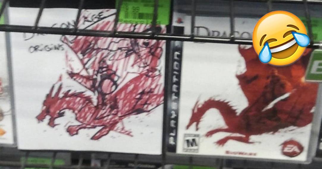
6 Artistic Repression: Origins

At first glance, I had a hard time understanding which one of these boxes was the copy (I'm kidding). Although, it looks like GameStop seriously struggled to spot the fake since both versions are the same price (some stores will give a discount for missing box art). It's hard not to admire this attempt since the artist was obviously trying to mimic the box the best they could. Unfortunately, it looks like they stopped midway through.
Maybe this is artistic representation. There were numerous times that I felt like thrashing around wildly in a fit of frustration when playing Dragon Age: Origins (it was difficult at times, or maybe I'm just a failure). To be fair, the dragon looks pretty good, at least, from the wings down.
5 A Global Firepower

Is this a hand-drawn copy, or actual box art? It could be either one, considering how old, stagnant, and tired, the Call of Duty franchise has become (bring on the hate, I can take it). It's sad to imagine that this hastily drawn pun is more entertaining than most of the recent Call of Duty titles. Don't get me wrong, I used to love the franchise just as much as anyone else and it's sad to see its current state.
There isn't much to say about this case from an artistic standpoint. In summary, it's a simple yet elegant pun (which I very much appreciate). At least the artist had great taste, Call of Duty: World at War was perhaps the best release the franchise ever produced.
4 The Elder Scrolls: Cod Liver Chronicles

I feel like I'm breaking the rules for this list a little bit. I already featured one The Elder Scrolls V: Skyrim hand-drawn box earlier on in this list, but this custom box-art is simply too good to leave out. This creation is by no means "bad," it's actually rather good. The proportions are great (for a humanoid scroll, I guess) and the perspective is solid (just look at that sexy scroll curl).
I had to include this entry because it's one of my favorites and good for a few laughs. Can you imagine walking into GameStop completely oblivious to what Skyrim is (impossible I know) and picking up this box? The Mature rating and cartoonish art style make it seem like some sort of strange adult version of Peggle.
3 S.P.O.O.K.Y.

Some of you younger fans may not be familiar with F.E.A.R. The cult classic, which stands for First Encounter Assault Recon, was released back in 2005 with a shiny Mature sticker. If you were a kid, you probably had a hard time playing this (unless your parents bought it for you on accident). Trust me when I say, it's better that you didn't play this game as a child because it might have scarred you for life. F.E.A.R. was pretty darn spooky when it first released, filled with jump scares and unsettling locations.
This cover is not an accurate representation of how truly unsettling F.E.A.R. was. However, it is hilarious, and I personally prefer it to the original box art. This would be a good way to prank someone. Hide the Mature rating and trick them into believing they're going to play something comical and cartoonish.
2 Tactical Stick Figure Espionage

What I'm about to say may come as a shock to some of you, but I never played Metal Gear Solid 4. I know, it's a timeless franchise filled with tactical espionage and a gripping storyline. I just never managed to get around to playing it, but I'll make it my mission to do so. Although I must say, I'm a bit confused about the premise of the game after seeing this hand-drawn box art.
Is that person hiding behind a wall, or is he the goalkeeper? Are those soccer balls near the bottom right corner? Most importantly, which one of these individuals is Snake? Maybe Snake is the deflated looking infinity sign, or the actual words in the bottom left. In terms of simplicity and confusion, this cover takes the cake.
1 You Need This, Ok?

This is it. This is the pure summit of poorly drawn and hastily scribbled box art. Of all of the hilariously bad covers featured on this list, this Mass Effect 3 artwork is hands down the best. From the moment I saw this I had a serious desire to find it and collect it. In fact, I might even try to reproduce it myself. It's just, in one word, perfect.
For those of you unfamiliar, there is a hilarious set of Mass Effect YouTube Poop videos (from Mans1ay3r) floating around the popular video-sharing website. This is where the "we'll bang, okay?" speech-line originated from. If you haven't had the opportunity to sit through the video series, I highly recommend it (you may lose your sanity though). This is a perfect blend of simplicity, hand-drawn goodness, and video game meme-like pop culture.