Although you aren't supposed to judge a book by its cover, most people do anyway, and the same is true for games. At this point, box art has become largely uniform, usually featuring the protagonist standing with their back turned, but it used to be commonplace for games to have different covers in different regions.
It is always fascinating to see how great box art was changed for different markets, and these are some of the best. Some examples may have you question your allegiances, but more often than not, one region clearly came out ahead.
10 Suikoden, Oh No

Suikoden's box art in North America was clearly drawn by someone with a lot of talent, but it is undeniable that there is something offputting about the hyperreal faces.
The Japanese cover, on the other hand, is extraordinarily effective at demonstrating the giant cast of colorful characters. It is impossible to know what convinced Konami that it needed to change the excellent Japanese box art, but it is clear that it had no familiarity with the concept of the uncanny valley. Thankfully, when Suikoden 2 was released it didn't make the same mistake again.
9 Mega Man Legends 2, Why Accept Excellent When You Can Have Unremarkable?

There is nothing really wrong with the North American box art for Mega Man Legends 2. However, once compared to the Japanese box art, the gravity of the situation becomes rapidly apparent. In Japan, Mega Man Legends 2 (much like its predecessor) has absolutely beautiful box art. It may be among the best. The same cannot be said for its American counterpart.
The 'very okay' box art people received in the west falls dreadfully short. We will never know why Capcom decided to discard the Japanese artwork, but whatever reasons it may have had, they were wrong. Very wrong.
8 Comix Zone, A Fascinating Turning Of The Tables
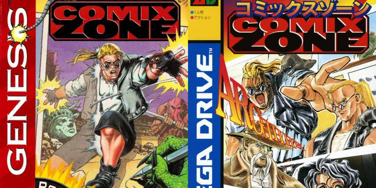
Comix Zone is a game that has a distinctly American comic book aesthetic. The western box art is able to perfectly capture that style. As a direct result, Comix Zone has an excellent cover in America. Unfortunately, the Japanese box art misses the mark by a wide margin. It isn't awful, but it is certainly a notable downgrade.
This is a fascinating case study, as the opposite has often been true of the western box art failing to capture the spirit of a game's anime aesthetic. Turns out that sometimes it is better to just stay in your lane because the American cover was perfect as it was.
7 Scarlet Nexus, Never Be Ashamed Of How Anime You Are
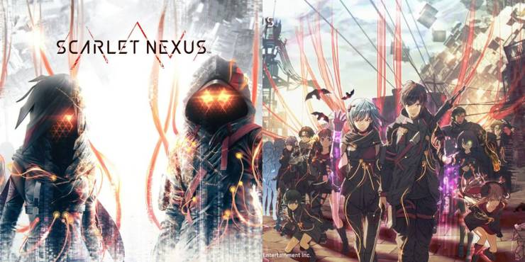
The Scarlet Nexus cover in North America is a bit puzzling. Surely the people at Bandai Namco aren't ashamed of how anime their games are, right? Because that is the first impression you get when you see the comparison between the Japanese and North American box art.
It isn't that the American box art is bad, it is perfectly competent if a little bland. It's just that the Japanese box art has so much more life. It is also more upfront about what Scarlet Nexus is: pure anime.
6 Super Castlevania 4, The Time When America Whipped Japan

Well, you can't win them all, Japan. The American box art for Super Castlevania 4 is absolutely stunning. The frame is filled with action, but it somehow manages to not feel too busy. It all works beautifully. It is a cohesive piece that deserves a spot in the pantheon of all-time-great box arts.
Japan's variant, on the other hand, looks oddly amateurish. They didn't even get Simon's color scheme right. You could be forgiven for thinking it is supposed to be the art for Dracula X. You win this round, America.
5 Breath Of Fire: Dragon Quarter, From Bold To Bland

Breath of Fire: Dragon Quarter is an incredible game that didn't receive its due respect. To add insult to injury, it also had its wonderful Japanese box art replaced with something lifeless and deeply awkward. It appears as though the people calling the shots during the PS2 era were absolutely in love with their blocky polygonal models.
While the Japanese box art features the heroes of the game reaching up towards the sky, a gesture that is symbolic of their primary goal in the game, the American box art has them staring lifelessly at the consumer. Dragon Quarter never had a chance in North America.
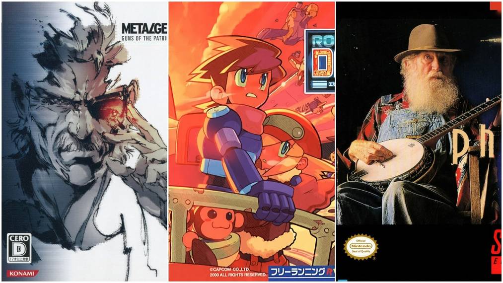
4 Metal Gear Solid 4, Murder By Polygon

How does one take a piece of art, an actual piece of art, made by a real artist, and replace it with a closeup of Old Snake's face? Yoji Shinkawa's Metal Gear Solid box art designs are absolutely legendary. Metal Gear Solid 4's Japanese cover is another example of a fantastic piece of Shinkawa art.
There are a lot of questions that rise to the surface when you compare the different covers for Metal Gear Solid 4: the most pressing question is probably "what were you thinking?" followed by a "how dare you?"
3 Phalanx, The Meme Will Never Die

While Phalanx has become well known as a headscratcher, it feels like the gaming public is unaware of how they have fallen into the marketing trap. The Japanese box art was wholly unremarkable. It is a better representation of the game, certainly, but it is utterly forgettable.
The American box art, on the other hand, is still being talked about to this day. We are talking about it right now. No matter how you feel about it, that is what making an impact looks like.
2 Chrono Trigger, A Battle For The Ages
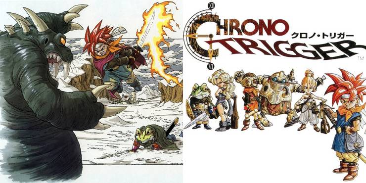
The American Chrono Trigger box art poses a unique scenario. In this instance, the American version of Chrono Trigger used a variant cover art, but it is another Toriyama illustration. And you know what? As good as the Japanese cover is, and it is a very solid cover, it was the right move to replace it with the American version.
While the Japanese cover displays all the game's heroes (outside of everyone's favorite pointy-eared anti-hero), the American box art captures the excitement of a battle in Chrono Trigger beautifully. There is no real loser here, but there is a clear winner.
1 Mega Man, Sometimes Worse Is Better
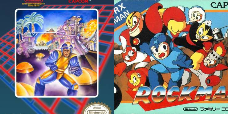
Here we have it: the GOAT. When you think of regional differences in box art, you think Bad Box Art Mega Man from the American release of Mega Man. But here is the thing, the Japanese cover is fine. It is perfectly acceptable. But it isn't legendary.
The American artwork, on the other hand, spawned its own unique character. A character who has gained their own cult following. Sometimes bad can simply be better than good. As a side note, the European art for Mega Man is stunningly beautiful. But even so, it isn't nearly as iconic as its American counterpart. So Bad Box Art Mega Man still wins. Long live the king.