The RPG genre has a storied history when it comes to art. A number of notable artists have established themselves through their work on these games. And what is the most important piece of art for any given title? Well, it is the cover art, of course! Love it or hate it, the cover does form the first impression.
And thankfully there are a lot of excellent pieces to choose from. Most of these covers are evocative, helping to convey the tone of the game. Many of them act as an introduction for their roster of characters. However, all of them have one thing in common: they are absolutely stunning.
A quick note before we begin, since there are so many wonderful entrants, we decided to limit each franchise to one entry. This means we had to make some extremely tough calls. Forgive us if your favorite missed this list. There are literally hundreds of amazing pieces we could have put on this list!
10 Soldnerschild

You almost certainly fall into one of two camps when it comes to Soldnerschild: you've never heard of it, or you only know of it because of its box art. And it isn't hard to see why, it is a beautifully drawn montage of the cast of characters. The game itself is a solid enough SRPG (that unfortunately never released in the west), but while few people reference the game, its cover will still often come up wherever people are discussing beautiful artwork in games.
There is an elegance to it all that feels utterly timeless and absolutely entrancing. Even the lady in the bikini armor doesn't ruin it. By the way, if you are looking at that cover and trying to figure out why it looks so familiar, it is likely because it was drawn by Symphony of the Night's own Ayami Kojima.
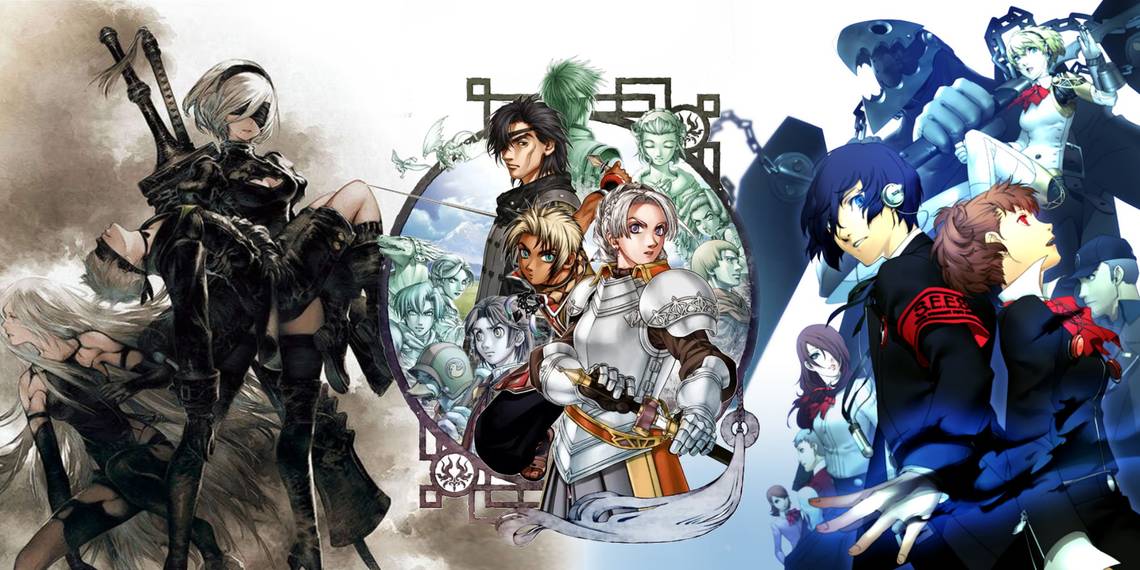
9 Persona 3 Portable

The Persona games are absolutely filled with titles that have excellent covers; there really isn't a loser in the bunch. However, the excellent PSP version of Persona 3 features an absolutely stunning cover. For those unfamiliar, the Persona titles all have a color associated with them, which is why the P3P cover is tinted blue. In that regard, Persona 3 has a pretty big advantage over its brethren (sorry, Persona 4, you got the short straw with yellow).
The blue tint gives this cover a sleek, uniform, cool look. And, of course, the fantastic art of Shigenori Soejima does a lot of heavy lifting. There is a sense of tension here, and the way Minato stares directly at you gives the art a quasi-fourth wall-breaking element. It is almost like he is looking to you for help.
8 Chrono Trigger

So often in the 16-bit era the Japanese box art was just better. However, the west won when it came to Chrono Trigger's cover art. It is a beautifully illustrated rendition of a Crono and Marle performing a Dual Tech attack against one of the game's many bosses (good ol' Heckran).
The cover manages to be exciting while simultaneously depicting the game itself accurately. Which was surprisingly uncommon during that era of box art.
If you are curious about why Marle is using fire on the cover here, there are some screenshots floating around on the internet that shows her using fire magic in an earlier build. The more you know!
7 Nier: Automata

The majority of the covers we are highlighting here feature their cast of characters, often in a collage-esque arrangement. While the Nier: Automata cover art does feature all the playable characters, instead of them striking poses, this cover features 2B holding the limp body of 9S (with A2 looking off into the distance). Establishing the dramatic tone of this grisly, bleak, classic.
The colors are muted here, which gives this cover a distinctly somber aesthetic. It is quite simply a perfect fit for the dour game that is Nier: Automata. In that regard, the cover perfectly mirrors the game's content.
6 Breath Of Fire 3

Breath of Fire 3 features its core protagonists Ryu and Nina front and center simultaneously striking battle poses as they embrace each other. Which you would think wouldn't work, but it absolutely does (though we can't imagine it is the most efficient way to win a fight).
What we love most about this cover—outside the gorgeous art—is how the secondary cast of characters is silhouetted against the scales of the dragon that entwines our two protagonists. The more you look at this cover, the more you will see these details. Having these details tucked away allows there to be a clear focus, while providing visual density to the cover.
5 Kingdom Hearts

We know, Kingdom Hearts can be a bit of a contentious title for some people (not us, we're all fans). But love it or hate it, Kingdom Hearts' cover is absolutely spectacular.
From the way it stacks its cast of characters, who are all contrasted with the starry night, to how it cleverly incorporates the iconography of the series in the form of the heart-shaped moon, Kingdom Hearts' cover helps establish the visual identity of the series before you even remove the disc from the box! It is aspirational, beautiful, and extraordinarily memorable.
4 Trails In The Sky

It makes sense thatr most RPG covers are going to focus on featuring their cast of characters. Most RPGs live and die by the quality of their protagonists. However, what very few of these covers manage to do is to sell us on the themes present in the game itself. This is where the cover art for Trails in the Sky comes in. It features the game's central protagonists peering up into the sky. It is simultaneously hopeful and aspirational.
It also ties into themes of the first game as Estelle is a character who spends a large part of it aspiring to greater things. It is a wonderful cover, and it perfectly represents the airy beauty of the game itself.
We want to give a shoutout to the Japanese cover art for Breath of Fire: Dragon Quarter. It features a similar theme, with the protagonist reaching toward the sky.
3 Suikoden 3

The Suikoden series is an excellent example of how important first impressions are. To this day, when people use the words "Suikoden" and "box art" in the same sentence, they are probably referencing this first game's North American cover. But the other Suikoden titles have excellent covers! The best example of this is Suikoden 3's cover art.
It features a collage of the game's many heroes; with the game's central protagonists popping due to the color contrast with the rest of the troops. It is all pretty subtle, but it helps create something memorable and pleasing to the eye. It is also a cover that prominently features a bipedal duckman, which has to be worth something!
2 Octopath Traveler 2

Is this cheating? Are we cheating right now? Look, we get it, the game isn't even out (as of the time of the writing of this article), but the cover has been revealed! And hey... just look at it! It is beautiful. Instead of showing the various characters in a series of disconnected poses as so many RPG covers do (some of which made this list, so we aren't knocking it), Octopath Traveler 2 instead chooses to show them all congregating by the fire. It gives this cover a strong sense of community.
And look at the color scheme! The harsh contrast between the warm colors emanating from the fire, and the cool blues that surround the frame, give the flames palpable warmth. We can honestly say we have never seen a cover that looks anything like this one. So, cheating or not, we aren't leaving it off this list! We suspect the game will be good, but we know the cover is amazing!
1 Final Fantasy 6

Final Fantasy 6's box art in the west was... fine. It featured a lone Moogle leaning on a sword in a black void. But the Japanese box art? Dear god it is beautiful. It makes use of all the real estate available, effectively turning the game's box into a canvas. Final Fantasy 6's cover art is unmistakably drawn by Yoshitaka Amano. It features his iconic, wispy linework. Amano's work feels uniquely delicate; there is an ephemeral quality to it. Which makes the harsh industrial elements all the more notable here.
The cover itself shows Terra riding her Magitek armor, looking at the oppressive walls of Vector. Which seemingly implies that the image on the cover takes place before the events of the game itself. Pretty neat! This stands out as being a game cover that works as a piece of art; it belongs just as much in a frame as it does on a box!