The Call of Duty League is set to start at the end of January, and all 12 teams have officially unveiled their branding. Transitioning into a location-based league, organizations and teams had the opportunity to blow everyone away with the new names and logos they would be using going forward. Unfortunately, not every team's new brand hit the mark. While there are no true atrocities, the names range from "meh" to "really cool." Here are the 12 Call of Duty League teams ranked based on their name and logo.
12. OpTic Gaming Los Angeles
Optic Gaming has some really strong branding for the organization. The clean, simple design of their logo is effective, while the lime green and black combination really pop. Unfortunately, this Call of Duty League team took the easiest possible path with their branding. To make matters worse, the name feels awkward to say the way it is arranged. The logo is the same as well. It's isn't technically the worst, but definitely the most uninspired, placing it securely in last place.
11. New York Subliners
This name doesn't make much sense. What the heck is a Subliner, anyway? Despite that, the blue and yellow color scheme looks really good and helps the team stand out from the rest. Still, the logo isn't doing the colors any favors. Maybe once the jerseys are unveiled and the name becomes more commonplace can the branding can be seen more favorably. For now, though, the New York Subliners are just meh. There isn't a better way to put it.
10. Los Angeles Guerrillas
The Los Angeles Guerrillas are a mixed bag. On one hand, the name is cool and fits in with the Call of Duty concept overall. On the other, the logo is terribly boring, generic and somewhat uninspired. Featuring a hooded figure in a painfully simple design, the Guerrillas missed a key opportunity to have a strong logo to go with their name.
9. Atlanta FaZe
Borrowing from OpTic Gaming Los Angeles' playbook, the Atlanta FaZe will carry on the legacy of the FaZe Clan. Despite carrying over the branding, they decided to follow the traditional naming pattern instead of being FaZe Clan Atlanta. Incorporating the FaZe logo into their own, the Atlanta FaZe have decent branding (even if they somewhat took the easy way out). The classic red and black colors fit in with other sports teams from Atlanta like the Reign and the Falcons.
8. Toronto Ultra
Ultra is a pretty neat name and fits well when thinking of names for a Call of Duty League team. The Toronto Ultra feature some bright purple coloring which could have been muted a bit, though it does stand out. The logo is neat as well, a "U" that subtly features a squirrel front and center. It is simple but effective.
7. London Royal Ravens
London was so close to being one of the best brands in the league - only one word away, actually. The "Royal" aspect of the name makes it feel a bit pretentious. If they had gone with the London Ravens, it would have been much more effective. Still, the logo is powerful, even if it is somewhat simple, and the color scheme fits well with the city.
6. Paris Legion
The Paris Legion also had the opportunity to be much higher on this list. Their name is one of the best out of the 12, but their logo is a bit lackluster. Yes, the Fleur-De-Lys is a well-known French icon, but it's rather overdone at this point. Still, the orange and red color scheme is unique and works well together. Despite hesitation, this branding has a lot of potential to climb higher once we see them in action.
5. Chicago Huntsmen
The green and muted yellow color scheme for the Chicago Huntsmen really works. It looks classy and the logo helps bring it home. It is a simple design but has some strong details to it that makes it one of the more unique ones in the league. The name Huntsmen doesn't seem that cool at first, but after some thought, the entire branding is strong.
4. Florida Mutineers
This is the first team on this list that has a truly great team name and logo. The Mutineers fit right in with Florida and the logo is probably the most unique one in the league. The aqua-green primary color helps them stand apart and the secondary orange color brings it nicely together. With a name like the Florida Mutineers, the logo needed to really showcase the cool name - and it definitely succeeded.
3. Minnesota RØKKR
Despite the obscure name, it's hard to deduct points from the Minnesota RØKKR. The name is definitely the most unique - as it is the Norse word for "twilight." The logo is amazing while the dark purple and light blue color scheme might be the best colors in the entire league. Minnesota definitely shines with their team branding.
2. Dallas Empire
The Dallas Empire probably have the simplest branding this high up on the list, but it sure is effective. Empire is a classic name that fits with any city. The logo is a crown (fit for an Empire) that incorporates the letters "N" and "V" into it, a subtle nod to the organization behind the team. They have the effective color scheme of black and gold as well as the secondary color of navy blue. The entire branding is clean and effective, making it one of the best in the league.
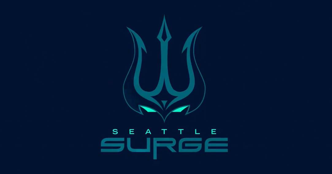
1. Seattle Surge
Alliteration can be effective when done correctly and the Seattle Surge nail it. The name goes extremely well with their logo. It's a unique (but mysterious design) that incorporates a few different elements in it. The various shades of blue that make of the color scheme resonate with the Pacific Northwest region and the stormy, sea-drenched theme Seattle went with. It's the most effective and best branding in the league.