Video games are everywhere. We've reached a point in our society where games and the worlds they create are almost as valid in mainstream society as other forms of entertainment like movies, TV, and books (remember those?). And as they increase in public prominence, we start to see them in places we never looked before. Strange associations and little coincidences start turning up everywhere, and in many cases, as the famous saying goes - once you see them, you can never un-see them.
Now, some of these things might be found on video game boxes, a topic I've covered before, and it was great to find some more for this one. There's a lot of bad video game box art out there everybody, and I mean that in every possible meaning of that word, from every era throughout time.
Of course, sometimes the things we notice are just typos and relics of an era gone by, made funny by the passing of time. Nevertheless, they get burned into our memories for better or worse, so it's my duty here to show you the funnier side of these things if I can. But rest assured, I'm not above showing you some of the crazier things out there if I think they're cool enough. I've got twenty of these gems, and I'd love for you to take a minute and check them out with me. Some will make you laugh, some will make you cry, and some will just make you say "...What?"
Let's get started!
20 Master Chief's Junk (Destiny/Halo)

People have talked at length of the relationship between Halo and Destiny. Both are created by the same studio, and both share aesthetic decisions, such as the complete raiment of all of their characters in head to toe body armor that has far too many segments to actually be tactical or practical. There are several subreddits out there trying to mine for details to link these worlds together into some massive shared universe, with Destiny being a game taking place in a post-apocalyptic version of Halo's future.
But probably the best link between them all is found right here. Buried within a Halo 2 co-op match teabagging was the secret we should have realized long ago: it was Halo's Destiny to become the one game that's going to teabag the entire planet.
19 WE WERE SO WRONG (Pokémon)

Diglett is one of the most adorable Pokémon of all time. Literally just a brown hill with a face poking out from under the ground, no one has yet discovered what lies beneath, though many have speculated. But the one thing we've always known about Diglett is that he has two eyes, a nose, but somehow still says his name in the anime.
But this picture is here to change everything you know about this little mole baby. What if we've been looking at it all wrong? What if his nose is actually an open mouth, and the reflection shine on the nose is actually a tooth? WHAT THEN? WHAT HAPPENS TO OUR BELIEFS?
Nothing. They're noses, just look at the anime. This is pretty hard to un-see though.
18 He's Been Mocking Us All Along (Super Mario Bros)

...! Do you see that?!
That little bastard! And for all the stuff we've done for you and the entire Mushroom Kingdom?! We save you from Bowser, and you flip us the double bogey? Well I got news for you, buddy - you can take my plumber plunger and shove it right up your--
You know what? Maybe I'm reacting too rashly. I mean, after all, we've been saving him for decades now and...
You know what? No. This has been going on, in our faces, for DECADES! We cannot let this stand! It's time to let the Mushroom Kingdom meet the Pesticide Kingdom! Screw plumbing, we're gonna make Mario work for Roundup! Try and double-barrel us then!
Though I guess that could be his thumb and not his middle finger... nah. BRB, I've got some stuffed mushrooms to make.
17 Luigi's Hat (Mario Kart: Double Dash)

This actually takes some finding and some lessons in perspective to see. Just think of it this way - if Luigi was actually facing the same way Mario was instead of looking over his shoulder at - I dunno, a cow or something - that "L" on his hat would be facing the wrong way. His name isn't ⌋uigi, after all. It's not like this is some kind of backwards mistake, either - all of the other letters are correct.
It's odd because usually it's the third-party games that come out for Nintendo's systems that tend to have the typos and stuff, but never anything like this. This is a really big cover art problem. Obviously, something that's easy to miss, but something we'll never be able to unsee.
16 We See What You Did There (Pokémon)

Over the years, as Pokémon has evolved, it has changed with the times. And one of the little details you might have missed is the evolution of the Pokédex. It's had a rather... similar appearance to the consoles that we've been playing them on when they first came out. It's actually a really cool way to tie the Pokémon universe to the real one, as if we really needed to give more credence to our internal wishes that Pokémon were real.
Still though, I can't wait to see what the Pokédex is going to transform into when that main-series Pokémon title comes out for the Switch. Are we going to have to put it in a dock in our room to activate it?
15 An Uncanny Resemblance (BioShock 2)

Bioshock 2 was a great follow-up to an amazing game. It provided a much-needed shift in perspective while also shining more depth on the world of Rapture and how it came to be. It remains of the best games of its era. Its cover though... not so much.
Don't get me wrong - the Big Daddy is one of the most intimidating monsters/characters of all time. However, this one's diving helmet makes things a little too recognizable, in the worst way. By recognizable, of course, I mean that this one looks exactly like classic video game character Bomberman, someone very much not associated with dark brooding stories and demented villains. He's more about bombs.
14 Check Out My Balls (Pokémon)

So like... this picture pretty much does my job for me, but I'm here to say some words, so let's get to it. Possible jokes I could make about the Master Ball using this image as fuel:
1. I can only hope that he cleans his thong before he throws it.
2. A normal-sized Pokéball is about the size of a softball. How tight must this be on him?
3. Does that "W" go on the front or the back? I feel that's important.
4. If you look at how that thong is constricting the Master Ball, can you imagine what it does to Wario's junk?
5. When he's wearing this, do you even see it on him? Or is it all reclaimed by his... folds?
13 Turning The CBS Logo (Pac Man)

If you live in the United States, you've seen the CBS logo your entire life. If you're like me, you barely watch anything on actual television anymore and seeing the CBS logo brings you back to those long drawn-out dinners at your grandmother's house when you were a kid, being forced to watch 60 Minutes because Grandma didn't have a Nintendo and there was absolutely nothing to do.
However, it turns out that if you just turn the logo ninety degrees, you end up seeing a much more loved symbol of childhood. That's right, the world's most boring TV logo has actually been Pac Man in disguise all along! Now if only we could play it instead of watching another damn episode of Big Brother.
12 Kakuna Is A Dapper Little Gentleman (Pokémon)

When it comes to cute Pokémon, one doesn't really think of one like Kakuna. Sure, he's great for a good "Harden" joke or two every now and then, but other than that, he's just a stepping stone to getting a Beedrill solely for the Pokédex entry and then relegating him to a box for the rest of his existence.
However, one Pokéfan found something that's actually pretty interesting when it comes to his chest scales. If you look closely, you can make out what looks like a necktie!
Now I can't get the mental image of a little Kakuna going for a job interview in a place like Celadon City, carrying a little teeny briefcase in defiance of his lack of arms.
11 NARTUO (Naruto)

Typos happen to the best of us. I'm not too proud to say I've made my fare share (see what I did there?) for articles on this very site, let alone things like my Twitter page (which you can follow right here). But sometimes typos happen and they're much worse than a little deletable piece of information. Sometimes they go on boxes for video games based on one of the most successful animes on the planet, and sometimes you spell that anime's name wrong. That's when you know you done effed up.
However, it's not like this is the first time that the Nintendo 3DS has had such a typo. There have been many, and we're not even getting into the Wii-generation typos...
10 Inky, Blinky, Pinky, And Darth (Pac Man)

Sometimes, memes happen. And sometimes, memes get put on shirts. This is one of those times. And it is delightful. I mean, nobody ever really liked Clyde, the dumb ghost, in the first place. Literally, his Japanese name is "Stupid." So why not replace him with another ghost with a really awesome helmet? I mean, it works for me. I just don't think any of us want to know what's going to happen if he ever does get a hold of Pac Man.
Come to think of it, can he still use his force powers here? That might make things a quite a bit harder, since as long as Darth has a line of sight, he can force grab that little yellow circle right into him.
9 Invader Mario

So this might be a stretch here, but I mean come on. Take those little pixels out and how can you see anything else? If this isn't from Space Invaders, I can definitely see it in something like Galaga or Galaxian. But it's one of those things we've been looking at for years now, and how did it take us this long to figure it out? Granted, we've been looking at this in an incredibly tiny resolution for a good part of it. It's just recently that we've been able to upscale this stuff on 48" HDTVs and the like.
Still though, who would've thought that the design for Mario's overalls of all things looked almost exactly like a space invader?
8 She Vampires: Uhh... What?

The full name of this game is The Astonishing Adventures Of Mr. Weems And The She Vampires. Yeah, quite a mouthful, I know. It's one of those incredibly dense and silly Commodore 64 games with more interface than actual visuals, but let me just dwell here for a moment on this cover.
What the hell are we looking at here? Are these three vampire ladies three vampire ladies in various states of decay, or are we seeing one rise from the coffin and get more and more corporeal? Either way, I'd love to know where they got those ethereal stockings and lingerie bottoms from.
Listen guys, if you're going to make your game feel sexy, maybe don't throw in the version of the she vampire where she's literally a corpse? Kinda kills the mood.
7 Luigi's Bra-Stache (Luigi's Mansion)

Everyone's favorite awkward scaredy-cat/death-gaze kart racer, Luigi is a character that's seen much more character development than his portly brother ever has. One of those developments, it seems, has to do with this mustache. This iconic still of him from the original Luigi's Mansion for GameCube was just that - a really cool picture of him - for so long. Until today. If you're looking just right, you can see the supple curves of Luigi's beautiful mustache turn into something a little more... bouncy. If you treat his 'stache as the boobs and his sideburns as straps, then my friend, you got yourself one mean pair of Italian stallions. Bona fide spaghetti sweater puppies. Weird-ass hair boobs. I could go on, but you get the idea.
6 One Happy Giraffe (Resident Evil 6)

Oh, I'm so glad to be talking about this again. Last time, I just went into a little rant of what the board meeting to greenlight this logo must have been. Today I want to talk about this logo's inception.
I mean, who makes this logo and says to themselves "Yep, that's definitely a cool-looking six. Nothing else."
Meanwhile, the project manager in charge of bringing the final cover to Capcom looks at it and says "Hm. I don't see anything here. Nothing that looks like a giraffe getting a——."
The manager's assistant comes in and says "Yep, sure thing boss. I definitely don't see the strands that act like a hand, placed ever so gently on the 'woman's' head. Get it to Marketing!"
5 DARTH MART (Star Wars)

Some things hit a bit too close to home. A bit too "nail-on-the-head," if you will. Walmart is a company known for cheap prices, crappy consumer practices, and even crappier employee care. To make up for their insultingly-low wages, entry-level employees are coached on how to get government assistance to help them make ends meet. Don't get me wrong, I'm not one to disparage people who get help like that, I just think that the company should be paying enough that it shouldn't be a necessity.
Anyway, are they both evil? Unquestionably. Are they both headed by dark, arcane leaders of unholy cults who have the ability to shoot lightning from their hands yet somehow cannot figure out a way to stop falling to their deaths?
That remains to be seen.
4 I'm Sorry, What Am I? (Super Mario Galaxy)

It took some time to find this, but for some reason, the stars along the letters in the game's title from the box seem to spell out a silly middle-school-style insult:
U R MR GAY.
...No I'm not! You are!
It's still unclear as to why this ended up like this in the first place. It's a more intricate mess up than say, Mario Kart: Double Dash, but to this day Nintendo hasn't said anything about the "message" to this day. It's just a mystery that exists, being brought up from time to time by sites like us who want to talk about silly video game stuff on the Internet. Well kids, this low-hanging fruit is right here, and we're going to keep poking fun at it until everyone stops listening.
3 THE HORROR. (Pokémon: Ruby/Sapphire)

I think if anything, all of these recent HD remakes have taught us that things that were once in pixelated form do not need to be updated to HD. Sometimes we see things like Mario's overalls.
But sometimes we see this.
If you've never heard of Goatse, congratulations and welcome to the Internet! You should probably go home before we ruin everything you've ever loved. If you have, you know what's going on in this picture, even if that's not what's going on. Goatse trumps all, especially the innocent. It heeds no pleas for mercy and leaves no survivors.
All this because you wanted to play a game from your childhood in glorious HD, on a gigantic screen. I ask you -
Was it worth it?
2 DasRacist.jpg (Chinese Juggler)

Oh. My. God.
What fresh hell am I even looking at here?
Chinese Juggler? Are you serious right now? How was this even thought to be cool back in the day? Racism was totally still a thing, and this is some 1950's-Looney-Tunes level s**t. Why did anyone think this kind of cover was a good idea? I mean I get it - the game's about plate spinning, which is pretty boring to begin with, but why was this considered the best move? He doesn't even look cool or athletic - he's just kinda putting them up there through levitation or some noise. Nothing about this makes for a game cover that looks like it's actually fun to play. It's just partially there. But COMPLETELY racist.
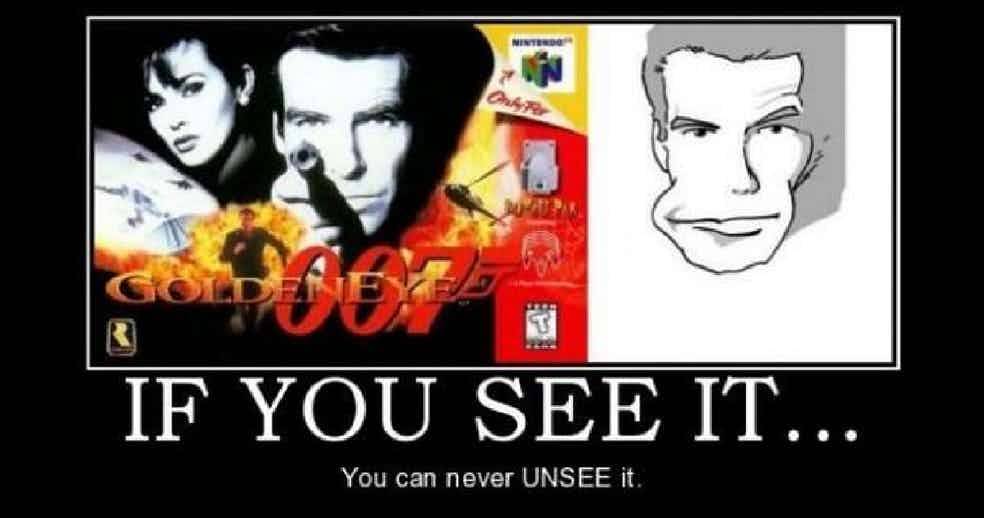
1 Let's Try a Big Smile Next Time! (Goldeneye)

This picture holds a sense of nostalgia to anyone who knows what the phrase "Slappers Only!" means. Yet it was only when the collective unconscious we all share known as the world wide web came on-line that we truly saw this picture for what it was: Pierce Brosnan with a really wide face.
Yes, I know that's supposed to be a hand holding a gun that will definitely recoil into his eye, but they needed to get the weapon to that level to keep it tight on his face.
I. Don't. Care.
It's been twenty years now, and it honestly doesn't matter what we see anymore. So I'm going to see the more entertaining version. If you don't like it, 1v1 me in the bunker and see who comes out alive. No Oddjob, though.