It's always fascinating to see how much variety, creativity, and general artistry can go into something as simple as a custom piece of gaming hardware. From chiseled and carved textures, to 3D decals and figures, to embedded LED lights, there are a ton of different artist and modder approaches to sprucing up a game console. Sometimes a well-crafted paint job is all it takes to turn a typically bland and clunky gadget into a gorgeous 3D gaming canvas. And particularly in an entertainment industry such as gaming, which is wrought with colorful characters and epic virtual worlds, there is a massive slew of content to draw from which can translate into some truly majestic game-themed designs. From the fantasy realms of Hyrule, to a galaxy far far away, there are plenty of fun options.
With all the variety and free reign involved in custom designs though, the potential is always there for some bizarre, ugly, or simply bland aesthetics. It could be a matter of a design turning into a cluster of too much visual noise, harsh, unappealing colors, or poorly drawn artwork. It could quickly transform a console into a clunky, burdensome mess, and can even seep its way into the comfortability or functionality of a controller or console itself in some cases. It's clear when examining some of these, that it can be tough to find the right balance of simplicity and complexity, and going too far in one direction can produce a sight for sore eyes.
In this list, we will sort through a seemingly endless array of custom-crafted consoles, and highlight some of the worst of the worst. We will also throw in some artistic gems, which will serve as a comparison and a contrast to the duds.
29 Lame: Because When I Think NES, I Think Tengen

Out of all the potential options of colorful Nintendo brands from which to model a custom NES, it's something of an odd choice to choose Tengen, an obscure offshoot of Atari, especially one who's mainly known for a mere 3 (licensed) games for the console.
Oh, they did manage to crank out a slew of unlicensed games though, which Nintendo promptly sued them for.
On top of this odd choice in a custom design, the brass-esque color scheme just looks ugly and off-putting. Perhaps Nintendo should sue the designers of this custom NES for making it look even more unappealing than it already is.
28 Lame: Mountain Don't...

It's surprising that this is an official Microsoft and PepsiCo. sponsored custom console, as it sports quite an unappealing and boring aesthetic. Aside from the logo in the middle, the rest of the device just comes off as bland with its monochromatic color scheme.
It's no wonder the promotion to get this limited edition Xbox only lasted 5 months.
I suppose you could make the argument that the neon green goes with the Xbox "X" logo, but the harsh, light green color just doesn't mesh with the design of the console, which we're used to seeing sport a black paint job. Also, the hues tend to resemble toxic waste rather than either Mountain Dew or the green Xbox logo.
27 Dope: What Better Way To Play Some Gears 5?

Talk about dedication, this artist has clearly put a large degree of craftsmanship and detail into this epic Gears of War design for the Xbox One. This is true even when focusing on the console alone, with its gritty, Gears-esque paint job and deliciously creepy COG tag symbol, but they even took it a step further. Not only did they work on the controller and its holder, but even went the extra mile in painting and carving a realistic looking lancer onto an external hard drive! Everything from the texture to the 3D decals are sharp and detailed. This is one console I wouldn't mind eyeing while rocking some Gears 5.
26 Lame: Mimik-Eww

I might be a bit biased, as I'm a Pokémon traditionalist, so I'm not too interested if it's outside of Red/Blue territory, though I still feel this harsh design would be off-putting even to Mimikyu fans. The Gameboy Color frankly appears to be bleeding purple blood, the paint job is rather pedestrian, and the purple and yellow color scheme is just harsh and doesn't work.
This also isn't entirely the fault of the artist though, as this Pokémon just looks... bizarre in general. Unless you're a diehard fan of this Ghost-Fairy fella resembling Pikachu, I don't see how this would be appealing. How about an Articuno design?
25 Lame: Steampunk, Or Submerged In Mud?

The steampunk thing seems to be popular to a segment of gamers, particularly those who appreciate some good ol' gritty-dystopian sci-fi. It's largely a hit-and-miss design for me, as its unique aesthetic doesn't always work. In the case of this Xbox, it definitely falls into the "miss" category.
The wrong kind of gritty...
Aside from the grimy texture and ugly color scheme, the design is also missing details that typically come with Steampunk-laden art, such as gears or other old-school mechanical workings. It thus comes off as bland, and it's tough to make out as to whether the artist is going for Steampunk, or a console that's been bathed in a pool of mud.
24 Dope: Black Ops-Station 3

That curvy, slick finish on this Sony console presents the potential for some truly awesome custom designs, which is why I'm always surprised when I don't see more great PS3 designs. But Jriquelmemods has stepped up to the plate with this hypnotic, bold Call of Duty: Black Ops II modded PS3. Something about those framed LED lights just make for an enticing image. Those retro NES and Famicom painted controllers, while obviously unrelated, aren't too shabby either. I wouldn't mind picking this up in a care package!
23 Lame: Pika-Cube

It's not like this Pikachu design is particularly ugly when it comes to the artwork of our favorite yellow rodent on the corners of the console. In fact, this design in general almost looks like it could potentially be an official design by Nintendo with how clean it is.
This custom Cube isn't exactly an electrifying piece of art...
Where this custom Gamecube design drops the Pokéball has much more to do with its unappealing yellow and baby blue color scheme. It also comes across rather bland, which stands out in particular for a console that already supports a pretty basic square design.
22 Lame: TIE Fighters Just Scream "N64"

It you didn't see the cartridge slot sitting atop the ship, you'd never know this was a custom N64. Rather, it resembles a plastic toy, or perhaps a Lego set, more than a gaming gadget. Specifically, of course, it's meant to resemble the Empire's TIE Fighters/Bombers from Star Wars, which it manages to pull off decently. What gives me pause is the sheer randomness of the design, as the N64 isn't exactly home to many Star Wars titles. Also, this design just comes off looking cheap, bulky, and unappealing in general. Maybe very young Star Wars fans would get a kick out of this, though I can't see too many adults or even teens clamoring for this one.
21 Dope: Psychedelic Xbox One

Despite my bias for LED lights, they actually don't make a major appearance in this list - though in this case I just couldn't resist. While this Xbox One looks cool enough sporting the see-through casing with the red LED lights shining through, this modder actually rigged the lights to change colors from red to blue, green, and even yellow.
Watching this console can be nearly as enjoyable as playing the games it runs.
This turns the machine into a hypnotic light show as much as a game console, which should be quite the spectacle when playing in the dark.
20 Lame: Brown Skies Of Bland-ia

Much like Zoki 64, artist Vadu Amka is known for a whole slew of varying, often elaborate designs spanning a ton of consoles and controllers. And like him, this artist is also very hit-or-miss when it comes to custom creations.
Outside of a diehard Skies Of Arcadia fan (are there many of those?), I can't see this appealing to many gamers. The wood grain finish and logo on the top is actually a nice touch, but at least from a distance, it all comes across as dirty and worn out, as if the Dreamcast has been put through the ringer. The controller, in particular, takes on this particularly muddy look.
19 Dope: Classy Castlevania Craftsmanship

So as not to pick on Vadu Amka too much here, we've also featured a custom console that's not only dope, but perhaps one of the most awesome, detailed designs I've seen. Not only does the artist's gritty, dark style mesh perfectly with the themes of Castlevania, but the amount of craftsmanship here is very impressive, from the grooves of the stone finish to the skull figure, to the gorgeous artwork. It nearly reaches "too gorgeous to play" territory, and could be just as sufficient as a display item on a shelf. This classic console would also go perfectly with a copy of the classic SNES title Super Castlevania IV.
18 Lame: Zombi Mario, Because Why Not?

While the guys at Extremeconsoles.com certainly have some pretty airbrushed designs spanning several consoles and controllers, they also have plenty of odd choices, not the least of which is this Zombi meets Mario visual.
Just... Why?
I suppose the idea was to cover two of the franchises the obscure Wii U is known for, by combining this little known Ubisoft survival horror with a classic Nintendo IP, but it just doesn't work. Mario just looks creepy, taking on the appearance of a roided-up burn victim.
17 Lame: Doesn't Quite Do Final Fantasy VII Justice...

While some of the lame entries on the list get docked for doing too much with custom mods, some, like this Final Fantasy VII model, have the reverse issue; doing too little and coming across as uninteresting as a result.
This isn't a terrible design in and of itself, though the hallowed, silhouetted figure of Cloud is ambiguous looking, and difficult to make out, and the Roman numerals also look off. The basic glossy white color scheme might look slick if we're talking Apple products, but for a design based off such an epic like FF VII, it just seems like tons of squandered potential.
16 Dope: This IS The Custom Console You're Looking For

Talk about a great fit! This R2D2 inspired Xbox 360 doesn't necessarily do a ton as far as in-your-face detail. Rather, the appeal stems from just how much it "works", given how the console's disk slot and power buttons already appear to be modeled off the lovable Star Wars droid.
Help me Xbox 360, you're my only hope...
It's easy to mess up a Star Wars design; it can be too busy or too kid-friendly, but in this case, the artist nails the look. That sleek chrome C-3PO controller is just icing on the cake.
15 Lame: Mega Convoluted

Diehard Mega Man fans might disagree, but for my money, this artwork for the PlayStation is just too busy. The color scheme clashes and doesn't look particularly appealing, and there is just too much going on. The dark blue hues that make up the body of the console are a bit bland and dull, and it gives the appearance of an old, dirty console. The artwork on the flip-top isn't half-bad, but it just seems like it would work better as a box art or poster rather than a console design.
14 Dope: A Diamond In The Rough

You don't often see officially released consoles that are this imaginative and visually interesting, but Microsoft has proven that they can step up to the plate in this regard, with this Shadow of the Tomb Raider inspired Xbox One X. The design is simply gorgeous, especially with that hypnotic emblem in the center tying it all together. The amount of 3D detail etched in the body is impressive, to say the least.
Unfortunately, this gem isn't being released to the public, though it would likely cost an arm and a leg regardless. Supposedly, a variant of this has found its way to eBay, which was purchased for over 8 grand. Yikes!
13 Lame: A Color Scheme As Harsh As The Gameplay

This one might be a bit controversial, as the Cuphead logos and character art aren't bad here. I do enjoy me some Cuphead, as maddening as the gameplay might be at times. But this custom console reinforces a point I like to drive home, which is that so much of the appeal of custom artwork hinges simply on the color scheme, which, in this case, looks quite unappealing.
There's nothing mellow about this shade of yellow.
The harsh, bright yellow just doesn't go with the Xbox One, and it seems to cheapen what is typically considered a top-of-the-line gaming machine. This is further emphasized by the lack of detail throughout most of the body of the console.
12 Lame: No Your Gameboy Is Not Busted, It's Just a Zelda Skin

It feels wrong to pick on Vadu twice in one piece when the artist really does have some intriguing, creative, and well-crafted custom consoles. But this Gameboy just stood out as perhaps taking the gritty style of artwork a little too far. The crude, chiseled nature of the design almost comes off as too realistic for its own good, in this case, taking on an appearance of a withered Gameboy that's falling apart. The Zelda logo peaking beneath the opening in the shattered brick is a nice touch, but it's tough to make out. The device doesn't look particularly comfortable to play either.
11 Dope: The Queen Of Custom Cubes

As mentioned in our other Gamecube entry, this basic lunchbox design isn't easy to turn into a visually appealing work of art, but that's exactly what this artist has managed to pull off with this Metroid-themed Cube. The added appearance of wear-and-tear might be off-putting to some Zoki 64 fans out there who prefer their designs slick and clean, and there is a place for that. Yet, the worn look is well implemented in this case, and reminds one of a natural worn flair that Lucas' art team executed so well in the original Star Wars trilogy. The 3D emblem is a nice touch, and the orange and black is appealing and compliments this console nicely.
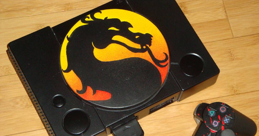
10 Lame: A Dragon Mess

The silver design on its own might almost work, though it would still make for a design that's too bare. This is where the metal Dragon Quest slime is supposed to come in I guess, acting as the focal point and visual "flair" of this Dragon Quest-themed console. But the appearance of this blobular creature dripping off the side of the console just looks funky - and not in a good way. It takes on the appearance of a machine that needs to be wiped down as a result of a cluster of dripping paint or something. Not my cup of custom console tea...