When thinking of the beloved films of your childhood, you may think of Disney first. But little do you know, there are several of your favorite childhood films that are actually a DreamWorks Animation production. The most notable would most likely be Shrek and its subsequent sequels, of course. But there are plenty more from back in the day, and even now, that you love and appreciate just as much as any other animated film you have watched repeatedly.
Aside from Shrek, you probably remember watching movies like Antz, The Road to El Dorado, and Sinbad: The Legend Of The Seven Seas when you were growing up. Even now, maybe you have younger siblings or children of your own that watch the latest releases from the highly acclaimed DreamWorks company like Trolls, the How To Train Your Dragon films, and The Croods.
But when any film is being made, artists have to come in for the company and present concept art for the movie of either characters or specific scenes so they can plan out the look and feel of the scenes and characters. This is even more important to animated films.
Unfortunately, though, not all concept art is used or accepted for the final result of the film or films. A lot of it is truly incredible, too, and makes you think that it may have even been better than the end results of some major productions. Luckily, many artists have shared their unused concept art for the world to see - including us. So here are the 30 Unused DreamWorks Concept Art Pictures That Would've Changed Everything.
30 Donkey’s New Hair ‘Do

Art by: Leighton Hickman
Donkey was hands down the most hilarious and charming part of the entire Shrek franchise. Especially in the first film. But he almost looked a lot different due to one hairstyle change in this concept art.
Yes, Donkey does indeed have hair.
It may not have changed the whole plot of the film, but it would have made Donkey look remarkably different and possibly less adorable as he did in the film. Luckily, they did change it in the end and instead we have the adorable donkey we know and love still to this day.
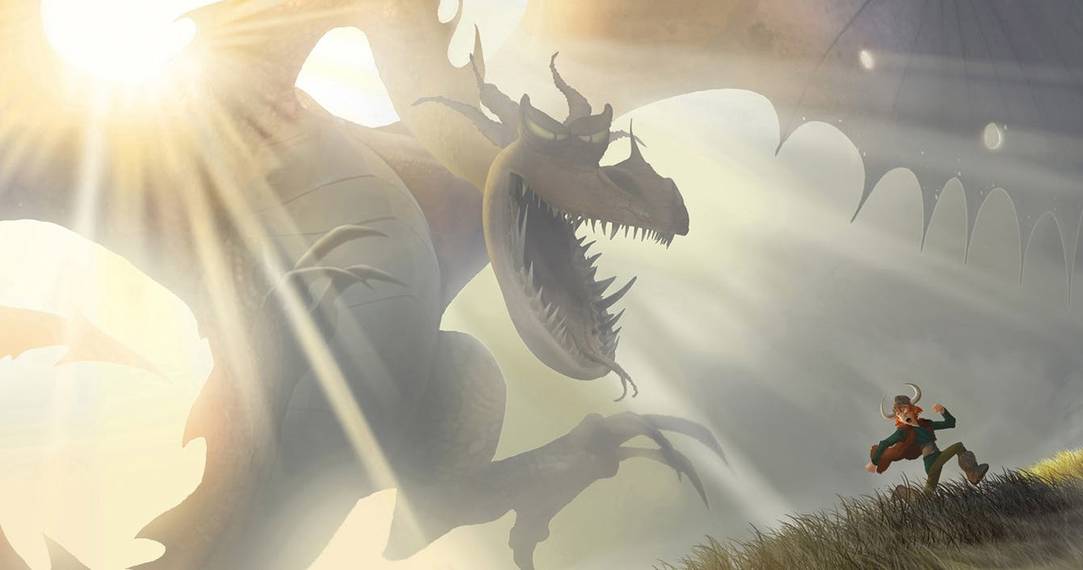
29 An Intense Dragon For A Kid’s Film

How To Train Your Dragon is a wonderful children's fantasy film based on the book of the same name. It's a story detailing the life of a young Viking who is expected to end the life of a dragon since they are at war with the Vikings and it is what would make him a "true Viking". But instead, he befriends them.
It is a wonderful story that turned into a franchise, but it almost was a lot more intense than a kid's movie should ever be thanks to this early concept art of a dragon.
Lucky for us, they went a different route.
28 A Much Different Shrek

Art by: Barry E. Jackson
Before Mike Myers took on the iconic role of Shrek, Chris Farley was attached to the role. Unfortunately, he passed away, and they had to move in a different direction.
But this was the original concept art design for the version of the ogre Chris Farley would be voicing. It's understandable that they decided to change the concept art for the character after his passing and make it more suitable for Mike Myer's version.
It is still incredibly interesting to see what could have been as opposed to what we saw in the film.
27 More Likable Bees

While DreamWorks may have plenty of hit films in their roster, some of their movies have not done nearly as well at the box office. One of those films is Bee Movie.
Part of the reason for the movie flopping most likely had to do with the fact that it was hard to wrap your head around a bee falling in love with a woman and vice versa.
But maybe if this early concept art had made it to the big screen instead of the bees we saw in the film, it would have made it a little more appealing to the masses.
26 The Menacing Dragon

How To Train Your Dragon has many memorable scenes featuring the CGI animation of the epic dragons and the Vikings.
In this version we see an incredibly large dragon chasing after a Viking.
It is undoubtedly an amazing draft of the dragon in the film and makes you feel like you are in their world. But they would have come across in a different more scary light if they had stayed this large. But it still makes for a fantastic conceptual art design.
25 A Sinister Villain In Rise Of The Guardians

Art by: Simon Rodgers
In Rise of the Guardians, there was a truly creepy villain by the name of Pitch Black. The Immortal Guardians had to go up against him to protect the innocence of children.
He had a power to transport through darkness using magic, but in this early concept art of that taking place, it is much more brutal and evil than most children would be able to handle.
There are actual faces within his "body" that are created when using this ability that would cause nightmares in any youngster.
24 Sinbad’s Evil Villain

Art by: Seth Engstrom
Sinbad: Legend Of The Seven Seas tells the tale of Sinbad, the pirate who is traveling the seas to attempt to save his friend from Eris, the Ancient Greek Goddess of "discord and chaos."
In the film, Eris was inhumanly beautiful, of course, but still looked as though she always had a nefarious scheme up her sleeve - which she definitely did.
But in this artist's version of the evil beauty, she is even more intense than we could we have ever imagined.
It would have been interesting to see them try to make this version of the villain work for a kid's film.
23 The Kung Fu Team In Action

As we all know, before we saw the final version of any film, there are most likely several different designs created for the characters before it is decided on one.
And the same evidently goes for the Kung Fu Panda team and their band of misfits. Each of the characters looks significantly different than what was presented to us on screen, but Po probably looks the most like the final version of his character, even if there are still some differences.
It is interesting to think what the character's stories would have been like with these design changes.
22 When Rabbits Attack

Sometimes artists shoot for the stars and yet, they still completely miss the mark. This is one prime example of that.
While there were several animals in The Croods that were very oversized than what the animals would be like today, this creative licensing is taking it a bit too far with the giant, menacing rabbit.
That is most likely why they decided against it, in the end, but it still would have been equal parts scary and hilarious to see this on screen.
21 Bees Having Pets

In quite the remarkable turn of events, a concept artist for the Bee Movie decided to envision what it would look like for one of the bee characters to have a pet of their own, in the form of a lesser bug.
This may have been a funny concept, but it wouldn't have necessarily meshed well with the theme of the whole oddball film - to not exploit the bees.
Regardless, the art is very well done and definitely hilarious to look at.
20 Po Is Shrunken Down

Kung Fu Panda was a smash hit at the box office and is well-loved among children. The main character, Po, who is the panda featured in the story, is this chubby and large character who is hilarious. This is also because he is unable to be as stealth as his other kung fu pals.
In this early concept art, though, the artist imagined Po as being a lot smaller and cuter than what we saw in the film.
He may be cute, but it would have taken away from the storyline as a whole.
19 The Smoldering Trulio

Art by: Didier Conrad
The Road to El Dorado may have not been as widely loved as other DreamWorks properties, but it still had fans, including myself, when it first came out back in the day.
Regardless, there was some thought that the animation lacked a unique quality and made the movie altogether forgettable.
In this concept art, though, Trulio is presented in a much more handsome and unique way than what we saw in El Dorado. Maybe it would have helped the movie, or maybe not, but either way it is a great piece of artwork.
18 Grug Crood Goes On An Adventure

Art by: Arthur Fong
The Croods told a tale about the very first prehistoric family that goes on their own road trip of sorts into a world they have never known before.
In this concept art, we see the patriarch of the family, Grug Crood, galavanting in the field of carnivorous flowers. But it looks a little more happy than a field of carnivorous flowers should, and is definitely a lot less daunting than what we saw in the finished film.
It is a gorgeous scene playing out, but wouldn't work for what the film was going for.
17 Unfortunate Looking Trolls

Art by: Avner Geller
The Trolls film was a breakout hit when it entered theaters in 2016. Aside from the wonderful story, it helped that the Trolls that we remember seeing toys of in the 80's and 90's were made to be so unbelievably cute that we almost couldn't stand it.
But in this earlier concept draft of the aforementioned trolls, they looked far less adorable and cuddly than what we saw.
We are definitely glad they decided to go down a different path, which in the end, probably helped make the movie the smash hit that it was.
16 An Even Creepier Rumpelstiltskin

Rumpelstiltskin looked evil enough when he took on the villainous role in Shrek Forever After. But he almost looked far creepier than the animated version we got in the fourth installment of the Shrek franchise.
In this artist's vision and interpretation of the character, Rumpel looks almost like he has rat-like features with a tail to boot. It gives his persona an entirely different vibe than the straight-up villainous persona we saw in the film.
Whether it would have made the character better or worse as a villain, we're not sure, but he sure does look off-putting.
15 A Different Turn Of Events For Boss Baby

Art by: Stevie Lewis
Not many people would think of a hilarious storyline of a baby who is also a businessman/boss and the way his actions ensues chaos.
But the clever minds at DreamWorks did just that and made it into quite the witty and comical film. But there was almost a change in the storyline that would have been really interesting. The boss baby had his own home, which was placed out in the yard, where we could only assume it had a modernist feel to it where he would carry out his boss duties.
If only we could have seen that play out on screen.
14 Oh’s New Appearance

Art by: Griselda Satrawinata-Lemay
DreamWorks Animation created a real gem of a movie when they debuted their feature film, Home, in 2015. It is considered a "buddy sci-fi" film that focuses on Oh, the purple alien that is on the run and befriends a young girl on his quest.
In this early concept art of the character, he is gray instead of his signature purple skin tone.
It would have felt off if he was a different color, especially since the purple in his skin tone made him look more fun, friendly, and appealing to young kids who watched the movie.
13 Viper’s Earlier Look

Art by: Nico Marlet
Early concept art for Viper from Kung Fu Panda is a master of the viper style of kung fu. She is far less villainous and menacing than the stereotype that most snakes are known for. But in this earlier concept art for the character, she doesn't look as sweet and charming as we know her to be.
It is still a very unique and cool look for the popular character, but it maybe wouldn't mesh well with what her personality is supposed to be in the franchise.
12 A Vast Array Of Bees

Art by: Steve Huang
Before Bee Movie was officially made for the screen, there was plenty of concept art done not only for the main characters but characters that never even made it to the big screen in the first place.
Here we have several characters we wish could have made it in the final cut of the film, like Santa Bee and Mama Bee with her Baby Bees.
One of the more intense ones, though, has to be the Clown Bee. Regardless of that character being truly scary, the other characters would have made the movie even more fun to watch.
11 A Bald Drago

Art by: Nico Marlet
The primary antagonist of How To Train Your Dragon was the ruthless man who had twisted intentions with his army of a combination of dragons and humans.
He is known as the intense presence, but maybe he wouldn't have been so intimidating if he had the original look this concept artist created for him.
His huge, unruly hair is gone and now he is bald in this iteration. He still looks rather mean, but just not quite as intense was we know him to be.