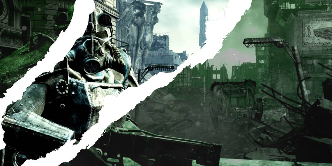
Green, green, green, as far as the eye can see. Green might be the colour that most reminds people of trees, fields of grass, and fresh, nourishing vegetables, but in the Fallout universe it's the colour of rot and decay. A lot of players and critics found the green filter over everything in Fallout 3 to be a bit sickly, and it turns out the devs may have gotten sick of it too after the hours they spent debating exactly which shade of green was right for the game.
In a video released to celebrate the 25th anniversary of the Fallout series (spotted by GamesRadar), several developers, including director Todd Howard, reminisce about the time they spent getting the specific shade of Pip-Boy green exactly right.
"Fallout has more colour disputes," says Howard. "We will debate the blue of the Vault suit but nothing tops the green." There's a silent horror that permeates his gaze, like a soldier remembering combat.
I remember Istvan and Todd having endless conversations about the colour green," Craig Lafferty, director of mobile games at Bethesda said. "Green is very important to Fallout," responds Istvan Pely, art director.

The Pip-Boy is the main UI for the entire game. As Fallout 3 is an RPG, you spend a lot of time in menus, so it's important they look how they're supposed to. "I would say it's electric green," said Howard. "We would go through endless shades of green and debates of green."
Pely rightly says the colour is reminiscent of the old-school phosphorus green computer displays. Since in the Fallout universe the transistor was never invented, technology remained in a sort of retrofuturistic '50s state.

Howard said, "Istvan would change [the green] in the middle of development," and even though the change was so subtle, it would have to be looked at again and again. "The amount of times we redid the colour green I lost count of," said Lafferty, the light dimming behind his glassy thousand-yard stare.
Perhaps controversially, I've always liked the shade of Fallout 3 green. It ties the whole game together and creates a clear visual identity. I can tell a Fallout 3 screenshot at a quick glance because that green is more burned into my eyes than the first rays of sun in the Lone Wanderer's.

A dingy green being the colour of an endless nuclear winter makes perfect sense. Radiation is green, duh, so of course, the world would be too. Distinct art direction often means a game won't appeal to everyone, but I'd much rather have more games that committed to an aesthetic than have them all be bland. The Matrix is green, Mad Max is orange, Moonlight is blue. The colours convey a tone that permeates every frame of the experience.
I'm glad the developers spent hours debating the green, because they landed on the perfect shade. Plus, you can adjust the colour of your UI so quit your whining.