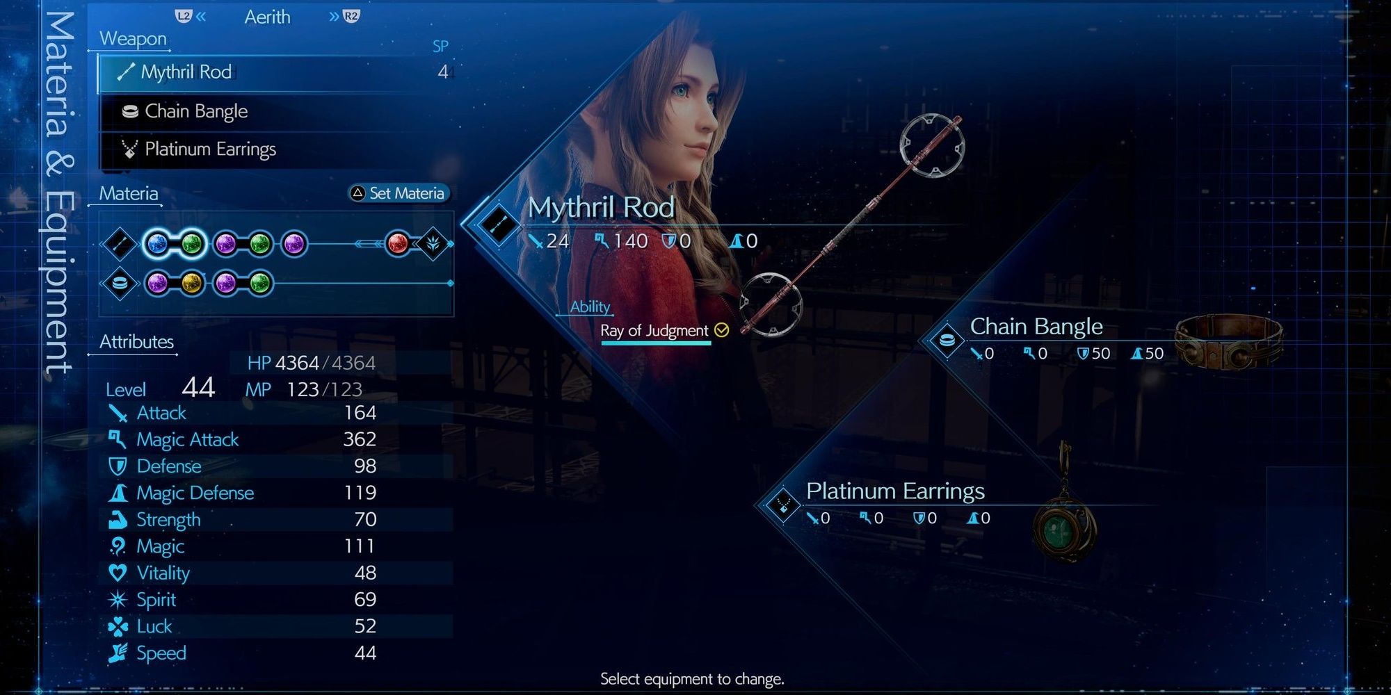
To celebrate the end of 2022, we just got a look at a bunch of future Final Fantasy 14 features. But amid bigger changes and new additions, it's the little things that can make the biggest impression. This is exactly what we're seeing with this new UI setting, inspired by Final Fantasy 7 Remake. As shown off in today's Final Fantasy 14 producer livestream, we got a look at the new "Clear Blue" UI setting. As the name suggests, it makes all of the boxes transparent and blue, very much reminiscent of the UI in Final Fantasy 7 Remake. This is likely to appeal to fans who got into the series with the recent smash hit remake, making it easier for them to see what all of the fuss is about over on the MMO. In the replies, players are already very pleased with this addition to the update. Many feel that it's more in line with the Final Fantasy aesthetic, and just looks easier to navigate and read in general.
The importance of good UI definitely shouldn't be lost on Square Enix after its recent text-based drama. Back when Final Fantasy 1-6 Pixel Remasters launched, fans were furious with the choice of font in all of the games' UI. Admittedly, it was a pain to read, as the text was all scrunched together and too thin to really stand out from the background.
This proved so controversial in fact that, when the console ports were revealed, many were disappointed to still see the old font in the store page screenshots. These have since been removed, however, with sources suggesting that it will be possible to alter the text in these updated versions of the games. So it definitely seems like the studio is aware of how passionate fans can be about this matter.

