When you mention the GameCube's hardware or graphics, many Nintendo fans hearken back to Space World, a now-defunct E3-like event that featured Nintendo-exclusive showings. Hype of "Project Dolphin," as it was called, reached astronomical levels when the company showcased a tech demo featuring flashy looking Link and Ganondorf character models sparring. The next generation had officially arrived. Gone were the days of N64-style jaggies, restrictive cartridges, and muddled resolutions.
The results fell a bit shy from where many of our imaginations carried us at the time. The games certainly looked a step above 32 and 64 bit and their gross, blocky polygons. The hardware packed into the small lunch box design, courtesy of the cutting edge ATI "Flipper" graphics card, did display some impressive visuals for the time. Not only had the jaggies been smoothed out, but the draw distances expanded, and textures became crisper and more detailed. The console boasted some of the best graphics for their time, only slightly edged out by the Xbox.
Still, in much the same way we look back on, say, Tomb Raider and Goldeneye, some of these GameCube games don't look quite as epic as we remember. Some still seem to bear the hallmarks of N64 crudeness. And yet, a number of titles have been given new graphical life and vibrancy, thanks to the uprezzing of emulators like Dolphin. Certain games opted for a more stylistic, cell-shaded approach too, which has helped them withstand the test of time aesthetically.
Thus, the GameCube has turned into sort of a mixed bag when it comes to its visuals. With that in mind, let's dive into some of the most notable examples of the most visually poor GameCube games, and some that still look gorgeous today.
30 Still Looks Amazing: The Legend Of Zelda: Twilight Princess

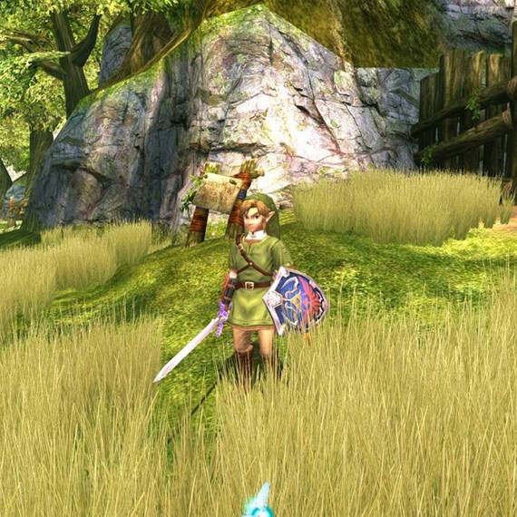
While Zelda: Breath of the Wild is all the rage these days, at the time, it was Twilight Princess that was catching all the buzz. The E3 2004 reveal might be remembered as one of the most raucous reactions from the Nintendo faithful as Link's new epic adventure flashed on screen.
This marked the first realistic, mature-looking Zelda title since Majora's Mask.
Considering how nice this game still looks, especially in HD, one can imagine the hype levels generated from seeing this for the first time. It sported massive colorful 3D environments, slick character models, and impressive lighting effects. Visually, it even held its own against the Wii's library, despite being a direct port.
29 Bad: Animal Crossing

This may be a bit unfair to Animal Crossing for a couple of reasons - it began as an N64 title, and it wasn't particularly meant to look visually stunning. Rather, it was given a cartoony, almost toy box aesthetic, no doubt as a means to draw in a mass audience. Still, at the end of the day, this needs to be judged as a game released in 2002. Through this lens, it doesn't hold up too well with its flat and blocky graphics. If anything, the game resembles something closer to an early PlayStation 1 title.
28 Still Looks Amazing: F-Zero GX

Boot up a modern day futuristic racer, and run F-Zero GX right beside it, and you'd be hard-pressed to notice much of a difference graphically. This is especially true in HD, which suits this game particularly well. Everything looks so slick and crisp throughout; the backgrounds are gorgeous, and the particle effects emitted from the ships and elsewhere are impressive.
The game also runs at a smooth, steady frame rate despite zipping through the tracks at lightning speed. If you're looking for a GameCube title that holds up in the modern era visually, this is it.
27 Bad: Final Fantasy: Crystal Chronicles

Nintendo fans lacking the Sony line of consoles, like myself, were excited following the announcement that Squaresoft would resume making Nintendo games after a several year hiatus. We imagined some awesome RPGs featuring stunning graphics and epic cutscenes.
If the 32 bit PlayStation could pull them off, surely the more powerful GameCube could, right?
Well, not exactly... The game didn't feature those slick pre-rendered cutscenes we were hoping for, and the in-game visuals were pretty bland. The character models were crude and everything seemed to take on a muddled and foggy appearance, wrought with greys and browns.
26 Still Looks Amazing: Resident Evil (Remake)

When Nintendo fans found out that the Resident Evil series was going to be a major franchise for the GameCube, we were ecstatic. Not only this, but the original classic was going to be remade with a shiny new coat of graphical paint and gameplay enhancements.
The only thing more off than these graphics were those awful Crimson Head zombies...
Not only was the gameplay refined, but it truly made the PlayStation original look archaic by comparison visually. It boasted gorgeous pre-rendered backgrounds, realistic lighting, spruced up character models, and all new flashy cutscenes with improved voice acting.
25 Bad: Sonic Adventure 2: Battle

Much like with Animal Crossing, this game was designed around inferior hardware; in this case, the Dreamcast. So it's a bit of a cheap shot to knock this decent 3D Sonic platformer for its visuals.
For a game that was released in 2002, it sure tends to resemble a mid-90s platformer. Super Mario 64, anyone?
Still, aside from its appreciation of vibrant and colorful environments, the game does take on a blocky and choppy feel. This particularly stands out when it comes to Sonic games, as the players expect a slick and fluid experience to complement the speedy pacing throughout.
24 Still Looks Amazing: Super Mario Sunshine

Although Super Mario Sunshine isn't exactly the cream of the crop when it comes to Mario games, it certainly stands out from a visual standpoint. The colorful, vibrant tropical environments set the stage for some pretty landscapes that are easy to become enriched in.
If Super Mario 64 was the breakthrough for Mario in the 3D realm, Super Mario Sunshine polished and refined the aesthetics, cleaning up the jaggies and sprucing up the basic, bland textures. After all, "cleaner's better than dirty, and dirty's meaner than clean!"
23 Bad: NFL 2k3

In the early 2000s, football games had already come a long way from the 16-bit sprites that resided in the early 90s era of Madden and other football sims. Yet, this era stands as sort of a strange "in-between" phase for these realistic type games.
You might equate this to the awkward young teenage phase for sports sims.
They didn't hold the nostalgic, stylistic charm of 8 or 16-bit sprites, yet the 3D graphics were still basic and rough around the edges. This made for aesthetically awkward sports games that didn't approach a level of immersion or realism seen today. NFL 2k3 is a prime example of this, with its stiff, blocky character models, and flat fields that resemble a Foosball table more than grass football fields.
22 Still Looks Amazing: Star Wars Rogue Squadron II: Rogue Leader

As game graphics and console horsepower were revving up at the dawn of the 2000s, one franchise many wanted to see in glorious glitzy next-gen form was Star Wars. Well, Factor 5 and Lucas Arts delivered in a big way, with their stellar effort for the GameCube, Star Wars Rogue Squadron II: Rogue Leader.
The force will be with this game, always...
It was one of the prettiest Star Wars games of its era, with its cool explosion effects, as well as its detailed models and textures. It also made for an immersive, and all around solid flight shooter that was a blast to play.
21 Bad: P.N.03

In the early 2000s, there were meant to be 5 epic exclusives by Capcom to be released on the GameCube. This game stands as one of only 4 of the "Capcom 5" titles for the console to even be released. It's a shame then that it turned out so underwhelming, in terms of its graphics and gameplay.
Another title that looked like it held potential, Dead Phoenix, was canceled.
Potential eye candy from the game's protagonist Vanessa aside, P.N.03 is pretty dull and boring to look at. The majority of the game takes place inside a monochromatic sci-fi facility that's filled with an abundance of greys and whites. Everything comes off as blocky, bland, and lifeless.
20 Still Looks Amazing: Star Fox Adventures

This would be Rareware's last effort on a Nintendo home console, and they sure went out with a bang; at least on the graphics front. The gameplay, which diverges from your typical Star Fox space shooter elements, focus on 3D platforming with a heavy emphasis on fetch quests. While this has brought a mixed reception, most can agree that the aesthetics are second to none. The game displays some massive colorful and imaginative environments, and the animation and textures on Fox's fur are quite impressive for an early 2000s game.
19 Bad: Battalion Wars

Battalion Wars, the sequel/spinoff to the GBA breakout strategy hit, Advance Wars, seemed to be just about everything that game was not. Where Advance Wars offered addictive and interesting gameplay, Battalion Wars felt more "meh," and resorted to more typical shooter elements.
While Advance Wars was charmingly stylistic with its colorful 2D sprites, this game displayed some bland, formulaic 3D graphics with a dull color scheme. Unlike Advance Wars, these unappealing visuals haven't aged too well.
18 Still Looks Amazing: Pikmin

When Miyamoto announced this odd gardening game, which he explained was inspired by his own gardening activities, Nintendo fans didn't quite know what to expect. Though most were pleasantly surprised by both the addictive RTS puzzle gameplay, as well as the beautiful visuals.
Pikmin was able to generate dozens of tiny 3D AI models at once, which hadn't been seen very much on a Nintendo console. But moreover, the environments and character models had a slick and polished look that draws you into these strange alien worlds and doesn't let go.
17 Bad: James Bond 007: Agent Under Fire

For whatever reason, 1st person shooters on old consoles never quite seem to age well aesthetically. Just ask Goldeneye, along with another, slightly more modern Bond game, James Bond 007: Agent Under Fire. As the game focuses on immersion in the 1st person view, the jaggies and rough frame rate particularly stand out here.
At least Goldeneye's gameplay was memorable enough to forgive the mediocre 3D graphics.
It also doesn't help that the color palette is quite limited and dull. A game doesn't have to be colorful for it to shine graphically, but games like P.N.03 and Agent Under Fire prove that it can certainly hurt their causes if the color scheme is limited.
16 Still Looks Amazing: Metroid Prime

Fans of the classic Metroid series were unsure what to expect when Texas newcomers, Retro Studios, was given the daunting task of creating the next game starring our favorite bounty hunter, Samus.
The game was dubbed a "first-person adventure," a departure from the sidescrolling shooter gameplay.
As it turns out, Retro created not only a unique and memorable Metroid game, but a gorgeous one to boot. These wondrous environments and dazzling effects immerse you into the world of Tallon IV and still hold up today.
15 Bad: Universal Studios Theme Park Adventure

This isn't just one of the worst, most broken GameCube games to play, but it's also one of the ugliest. Even by the meeker standards of 2001, it wasn't up to snuff, especially compared to the likes of, say, Luigi's Mansion, which launched around the same time.
This is a polygonal mess that actually makes some N64 titles look slick.
As if the gameplay itself - which often involves collecting trash - wasn't off-putting enough, the graphics are somehow even worse. Between the frame rate issues, awkward fixed camera angles, and flat backgrounds that look like they were made in Photoshop, this was quite the universal eyesore.
14 Still Looks Amazing: Resident Evil 4

For as pretty as the Resident Evil remake was, Capcom outdid themselves with their new sequel to the survival horror hit, with Resident Evil 4. This time, the game was totally built from the ground up, and it shows. Everything just looks slick, smooth, and detailed, from the textures, to the character models, to the eerie environments.
They also managed to provide a level of gritty realism that engrossed you into the heart-pounding gameplay. The zombies (or specifically the "Los Illuminados") are creepily realistic in both appearance and behavior. All of this made the experience all the more thrilling.
13 Bad: Fire Emblem: Path Of Radiance

It's true, real-time strategy games aren't typically known for their graphical prowess. As they often rely on top-down perspectives or far range isometric views to capture all the action, conveying information is more key than visual glitz. Still, Fire Emblem: Path of Radiance is particularly underwhelming, especially considering the game was released later in the console's life. The game fuses rather lifeless cell-shaded cutscenes with some blocky and flat environments, and it all sports a pretty muddled look.
12 Still Looks Amazing: Viewtiful Joe

Cell-shaded graphics can be a hit-or-miss stylistic direction to go in. They can come across as flat, childish, or limiting on the one hand. Yet in the case of certain titles, like this quirky 2D beat 'em up from Capcom, this technique can really enhance it visually and artistically.
The sharp, detailed images and neat special effects like motion blur really emanate a unique action hero comic vibe and keeps things interesting throughout. This helps elevate this otherwise pretty standard action game to another level.
11 Bad: Timesplitters 2

Don't get me wrong - I'm quite partial to this "not Goldeneye" spiritual successor from some of the ex-Rareware refugees at Free Radical Design. But just like their prior project, Goldeneye, Timesplitters 2 just looks ugly in hindsight. Obviously, you're not going to get close to photo-realism in the early 2000s, but this 1st person shooter looks so crude that it almost puts a damper on the amusing gameplay. The jaggies seem to be at a near N64 or even Playstation level at times, and everything, particularly the indoor environments look hollow, flat, and uninteresting.