UI is a pretty integral part of any game. You wouldn't really be able to do anything without it. UI can pretty commonly be conflated with HUD (Heads-Up Display), but the HUD is simply what's displayed to you while playing, so all your necessary information is available at a glance. UI is in every element you interact with, from menus to button prompts.
This aspect of game design is pretty essential. For most people, the HUD is where most of the style will go since it's what players will see most, leaving their menus pretty threadbare. But some games go the extra mile, tying every part of their game's design into the UI as well for one wholly consistent experience.
Updated on January 24, 2023, by Hilton Webster: With the new release of the Dead Space remake, the discussion of unique UIs has been revitalized. To ensure that you don't miss out on the best examples of stylish UI systems in games, we've updated the list to include the classic horror title, along with a few more noteworthy mentions.
13 Dead Space

For many games, UI is its lifeblood. Well, all games actually. Mainly, however, they rely on setting it to the sides of the screen or giving you dedicated menus layered over the game. Dead Space is a game that thrives on environmental storytelling, though, so it's only fair its UI does the same.
Almost every aspect of Dead Space's UI is shown from an in-lore perspective and projected from something. Your health bar is built along Isaac's back, guns have their ammunition displayed along the side, and even the map is portrayed in 3D in front of you. It's all part of the immersion and serves the intent perfectly.
12 Deus Ex: Human Revolution

Despite beginning back in 2000 with the original Deus Ex, the series hit mainstream attention with Human Revolution in 2011. Set in a near-future Cyberpunk setting, Human Revolution has you take control of Adam Jensen, as famed for his game as his infamous "I never asked for this" line. It's a classic.
However, due to all of his cybernetics, most of the UI you see is actually as Jensen sees the world. The way objects are highlighted, or how pheromone readings come up in conversation, is part of his view, for example. Then there are aspects like the in-game computers or how his body is highlighted in the upgrades screen. Everything forms this cohesive whole of sharp technology in a city struggling to keep up.
11 Papers, Please

Papers, Please is a fun game. It feels odd to say that, considering so much of the game is incredibly stressful and involves threatening people's livelihoods, but there's a form of fun in that. Much of it probably comes from the game's presentation.
While the art style feels heavily inspired by old propaganda posters, the UI itself is so striking. Everything is very clean and minimal, which actually serves you great when items start piling up. Suddenly, all your various tools and how everything is layered feels expertly put together in a way that's both clear and distinctive despite so much of its presence being contextual.
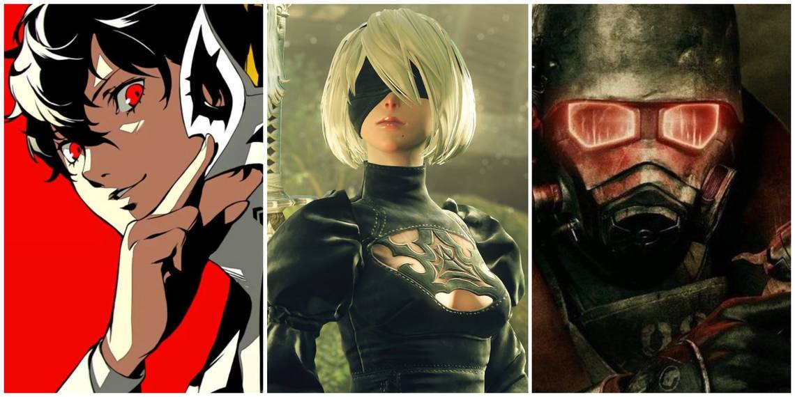
10 Persona 5

Right, let's get the obvious one out of the way. Persona 5 is stylish, for as tired as you must be of hearing it. The character designs, the unorthodox layout of the UI, jagged edges, and moving boxes. The way elements fold around the characters in combat and every action ties in with some good audio cues.
Persona 5 refuses to let you escape its presence. You're assaulted by its color at all times, its urge to make you feel energized. Every shop has a unique UI to represent the person you're buying from. The use of color makes certain elements stand out across all backgrounds. It's a masterful design, really.
9 Fallout

Fallout, as a series, has always had a defined aesthetic. That grimy, rusted feel. Something very obviously old but also preserved eternally. This feeling of being in a time both incredibly unusual and immensely familiar at the same time. This is shown in the UI elements, too, styled as some blend of new and old computer parts.
If anything, Bethesda only styled the UI differently, as the whole intent and strong design had existed since the beginning. But a major shift in Bethesda's Fallout was the use of the Pip-Boy. You navigated everything in-game through it, twisting knobs and little technical glitches. But even the pause menus have that soft styling to them, like a computer screen.
8 Kingdom Hearts

Kingdom Hearts is something quite odd, being the blend of Final Fantasy and Disney that it is. But while many Final Fantasy games have relatively simple UI's that are clean and easy to read, Kingdom Hearts chose to go somewhere else with that, making a UI styled quite unlike most things before and since.
Core to this idea are the character portraits that change as you take damage and the thick health bar that curves around your character portrait. The Gummi Phone is navigated like a phone app. The command menu styles itself after every world. Even the pause menu has all the characters walking toward you with their stats displayed around them. There's a strong, heavy presentation to every element.
7 NieR Automata

Nier Automata is famed for many things - its distinct style of storytelling, its melancholic world, its wonderful music, and so much more. All of this is communicated through a rather colorless UI. But that was actually the entire intent, something that stood out in ways other than color.
The UI is clean and precise. Even though it's styled as if you're watching it through a screen, it very rarely glitches - UI elements slide on screen smoothly, and information is presented through size rather than color. Or how your plug-in chips are designed to look like computer memory sticks. A lot of effort went into getting that design just right, too.
6 Metroid Prime

A lot of the perspective of first-person is designed around immersion, like you're seeing through the eyes of the character you're playing. You need to feel like you are them, rather than just some camera attached to them. Plenty of games have found ways to implement this feeling, but one of the finest is Metroid Prime.
Metroid Prime's HUD is all in-lore, oppressively displayed in front of your face through Samus' helmet. The UI elements shift with you, dragging shortly afterward. But all the menus are rendered with this same aesthetic, making it feel like everything is truly being seen through Samus' eyes, and that of her restrictive suit.
5 Death Stranding

Hideo Kojima has something of a reputation for making things that are weird - using surrealism to tell serious stories can be obscure, but deeply effective. In actual gameplay, the UI in his games also function to tie into the greater feel of the whole experience.
Death Stranding is a great example of this. Though a third-person game, navigation is central. As such, you have to constantly use your map, displayed through your cuff link as a 3D visualization you can tilt. But all conversations appear from the cuff-link too. Your blood and stamina wrap around you, so they're always close. All are displayed in a mechanical-digital style to represent the in-game systems you interact with.
4 Resident Evil 6

Resident Evil games are quite interesting when it comes to UI. The older games were relatively simple, relying more on visual cues than an intensive UI to inform you. Resident Evil 4 decided to go heavier, styling your inventory through the attaché case and your health and ammo in a simultaneous wheel that looks like a digital watch.
Resident Evil 6 went somewhere else. Every campaign has something of a unique UI. Sure, most menus retained a relatively identical design for consistency, but then all in-game UI elements were unique to the characters' COMs device. Some characters had radial menus, others had cross-bars. Ada had a cube phone that displayed things in a 3D grid. Not always the most functional, but always stylish.
3 The Elder Scrolls 4: Oblivion

Though Skyrim may be famed for a great many things, its clean and minimalist UI being one of them, it's a stark departure from the style employed in Oblivion. Rather than vying for as few UI elements as possible, Oblivion instead chose to have a singular aesthetic across it all, in the form of almost a medieval manuscript.
Rather than the 3D map of Skyrim, Oblivion has an almost cloth-looking map. But all in-game menus look like various pages from one big book, great and aged. The yellowed edges give a feel of antiquity. The journal has the marking of medieval calligraphy, like a personally held item. No piece of UI feels inconsistent, and it all feels like it fits in the world as well.
2 Devil May Cry 5

The Devil May Cry series has quite the history. Being the birth of combo action games, it's had quite the change in how its core gameplay evolved along with its history to be the celebrated thing it is today. But one element that's been inconsistent is UI. Devil May Cry had intense, gaudy menus to bring you into the gothic aesthetic, while DMC4 had every character with a unique HUD to display their gameplay properties.
DMC5 has perhaps the best. It's less intensive than previous entries but utilizes this cleaner UI to style what remains more heavily. In the upper left corner with your health and Devil Trigger is cracked glass, reflecting the world around you. For Nero, you can see the revved engines of Red Queen. And the way the style meter grows and reverberates with the music is an unbeatable feeling.
1 Dishonored 2

Arkane studios are a wondrous group of developers, creating worlds with an incredible feeling of immersion with gameplay that constantly encourages experimentation. But its games also always have a strong visual identity, from Prey's sci-fi blending of the '60s to Deathloop's jazzy parties and pseudo-futuristic mechanical designs.
But Dishonored 2 takes an already stellar world from the original and takes it further. Your health and mana are curved smoothly around your ability portrait. Almost every menu can be tilted around, the words shifting with it. Every option on the UI uses a different font, as if handwritten. Everything you interact with is highlighted and actions are displayed neatly. It's cleanly displayed, but with its visuals central to making them pop.