One of Magic the Gathering's most enduring and popular elements is its art. Every card has a lovingly-created illustration, effortlessly expressing its world and story, with some becoming so popular that original copies of Magic art can sell for tens of thousands at auction. Many of Magic's best-known names are its artists, like Seb McKinnon, Kev Walker, and Rebecca Guay.
One of the most significant artistic overhauls to Magic in recent years was the introduction of ‘Booster Fun’ in 2019. Starting with Throne of Eldraine, more booster packs would have some kind of alternate art treatment, like a Showcase Frame or extended art that creeps into the border. It's proven popular since then, with the Showcase style becoming a major selling point of each new set. But at the same time, it does show a marked contrast between how Magic managed its art in the early days of the game and how it does it now. Why does everything weird and different seem to be a selling point these days?
In the past 10 to 15 years, Magic has seen its artistic direction become more and more specific. Since around 2010's New Phyrexia, Magic's style has shifted from a highly varied array of fantasy-inspired pieces to high-res, highly rendered digital (or digital-looking) art.

Don't get me wrong, the artists' work on these sets is incredible, often bursting with character and colour and storytelling in a way very few other games can pull off. But if you take a recent set like Innistrad: Crimson Vow and compare it to an older set like Alpha, Homelands, or Mercadian Masques, there is a definite solidifying of an aesthetic that feels almost restrictive.
Older Magic was willing to lean more heavily into its fantasy influences. Just looking at the first set, Alpha, you had art that could fit into today's sets, like Bog Wraith, Will-O-The-Wisp, or Tranquility. You'd also see more cartoony or comic-inspired art, like Demonic Attorney, Counterspell, Ancestral Recall, Northern Paladin, and Howl From Beyond. Then you'd get the really weird art that has continued to be some of the game's most iconic, like Pestilence, Terror, Chaos Orb, and Stasis.

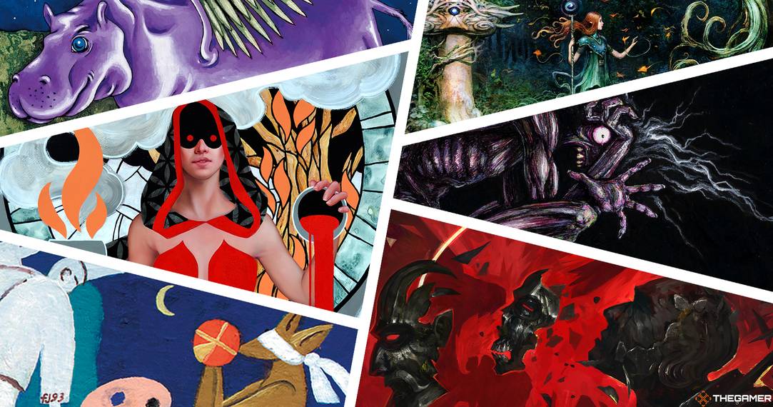
Then look at Crimson Vow, one of the most artistically diverse sets of the last few years. All of its art is amazing, but it does skew towards that detailed, highly-rendered style that's dominated the last few years. There was some experimentation thanks to artists like Dominik Mayer (Curse of Hospitality, Abrade, Nature's Embrace, Thirst for Discovery) and Sam Guay (Demonic Bargain, Change of Fortune), but their cards were notable breaks for the norm.
What's sad is that it isn't that Magic isn't doing varied and experimental art on its cards, it's just not putting those cards front and centre. Going back to Dominik Mayer, his first contributions to Magic were in Zendikar Rising's Showcase frame and its associated Secret Lair. He then did work on Strixhaven's Mystical Archive (the set's replacement for Showcase frames) and its Secret Lair. He contributed some of the best art in 2021, but he didn't take a regular slot in a main set until the last release of the year, Crimson Vow.
Also in the Mystical Archive, Carly Mazur's Faithless Looting caused a lot of unnecessary controversy. With its flat colours combined with highly shaded photorealistic figure, it was some of the boldest, most radical art release for Magic in a decade. But its different look led to much vitriol and people arguing it "didn't look like a Magic card". The fact that this is even an argument in the first place shows Magic needs to diversify its aesthetic, and offloading new, bold, and challenging art like this to booster fun alternate art treatments doesn't help.

We could sit and list off loads of artists doing excellent work for the game right now – but the artists themselves aren't the problem. You can take any individual piece of Magic art and it would be stunning. While they have the difficult job of providing hundreds of pieces of art multiple times a year, I think the buck ultimately stops at Magic's art direction team.
The problem could be in one of two places. The first could be in the instructions it gives to the artists it commissions. This doesn't seem likely, as artists have released the exact briefing they were given on Twitter and they tend to be more about the subject and environment than the overall aesthetic.
On the other hand, it could be with which artists Wizards commissions. Wizards likes this style, so it commissions more artists who do this style. Even aspiring Magic artists seem to have picked up on this, with many on sites like ArtStation trying to emulate the highly rendered style in hopes of being 'seen'.

The solution to the latter is obvious: find a more varied pool of artists, and let them do work outside of your marketing-friendly products like booster fun and Secret Lair. Take the risk of less experienced artists, or those working in mediums usually not associated with Magic - remember when Kaldheim had Sagas that were photographs of wood carvings?. Give artists from outside of Europe and North America more chances to bring their art to the main sets, instead of making them selling points of Collector's Boosters and Secret Lairs.
Some of Magic's best artists are known because they bend against the house style: Seb McKinnon's British Impressionist-esque illustrations, Jesper Ejsing's softer, slightly more cartoony style, Sam Guay's bold line work and flat colours, Dominik Mayer's high contrast and geometric shapes, or Nils Hamm's darker, whimsical style. I'd much rather a set that has a few duds but tries to do something new with its art than one where all the amazing contributors blend into one, solidified block of capital-F Fantasy Art.