It's a well known fact that, in the majority of cases, Japanese box art is far superior to Western box art. This was especially true in the '90s and early-to-mid 2000s: a result of EU and US publishers thinking the 'weird', 'arty' cover art often favoured by Japanese developers wouldn't sell on this side of the pond. That's how we ended up with the famously terrible US cover for Ico. Seriously, Google it. But it wasn't just Japanese box art that was killer: the discs themselves were too. A whole world of incredible graphic design and typography was hidden in those plastic cases, some prime examples of which I've collected here.
Final Fantasy 9

Thanks to its immense size, and all those lavish pre-rendered cutscenes, the ninth mainline Final Fantasy came on 4 discs—each of which featured illustrations of the main characters by longtime series artist Yoshitaka Amano. The US release used close-up rendered portraits of the cast instead, which was nice enough, but nowhere near as classy. Props to whoever was behind the EU release: they used those lovely Amano drawings too.
Street Fighter Zero 3

Better known in the West as Street Fighter Alpha 3, this is one of many examples of a Japanese PlayStation disc using a tasteful two-colour palette. The featured character here is Rainbow Mika, or R. Mika, who was introduced in this game and has since become a staple of the regular Street Fighter roster. In the US release of the game, the disc featured little more than a faded image of Ryu with the logo slapped on top. How dull.
Rittai Ninja Katsugeki: Tenchu

This was the original Japanese release of what would eventually become Tenchu: Stealth Assassins in the West, and there are a lot of differences between the two versions. So many differences, in fact, that the Western version of the game was re-released in Japan as a follow-up to this one. This example of disc art is simple, but elegant and striking: just like a ninja, I suppose. The use of white and gold is particularly aesthetically pleasing.
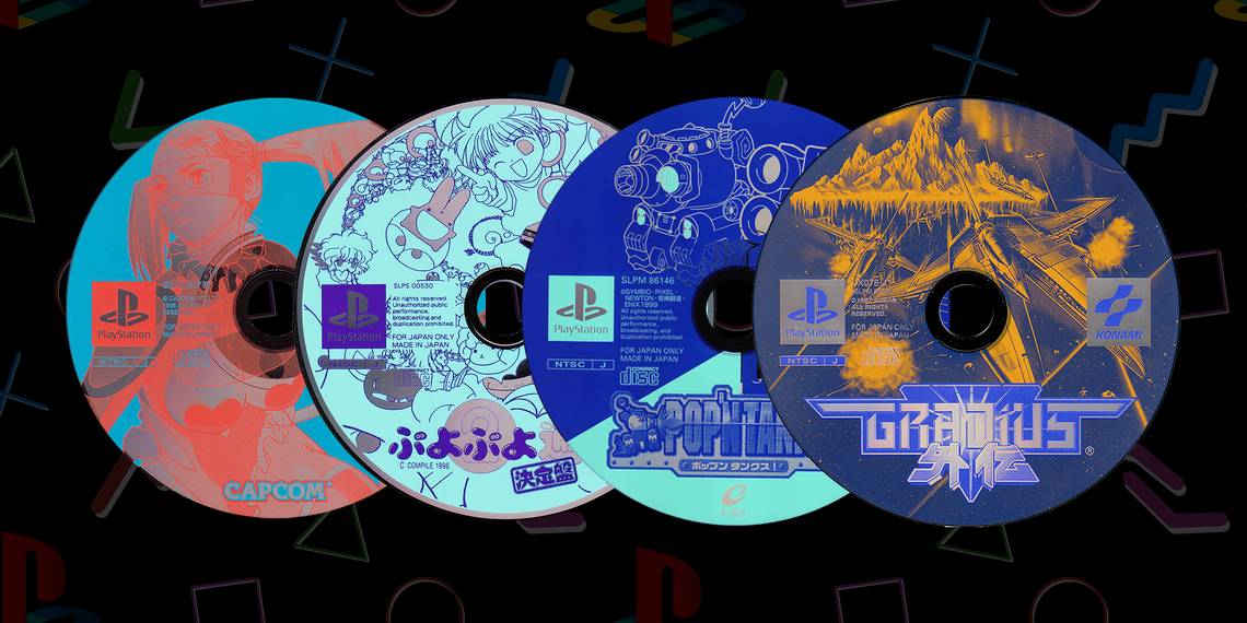
Puyo Puyo 2

When developer Compile made the first Puyo Puyo, it had no idea its cute puzzle game would become a smash hit. It responded to this sudden (and surprising) success by stepping up its game for the much anticipated sequel, the result of which is one of the best puzzle games of all time. This is another disc with a tasteful 2-colour palette, parts of which show the shiny surface of the disc below. It's even prettier than the game's actual box art.
Dino Crisis

After the success of Resident Evil, Capcom asked creator Shinji Mikami to come up with a new survival horror series. He came back with Dino Crisis, which is basically Resident Evil with dinosaurs—and way more guns. I love the inverted image of the raptor on this classy monochrome disc. It's more subtle than some of the other examples here, but nicely minimalist all the same. It certainly captures the game's dark, moody atmosphere.
Biohazard 2

Resident Evil 2, as it's known in the West of course, famously came on two discs: one for each of its main characters. Legend has it that this was an expensive mistake, and the developer could have fit the whole game onto one disc after all. But it ultimately paid off as a popular gimmick and made the game feel like better value for money. The bold, simple typography of each hero's name on their respective disc is really well done here.
iS – Internal section

This trippy shooter is one of the weirder, lesser known games in Square's extensive back catalogue of PS1 classics. A 'tube shooter' inspired by the likes of Tempest 2000, the visuals responded to 16 music tracks included on the disc—or your own music if you put any CD you owned in your PlayStation's disc tray. The stylish design on the disc here mirrors the twisting, psychedelic tunnels you fly through in the game.
Pop'n Tanks!

This shooter by Symbio Systems featured tiny, cute tanks blowing each other up on colourful battlefields. It was notable for its detailed customisation, letting you slot hundreds of parts together to create your own tiny tanks. You could even save your bespoke tanks to a memory card and use them to fight a buddy in multiplayer on their PlayStation. The blueprint-style tank diagram they used for the disc art here is nicely subtle.
Gradius Gaiden

Designed specifically for the PlayStation, Gaiden is widely considered to be one of the best games in the long-running Gradius shoot-'em-up series. It added the ability to fly multiple ships and used the console's hardware to implement flashy rotation and transparency effects. The disc art features a classy orange-on-blue mirror of the game's cover art, set above an impactful logo. Orange and blue always work well together.
Policenauts

Before becoming the games industry equivalent of a household name with Metal Gear Solid, Hideo Kojima mainly worked on visual novels: including the superb Policenauts. It was never released outside of Japan, but there are some great fan translations out there if you do some Googling. The game's double discs (there are a lot of animated FMV cutscenes) feature hero Jonathan Ingram and villain Tony Redwood.
Chrono Trigger

In 1999, Square released an enhanced PlayStation version of SNES classic Chrono Trigger. This included new anime cutscenes by Akira Toriyama's Bird Studio and Toei Animation, but criminally long load times ultimately let the port down. The Japanese disc art was very nice, though, featuring Toriyama-drawn line art of hero Crono and the game's iconic logo printed so that the shiny surface of the disc could be seen through it.