The cover art for any video game serves two primary purposes. To lure in the player and make them want to play the game. And to give the player an idea of what the game is, as well as what they'll be doing in it. While most games succeed in these regards, there are those that are quite misleading.
In some cases, video game cover art can misrepresent the gameplay, the genre, the tone and mood, the targeted audience, the characters, and more. While the results can be humorous, they can also be instances of false advertisement.
9 Metal Gear Solid 2: Sons Of Liberty

There is nothing wrong with the cover art for Metal Gear Solid 2. It has flashy imagery that appeals to the eye, features an action hero star, and gives you a good idea of its militaristic themes and story. The problem is that the character on the cover art is Solid Snake, who you only play as in the opening moments of the game. After that, you take on the role of Raiden, a very different looking character.
Much of the marketing and promotion for Metal Gear Solid 2 focused on the character of Solid Snake. Trailers showed him on the tanker, as well as on the Big Shell facility (the area he is not playable in). The inclusion of Raiden was kept a closely guarded secret by creator Hideo Kojima and Konami. The cover of this game was therefore deliberately misleading.
8 Tetris

Everyone knows what Tetris is. In the game you maneuver a never-ending slew of blocks and shapes, making them fit together, earning points by eradicating rows and lines and carrying on until it becomes so overwhelming the blocks fill the playing field. The cover art for the original 1988 version of the game does not convey that whatsoever.
The cover art for Tetris instead shows an image of St. Basil's Cathedral in Russia, alongside some of the blocks and shapes you play with in the game. There's no indication of the gameplay, no suggestion of the genre. The only thing that's abundantly clear is that it's Russian.
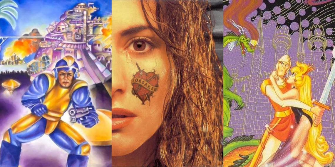
7 Forsaken 64

On the cover art of Forsaken 64, you have the image of a grayed-out environment that looks more like the moon than Earth, as well as a teary-eyed female character with an unusual heart tattoo with the word 'forsaken' on her cheek. There is nothing on the cover that gives you a clear idea of what the game is.
The game is set on Earth, in a post-apocalyptic future, but the cover art does not make that clear. And the female character is not in the game at all. The use of contrasting colors helps draw the eye to the cover and intrigues people into researching the game and picking it up. But it is not representative of this sci-fi, 3D, first-person shooter game.
6 Pac-Man

Pac-Man is a classic video game that has had many iterations and as such, many different cover art designs. Many of these designs feature a round, yellow character, sometimes with legs, running through a maze, with a wide mouth, eating things, or being chased by red ghosts. These releases showcase a stylized version of what the game is.
The Atari 400/800 cover art does something similar. The problem is that its depiction of Pac-Man is both outlandishly horrible and hilarious. Here, Pac-Man is portrayed as a lanky, teenage-like character, with yellow skin and a round head, eating a red disk. It accurately gives you an idea of what you do in the game, but not who or what you play as.
5 Phalanx

Phalanx is a hyper speed shoot out in space, as the cover art accurately tells you. In it, you play as a side scrolling space vessel that traverses a number of locations, including space, shooting at enemies. There's nothing egregious about any of that, it tells you what the game is, and it shows you a rough drawing of the ship you play as.
The odd thing about the cover art is the inclusion of a stereotypical, elderly hillbilly with a banjo in hand. This character is not in the game, he does not have anything to do with it and the music in the game features no uses of a banjo either. His inclusion on the cover art is confusing, unexplained, and misleading. It makes you think this is a music or rhythm-based game, but it's not.
4 Mega Man

The cover of the original Mega Man looks like something ripped from the cover of a low-budget, nineteen-sixties, science fiction movie. On it, we see a crudely drawn, gun-wielding man in a yellow and blue outfit in front of a series of misshapen buildings with fire emerging from them. There is no indication of what the gameplay is.
Plus, the addition of what looks like a very none sci-fi gun is a direct contradiction to the video game. In the game, Mega Man uses a gun attached to his arm called the Mega Buster. The cover art for Mega Man would not improve until the third iteration of the game, where the central character started to look more like the in-game version.
3 Pirates Of The Caribbean (2003)

The cover art for 2003's Pirates of the Caribbean tells your exactly what you need to know about the game. It lets you know it's about pirates, in the Caribbean, its use of color helps establish the mood and tone of the game, and the skull and bones imagery, along with swords helps establish that further. The problem is that there's a popular Hollywood film franchise with the same name and logo, and this game has absolutely nothing to do with it.
The film franchise starring Johnny Depp and Orlando Bloom was first released in 2001 and at the time of this game's launch, it was a hot property. This game is actually a sequel to Sea Dogs, a pirate video game, which then changed its name to match that of the film franchise, to help market it and cash in on the bigger IP. The only connection to the movie is the inclusion of a ship named 'The Black Pearl.'
2 Dragon's Lair

The Arcade version of Dragon's Lair is a classic. It's an animated adventure game in which you use quick-time actions and memory to help your character explore the depths of a fantastical castle, battling dragons and booby traps along the way. It proved to be very popular and the cover art for the arcade machine does a good job at conveying what the game is all about.
Eventually, a port of the game was brought over to the NES, and it utilized the same cover art. There's nothing wrong with that, except that the port of the game was a very different game. The interactive gameplay and the animated visuals were gone, replaced by side scrolling action and slow-moving visuals.
1 Mobile Light Force 2

The cover art for Mobile Light Force 2 is full of color and style, showcasing an action-packed scene where three black-clad females, wielding guns and cool sunglasses are on the run from flying robots with laser guns. It's attractive, the action scene and the characters draw the eye and do a good job at conveying an action adventure video game, with possible co-op elements.
The actual game though is not what the cover art represents. The game is a vertical shooter in which you play as one of three Japanese anime-style characters. The Charlies Angels like cover characters are not in the game, and on close inspection, you'll see one of them doesn't know how to wield a gun. In Japan, the game is called GunBird 2, and for some reason, the same artwork was used for both the original Western release of Mobile Light Force and this sequel.