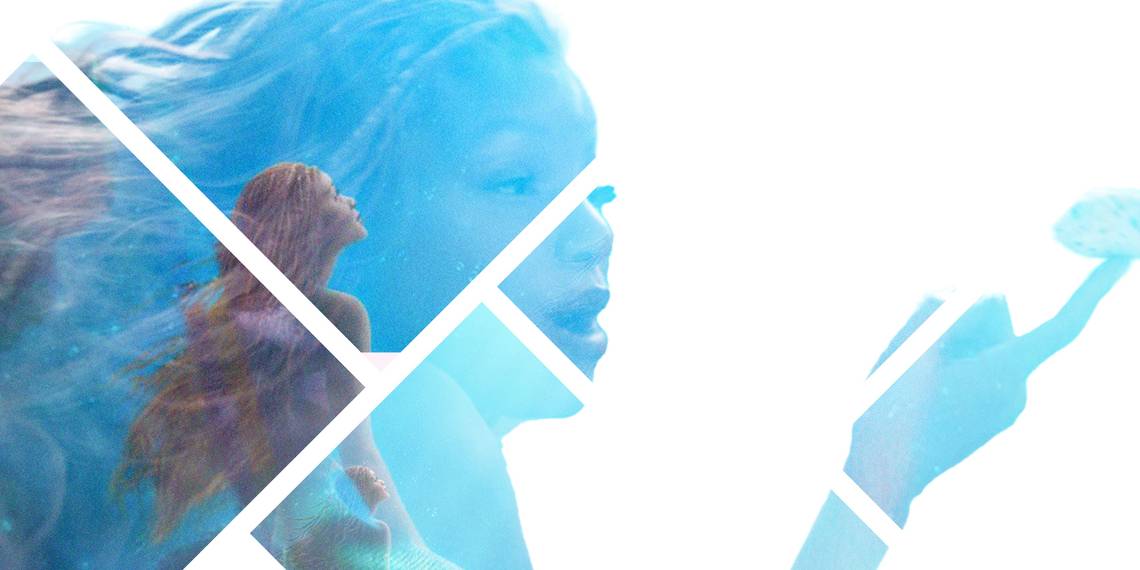
Disney has revealed the latest poster for The Little Mermaid, or at least, I think it has. For some reason, the poster is so dark and shadowy you can barely see the titular mermaid's tail, while everything else is weirdly greyed out. This is a children's movie based on a cartoon, why is the colour palette that of snow by the side of a busy highway? If this was a problem unique to The Little Mermaid, then it would just be weird, but it's not. It's a common problem across mass media, and everyone hates it, so why is it still there?
We've also seen stills from the new Peter Pan movie recently, again aimed at children, again based on a cartoon. And again, with the visual texture of brown sludge. It's not like children these days don't like bright colours, or even that the 'trend' of bright colours is over - so many movies are copying Into the Spider-Verse now, and that movie has an electric attitude towards colouration that even the loudest kids summer wear section can't compete with. Minecraft, Fortnite, and Roblox are incredibly popular with children too, and all three are bright and vibrant.
This isn't limited to childrens' media either. I can't even begin to list all of the moody prestige dramas that have been poorly lit in recent years, but one of the most famous examples would be Game of Thrones, which shot a battle scene in almost total darkness, leading to mass confusion from viewers. Video games have also embraced grittier tones as they attempt to further legitimise themselves as serious art rather than frivolous toys for children. Marvel movies have gotten darker too as the production has switched from real locations with real props into sound stages with CGI. And that brings us to the sad justification - it's cheaper.

While lighting itself isn't all that expensive, darkness can be used to hide a lot of things. Halle Bailey is not actually a mermaid, and so having the scenes be darker makes it easier to disguise the CGI work. This is particularly a problem with Marvel, which has increased its use of CGI and as a result decreased its quality. That shouldn't be an issue for a poster, but the darker visuals set the foundations for the film to follow suit.
The headline here is something of a double entendre - media is not just dark literally, as per its lighting suggests, it also has a darker tone. I don't expect The Little Mermaid to be the sort of dark retelling that would see it stick closer to the original fairy tale, but there's an overall sense of distance and dishonesty with modern media. Everything is ironic, needs to prove its intelligence, is too good for genre tropes or earnest storytelling. To be earnest is to be foolish, everything must be deconstructed, must be quipped away. The reason Top Gun: Maverick and Creed 3 have been hugely successful is because they stay true to genre conventions and attempt to execute them to perfection, not to subvert them to outsmart you.

Colours are not necessarily synonymous with earnestness - think of how many hackneyed brands use nauseating splashes of colour without meaning - but in modern media, it does feel as though using colour is an allowance only earnest films grant themselves. The most heartfelt movies we have seen over the past few years have all had explosions of colour behind them, like Into the Spider-Verse, Mitchells Versus the Machines, and Puss in Boots: The Last Wish.
Darkness can work - The Batman was praised for its use of darkness to capture the grungy mood it was going for, while The X-Files was famously dark on purpose, which became a core part of the show's identity. But with The X-Files, it was engineered out of earnestness once more, whereas darkness today often suggests the opposite.
There have been some brighter scenes of The Little Mermaid shown off, with the iconic purple top and turquoise tail glistening. And the original cartoon was a little darker (in both senses) than the other Disney cartoons that came out around the same time. Still, this poster seems to follow disappointing trends of relying on darkness to disguise corners that have been cut with CGI. Posters are supposed to get you excited for a movie, but I can't imagine children being hyped by this grimly lit poster, and as a Disney Adult, neither am I.