Pokémon has been around for a long time now. In those years, hundreds of different pocket monsters have been introduced – each having their merits and disadvantages. Everyone has their favourite Pokémon or even their preferred type. Some choose them based on their ability in battle and some like their Pokémon just because of how they look. One line of thought that really angers fans is the idea that Gen I Pokémon are superior to their successors. These “Genwunners” have quite the reputation and, while you can understand how they’d favor what they knew in their childhood over some of the newer Pokémon out there, these guys have nostalgia goggles on.
Every Pokémon generation has its fair share of home runs and duds. There are so many though that it’s a pretty even split. Now, you’ll also get those who’ll say that the first generation of Pokémon wasn’t all that great. That’s a bit of an overstatement, though it does bring up something the “Genwunners” won’t seem to admit. Not every Pokémon from Gen I was as awesome as you might remember them being. In fact, some of them are pretty bad. So take off those nostalgia goggles and take a look at these 15 Gen I Pokémon that are actually the worst of the bunch.
15 Rattata

Consider all the fun, imaginative Pokémon designs out there that really showed off the wonders that the Pokémon franchise could give us – and now look to Rattata. It doesn’t take a genius to come up with this. Just like Pikachu, Rattata is categorized as a Mouse Pokémon. But while Pikachu’s design is much more vibrant and creative, Rattata’s is pretty plain. It’s a purple rat for crying out loud. This isn’t exactly showcasing Ken Sugimori’s talents all that much now is it? The one good thing you can say about this design however is that it isn’t anywhere near as bad as its Alolan counterpart. Some of the new Aloan designs were pretty cool, but a lot of them were just strange and seemed unnecessary. We’ll take the original Rattata over the Alolan any day. Though that’s not saying much.
14 Magnemite

As far as Pokémon go, Magnemite is a pretty solid choice if you want a good electric-type in your party. It, along with its evolutions Magneton and Magnezone, are great special attackers and can do some real damage. But this isn’t about whether or not it’s a good Pokémon. No, we’re concentrating solely on Magnemite’s design right now. It might’ve looked cool when we were kids, but this weird little guy certainly hasn’t aged well over the years. We get it, it’s supposed to be a magnet – fine. That doesn’t mean it’s all that great of a design. While it’s evolved form, Magneton, is essentially three conjoined Magnemite’s, it still looks a little better than this bare bones design.
13 Dugtrio

We all see it. Dugtrio is – like Magneton – essentially a three-headed cluster of its base form. But while Magneton at least at least looks a little different than Magnemite, Dugtrio could easily be three Diglett’s sticking their heads out of the same patch of dirt. What is a Diglett anyways? Supposedly it’s based off of a mole, but it looks more like a smooth, living clump of dirt really. It’s unsettling to look at at times. Those beady eyes, the oval shaped pink nose, the general lack of any distinguishing features, everything about this Pokémon is just a little bit strange. Coincidentally, Dugtrio is another Gen I Pokémon who has the misfortune of having received a terrible Alolan makeover.
12 Geodude

As a kid, you might’ve thought that Geodude was a pretty cool Pokémon. It’s tough looking and has a pretty awesome evolution. But what is it really? If you take a minute to just look at it, without all the childhood nostalgia, Geodude is just a floating rock with arms. There’s nothing much to it really, it’s another pretty bare bones design that’s found itself on this list. We said it had some cool evolutions, but really, Golem is the one in that evolution line that really stands out. Is it a coincidence that a lot of these Pokémon received some pretty horrific Alolan evolutions? A normal Geodude is bland, sure, but that’s about all you can say about it. The Alolan Geodude on the other hand – along with its evolutions – just looks like someone weird kid’s drawings.
11 Seel

Here we have a Pokémon that has both one of the most unimaginative designs and name to go along with it. It probably flew over our heads as kids, but naming a seal-like Pokémon Seel is just lazy writing. It looks like a seal, sounds like a seal and is pretty much named Seel. It’s like naming Aerodactyl “Fossil Dinosaur.” It’s too direct and there’s little creativity that goes into it. It’s the exact same thing with Dewgong, its evolution. It’s just a larger version of Seel with little differences. These are always kind of frustrating to look at because you know that they could’ve probably done better but for whatever reason, this is what they thought would’ve suited the game best.
10 Tangela

What is a Tangela exactly? Is it some sort of sentient plant-life or is it just a Pokémon that’s draped in vine coverings? Well officially, it’s known as the “Vine Pokémon,” so you have to art least assume that it’s some sort of walking vine-plant thing. We don’t know, we really don’t. The only thing that’s clear is that it’s short and has sneakers on, so it probably has feet for some reason. No arms though – that’s what the vines are for it seems. This is one of the more cartoonish and exaggerated designs in Gen I, and it doesn’t really sit all that well. We can appreciate the effort, but Tangela is just a little too weird.
9 Fearow

Some Pokémon look bad and some look like lazy design choices. Fearow doesn’t necessarily have a bad or lazy design, but considering what it evolved from, it kind of has a disappointing one. Though the Pidgey evolutions turned out to be the most popular, Spearow was one of the best looking bird Pokémon of Gen I. That’s why it was so disappointing to see that its evolution had such a generic look to it. They just drew a bigger, scarier looking bird. Hence the name, Fearow. While Spearow’s design had some character to it, Fearow was kind of forgettable. The only notable thing about it was its size and even at that, it’s not much in terms of aesthetic.
8 Paras

Well, there isn’t exactly much to look at with this next Pokémon. Paras isn’t the most memorable of the bunch and for good reason. It just doesn’t have that great of a design. It’s just a crab with mushrooms growing out of its back. Pretty eerie when you read its Pokédex entry, but not all that stimulating visually. It’s not all that bad though, as its evolved form Parasect is one of the coolest bug-types you’ll see. Still, we wish some of that spark would’ve shown itself in Paras’ design, as it’s just too plain of a Pokémon to really say anything good about. However, at least it’s not as weird looking as our next Pokémon.
7 Bellsprout

What a pathetic looking little thing. Really, Bellsprout isn’t all that much to look at and kind of invokes a feeling of pity more than anything else. It seems to be based off of a flower design and, while its final form Victreebel is one scary looking Pokémon, Bellsprout is kind of a runt in comparison. Gen I had some pretty cool looking grass-type Pokémon, from the aforementioned Victreebel to Vileplume, Exeggutor and the entire Bulbasaur evolution line. Sadly, Bellsprout comes in at the bottom in that group. It isn’t all that bad though, as it does eventually turn into a pretty cool Pokémon, should you choose to evolve it. But then again, why wouldn’t you?
6 Slowpoke

Talk about a dumb looking Pokémon. There are quite a few Pokémon out there that are just plain stupid looking. This isn’t some aggressive statement or anything; these things were actually made to look dumb. Gen I has some of these Pokémon too. From Magikarp to our friend Slowpoke here, some of the “slowest” looking companions have come from this generation. So we at least know why they chose to name Slowpoke what they did. It’s called the Dopey Pokémon for a reason it seems, though they kind of went overboard with it, don’t you think? Slowpoke has quite literally become the embodiment of stupidity in the Pokémon universe over the years. Not a great legacy to have.
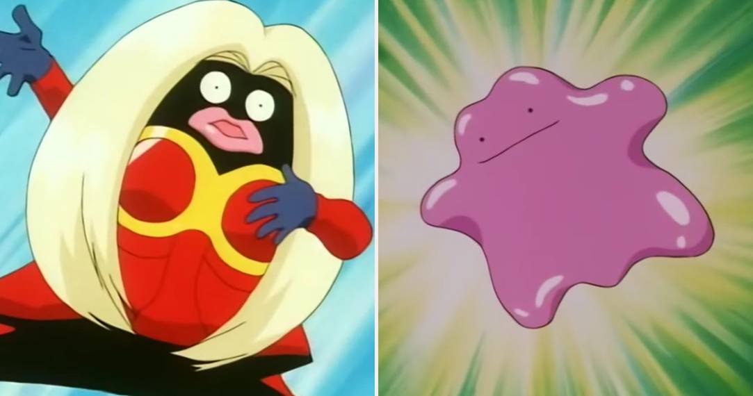
5 Ditto

This one might strike some of you as odd, while others might just not agree with this inclusion altogether and that’s fine. The main complaint here with Ditto is how utterly nonsensical it looks. Though the argument can be made that since it essentially just copies other Pokémon’s forms, its ambiguity is completely justified. Sure, that all makes sense, but it doesn’t mean that from a design standpoint this isn't just a boring looking Pokémon. We’re sometimes a little more lenient on older Pokémon designs because of how much we loved them when we were younger, but could you imagine a Pokémon coming out now that had this little level of detail in its design? It wouldn’t fly over too well with most fans, that’s for sure.
4 Grimer

Grimer over here marks the last Pokémon you’ll see on this list that received a God-awful Alolan form in Gen VII. First though, let’s look at the original Grimer. What is it exactly? Well that’s easy, it’s just sludge. It’s a moving, living mass of pollution that kids can apparently play with and battle. So what’s so bad about this Pokémon’s design? Well just look at it. It’s so damn ugly. It was pretty tough at first choosing between Grimer and its evolved form, Muk. But if you compare the two, Muk at least looks a little cooler – though the thing is essentially a much larger pile of sludge. The Alolan form makes things worse, however, as it adds a sickening green and yellow color scheme. Yuk.
3 Lickitung

We’re getting to the really, really weird Pokémon on this list and no, not weird in a good or creative way. Weird in the sense that it makes you question the very way in which it came into existence. That’s Lickitung. Our friend here – unlike a lot of earlier Pokémon designs – doesn’t look as though it was based on a particular animal or object. No instead Lickitung accentuates its massive tongue, making it look like it was some practical joke that got way too out of hand and somehow found its way in the final product. While it’s certainly one of the most unique looking Pokémon you’ll see, it just isn’t that great of a design to begin with.
2 Jynx

One thing you’ve most probably noticed when it comes to the entertainment industry is that anything and everything can be controversial. Video games are no exception to this and even a franchise as sweet and innocent as Pokémon has seen its fair share of controversy. People just like to complain. However, the controversy surrounding Jynx’s original design was a little more than that. Some people said that Jynx’s design perpetuated a racial stereotype. In Game Freak’s defense, the game they were making was first and foremost for a Japanese audience. They wouldn’t really consider the same things we think racist to be that offensive because it’s a completely different culture there. Still, Jynx’s design was changed, as the black skin was swapped for purple. That still didn’t stop it from looking creepy as hell though.
1 Electrode

Of all the lazy, uninspired designs on this list, this one definitely takes the cake. We’ve all been there, we’re exploring, looking for new Pokémon and we see something on the floor. Is it an item? A TM? Let’s see... Nope! It’s a friggin’ Voltorb or Electrode. These things are both essentially Poké Ball’s with faces. The fact that they try and take you down with them half of the time doesn’t help their likability all that much. Really we could’ve gone with either or in this situation, but the fact that we see terrible base forms with improved evolutions in Pokémon all the time is what got Electrode the number one spot on this list.