Paper Mario: The Origami King is one of 2020's very best games so far. It's a beautiful testament to Nintendo's willingness to encourage ambitious concepts, and a remarkable return to form after a decade-plus of truly slumming it. Every inch of this JRPG/puzzle/rhythm gaming romp is oozing with charm and personality, in a year where we're all in desperate need of escape.
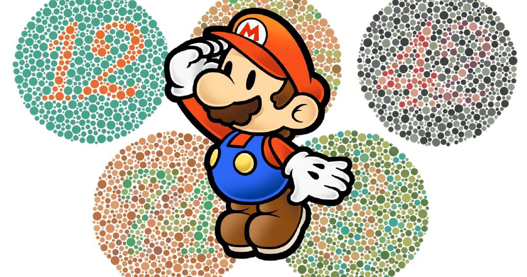
But while playing this vibrant, sumptuous visual feast of a game, I couldn't help but to think about my own colorblindness. Typically, games like this don't always shine in the visual department for me. That's because I have colorblindness, which often impedes my enjoyment of bright and colorful games due to my inability to distinguish different shades of greens and yellows, reds and browns, and greys and bright blues.
The thing is, The Origami King's palette is diverse enough that the game truly pops for me. Every color is distinctly separated in such a way that the palette never sludges together, and the colors chosen so unambiguous that I haven't gotten any, "huh, why is the grass yellow?" moments. Yet my experience won't be universal, because Paper Mario: The Origami King doesn't have a single colorblindness option.
That's a huge mistake.
Why Include Colorblindness Settings?

There are whole games that I literally can't play due to my colorblindness. The puzzle genre, one that I love dearly, has historically been very woeful about inclusion in that department. Games like Puzzle Bubble, Magical Drop, Puzzle De Pon, Puzzle Fighter, and countless more use palettes that prevent me from being able to distinguish pieces from each other.
Likewise, this can affect other games. Certain shooters can be unplayable if they use certain palettes and don't offer any alternatives, leading me not being able to tag and shoot enemies. Some games have menus where the text and background blend in for me, which gives me some serious eyestrain when just trying to read.
Luckily, things have gotten better in recent years. Excellent puzzle titles like last year's Crystal Crisis and the upcoming Swapette Showdown make excellent use of colorblindness settings, and modern shooters have been getting decent at offering alternative color schemes. Developers taking the extra time to think about this is really meaningful, and helps to make gaming way less frustrating.
Colorful Games Need Colorblind Options

The Paper Mario series trades in bright, happy colors, an extreme that often excludes players with certain types of colorblindness. I definitely remember certain areas in the original and The Thousand Year Door being truly difficult to process due to my internal muddying of the game's color scheme. While The Origami King is diverse enough in its palette that I'm not having those issues, that isn't to say others aren't.
A game like The Origami King, where a large selling point is the colorful aesthetic, needs to have options where everyone can enjoy it. It's pretty myopic of Intelligent Systems to think one size fits all when it comes to the visuals. While I'm not going to say there's malevolent intent or anything as kneejerk as all that, I do think it's a big oversight and I do think it'll impede the enjoyment of so many players. I know what it feels like for the palette of a "colorful" game to completely misfire on me.
For people with "normal" vision, imagine not being able to solve a puzzle because you couldn't see a crucial object, not being able to distinguish between a tree and its leaves, or not being able to aim at something because you can't see the reticle. That's the kind of impediment this can be, and it can really damper enjoyment of something.
Paint With A Broad Brush

In The Origami King, one of Mario's main actions is throwing up a colorful wad of confetti. This confetti rains down and covers up holes, repairs bridges, and fixes whole structures. The developers could have used a similar approach here - to throw in a bundle of different palette presets for the most common types of colorblindness. It would have gone a long to way to ensure as many players as possible could share the joy of this game's beautiful aesthetic.
So while Paper Mario: The Origami King is certainly a looker - arguably the prettiest game I've touched this year, in fact - there's an extra mile Intelligent Systems could've gone here. While I appreciate that my own breed of visual impairment is catered to with the game's distinct, diverse palette, I wish that my other colorblind comrades could have more options to make the game pop for them.