Each generation of Pokemon comes with new creatures, with some evolving from or into older Pokemon and others that are entirely new to the series. Something that isn't usually seen, however, is how Pokemon designs can change over time leading up to the final release of a game.Many unused Pokemon designs and older designs of currently existing Pokemon have been revealed in the last few years due to both leaks and more official sources. This includes the 2020 leak of the Diamond and Pearl beta sprites, which has a handful of Pokemon whose designs changed in the final versions.
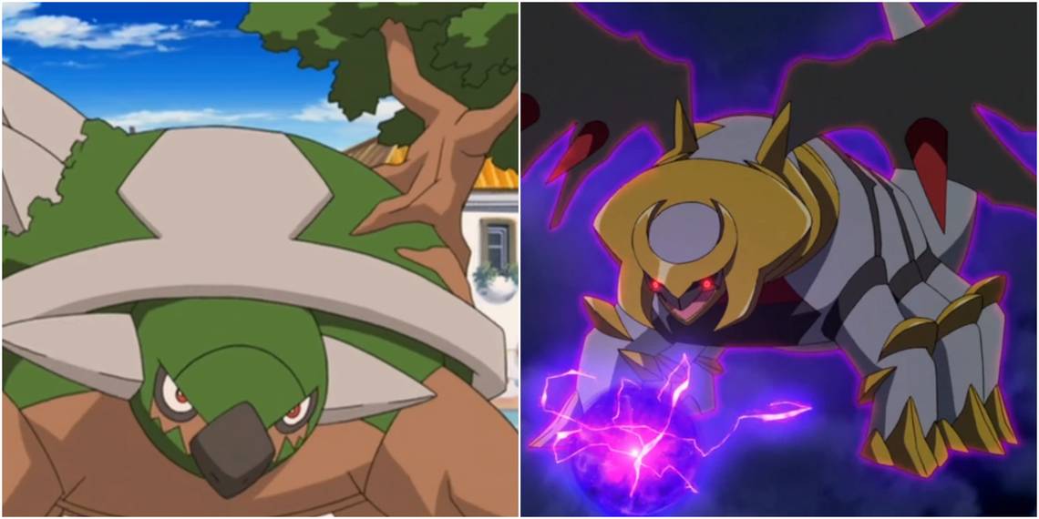
10 Torterra

Between the beta and final designs of Torterra, the Continent Pokemon didn't change conceptually but had its features majorly improved. The puke green color was changed to a more grass-like green, the head was shaped to look less goofy, and the bonsai tree on its back altered to resemble an oak tree.
Although the two versions have plenty of similarities design-wise, Pokemon fans are lucky the original design was improved on so much. It's hard to imagine just how hideous the multiple Torterra in Detective Pikachu would be if they were based on the beta design.
9 Darkrai
Darkrai didn't change too much from its beta design (known as "Darei), changing from a red crest on its face to a red collar and white hair. The beta version of Darkrai looks more like a demonic humanoid rooster than a being who feeds off of nightmares, which may be why they changed it.
Surprisingly, although Darkrai's final design was likely completed before the release of the Rise of Darkrai, the Japanese logo seen on several posters for the movie has an S reminiscent of the crest the beta version had. Maybe there's a possibility of it being an alternate form before being scrapped altogether.
8 Rotom

This is another case of significant improvement design-wise. The beta version of Rotom still looks like a ghost that haunts electrical appliances but looks more generic than the final version, so much so that it could easily fit into plenty of other monster taming games. In Rotom's final design, its eyes, orange coloration, and lightning arms help it stand out compared to its contemporaries.
If this design had not been changed, Rotom's other forms would probably look like a shiny Ditto transformed into those appliances, rather than looking possessed by another Pokemon. It probably wouldn't have gained a significant role in the anime series either.
7 Hippopotas

The beta design of Hippopotas looks like it would fit right in with the first and second generations of Pokemon, but seems out of place for a Pokemon introduced in Diamond and Pearl. While it is more adorable than the final version, beta Hippopotas lacks detail, making it look more like a potato that magically turned into a Hippo rather than the sand swallowing hippo pokemon known today.
With any luck, maybe this beta design will someday come back as a baby Pokemon, since the final design of Hippopotas would be more appropriate as an awkward second-stage Pokemon anyway.
6 Hippowdon

Beta Hippopotas and Hippowdon look more like different stages of counterpart Pokemon, such as Caterpie and Weedle, than part of the same evolutionary line, with the latter looking like it rolled around in a pile of Cheeto dust. Beta Hippopotas also happens to look like a rejected Nickelodeon or cereal mascot from the '90s, and its purple mouth, spouts, and marshmallow teeth don't do it any favors.
Hippowdon's design changed and improved a lot between the beta and final versions, so let's hope this design never comes back in any capacity since it's just so strange.
5 Togekiss

While it is still a similar design, beta Togekiss looks less happy than the final version and is also much more reminiscent of a plane. It's unfortunate this design didn't end up being used, because with a darker color scheme, it could have been the Dusk Stone counterpart to Togekiss, since Togetic requires a Shiny Stone to evolve. It could also have been the opposite of Togekiss lore-wise, as a sign of bad luck that only appears in areas whenever major conflicts occur.
Otherwise, the happy face of the final version of Togekiss fits its evolutionary line better, and it's weird any Pokemon in the evolutionary line not smiling.
4 Rampardos

Here's a case of a Pokemon whose final version is worse looking than the beta version. The beta version of Rampardos (known as Rambardo) is more ferocious and reminiscent of the fossil Pokemon introduced before it with its coloration and overall design.
The final version of Rampardos looks more like a dinosaur-like Pokemon that wasn't a fossil, similar to Tropius, and has a much worse-looking egg-shaped head due to the weird empty space between its forehead and the top of its skull. It's unlikely that something reminiscent of beta Rampardos would be created in the future unless fossil Pokemon started getting regional variants, which could still happen someday.
3 Gible, Gabite, and Garchomp

While Gible, Gabite, and Garchomp were always shark dragons, their beta designs differ from the final product. Unlike the beta versions of Hippopotas and Hippowdon, they still look like part of the same evolutionary line as well. The beta versions have a color scheme nearly opposite of the final versions and lack the jet engine horns. Beta Gible could also be easily mistaken for several rookie-level Digimon.
While the beta designs aren't necessarily worse looking than their final versions and could inspire regional variants in the future, changing them was still the best choice to help make these Pokemon more distinct.
2 Arceus: An Unpercievable Pokemon

The beta version of Arceus was shrouded in mystery, being a more shapeless being than the final more equine version, and may be a reference to how the true forms of many deities and mythological figures are not perceivable to human eyes.
Unlike many other older and unused designs, this is one of the few that could always come back as an alternate form for Arceus, since the 17 different forms of it that still exist do nothing more than change its color and type.
1 Giratina: A Completely Different Form

The change between Giratina's beta form and its final form is probably one of the most drastic in the history of Pokemon, at least that we know of.
Beta Giratina is thought to be based on chimeras and the Hudun of Chinese mythology. While this prototype design may be a far cry from the ghost dragon fans know today and likely has no connection to Giratina's Origin Forme either, it may have also helped inspire the Therian Forme of Landorus a few years later. It causes one to wonder what other Pokemon were changed or inspired later Pokemon.