Pokémon! A Worldwide phenomenon the likes of which can only be compared to properties like Star Wars and Mario. A setting that is filled to the brim of all sorts of wild creatures for tiny children to control. These Pokémon titles take place in different regions all involving a 10-year-old. This kid travels around fighting grown-ups with his captured pigeons and worms.
Over the years, there have been tons of different mainline games and a whole host of knockoffs, spin-offs, and genre switching titles. In most of these generations, however, Gamefreak introduces new Pokémon designs, ranging from 10-100 new Pokémon each time. This is where you get the stereotypical rabid fanboys ranting that “Gen 1 is still the best Gen” or “Gen 6 Mega Evolutions ruined Pokémon.” While these ravings do have some research done here or there, they’re mostly just opinions stated as fact. One thing most people tend to agree about, however, is that the 2nd Generation of Pokémon designs were very strong. The designs were kept simple, while also being unique takes on real-life animals and concepts.
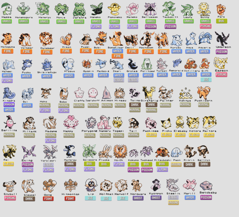
But now, we’ve only recently found out, that there were even more incredible designs Gamefreak didn’t use! Pokémon Gold and Silver were originally intended for the Gameboy Original, but when the Gameboy Color came out, they hopped development onto this new system. They left the demo version of the game behind in pursuit of bright colors. In 2018, people discovered this demo for the original game, and all of these unused designs came to light. And let me tell you, they’re the genuine article! Now it's time for me gush about the 25 designs Nintendo shouldn’t have dropped.
25 Chikorita’s Evolution Hanamogura Needs More Legs
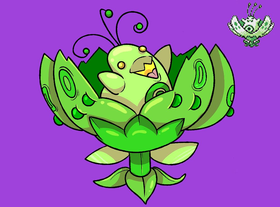
First things first, let’s begin with the starter Pokémon. For our grass type we have Chikorita and Meganium whose designs are the same but Bayleef used to be different. It used to be..well..a flower bud? It’s an odd evolutionary line to see, for sure.
Chikorita goes from a quadruped with plant-like parts to a full-on flower, then back to a giant quadruped.
Maybe this was the original Chikorita and the design as we know it would have been the second evolution? Either way, it’s a great design, it’s very adorable, but just doesn’t fit as well as Bayleef.
24 Dynabear Coolest Fire Starter Name Ever
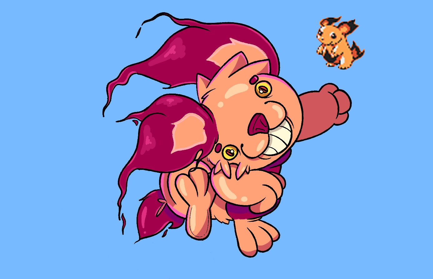
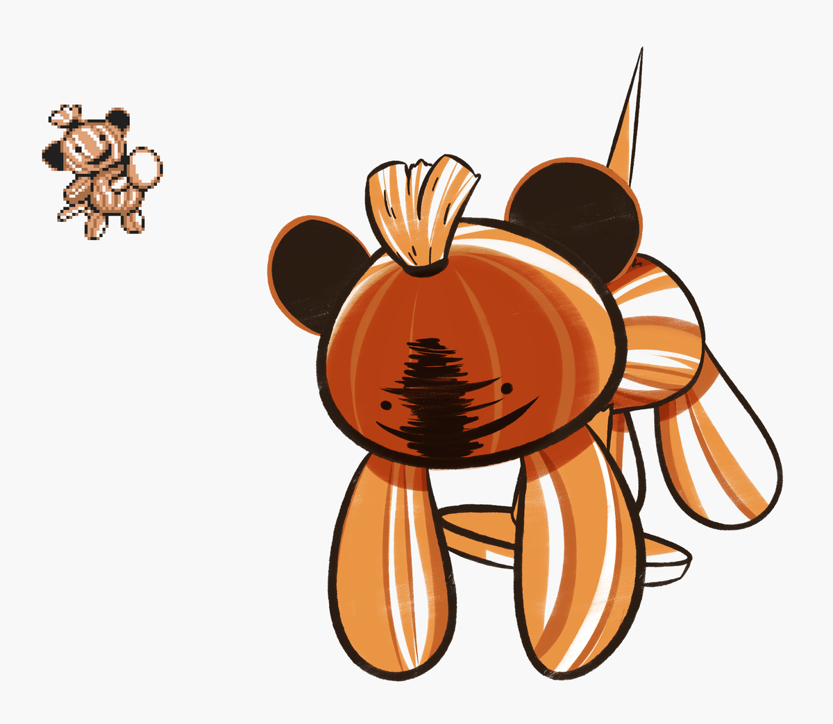
Cyndaquil’s line was originally completely non-existent. And instead, they had just a big, chunky fire-based Pikachu.
The first evolution in this line looks like a Pikachu variant, but as it evolves it essentially becomes a giant fluffy Arcanine + Flareon combo.
Honestly, I really like the idea of having a huge flaming puffball as a starter, everyone loves Arcanine. Making a relatively similar design a forefront Pokémon wouldn’t have been a bad idea. Plus they, of course, would have been popular with names like Volbear and Dynabear.
23 Water Seal Kurusu Replacement For Totodile?
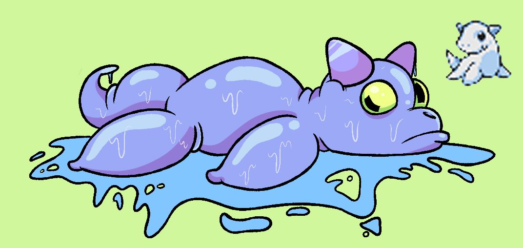
Now, this water starter line is interesting. It’s pretty basic contextually as it’s a water starter that’s a seal.
The designs themselves are pretty adorable and simple, plus the final evolution is a hulking water dragon.
In fact, if you’ve seen the final evolution of the Oshawott line in Generation 5, you’ll notice similarities. There are a couple odd things about this line, such as going from two horns, to one, then back to three. As cute as Kurusu is though, the Totodile line is a much more intimidating bunch of Pokémon.
22 Octillery Packs Some Massive Artillery
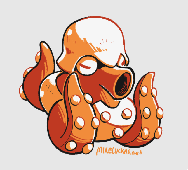
This is far and away, my favorite original design for these demo Pokémon. If you remember, Octillery evolves from Remoraid, and was always a bit odd since it evolves from a fish into an octopus.
Now, thanks to these demo designs, we know Remoraid was a gun-shaped fish, and Octillery was supposed to be a tank.
While still an obtuse concept, it’s a really amazing idea, and Octillery looks hilarious. The implication is that Octillery uses its tentacles like the track wheels of a tank, rotating them in circles to move. 10/10 Octo-tank.
21 Para's Dad Is A Bit of A Fun Guy
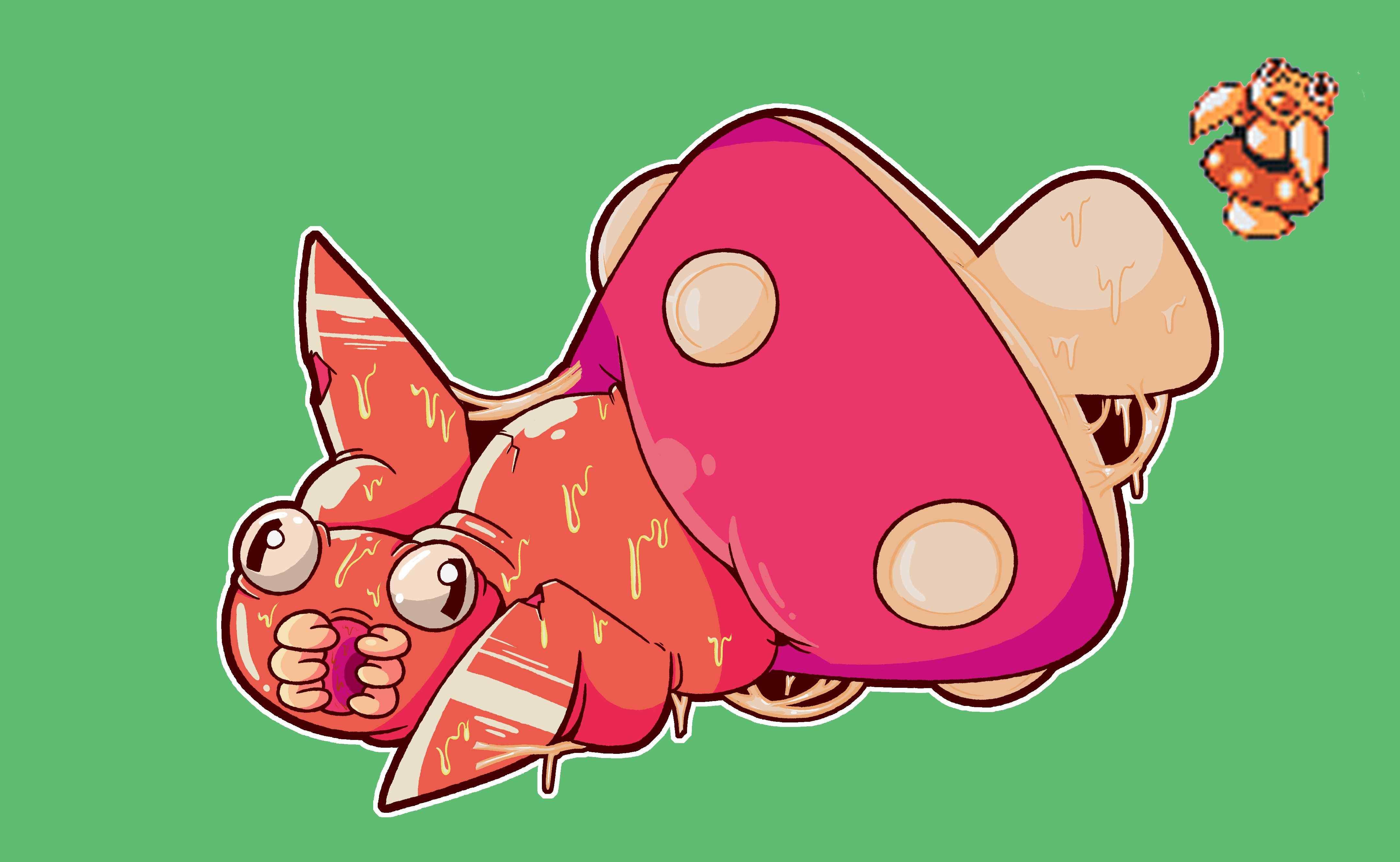
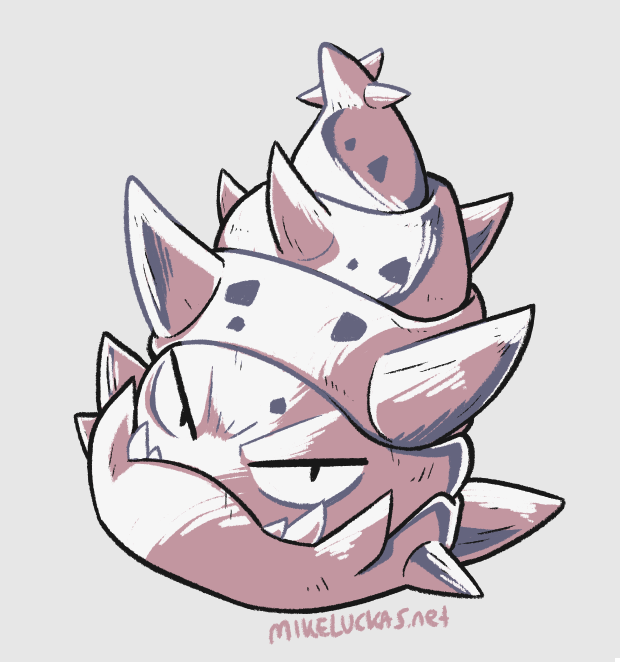
Now this one is even weirder than the others. Fans of the series tend to like the Paras/Parasect Pokémon because its background has dark overtones due to a Parasect essentially being a zombie controlled by the mushroom on its back. But Para, the baby evolution, seems to go to opposite route.
It’s not the mushroom that grows out of Paras, but Paras that comes from the mushroom.
At least that’s what this design implies. In any case, for a horrifying insect baby spawned from a mushroom, Para sure is quite cute.
20 Doduo, Dodrio, and Himasu?
This has to be the design I’m disappointed wasn’t included the most. Doduo was originally going to start as a baby!
Most people remember Doduo and Dodrio from Gen 1, and they’re not exactly a popular line.
Pokémon with only 1 evolution tend to be less popular and Doduo doesn’t really change too much as it evolves. But if this baby was in the game, and instead Doduo went from three heads, to two heads to one all-powerful one. What a different sort of Pokémon that would have been! Plus, boy is this nest of weirdo’s really charming.
19 Kohnya The Team Rocket Sidekick?
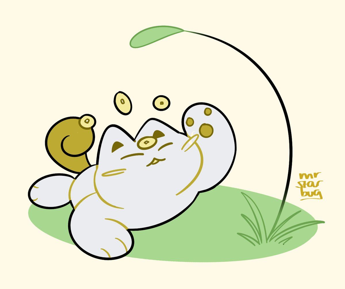
It’s all babies all the time here. This Meowth baby evo is well, just too downright cute. The wittle baby is tired and sleeping.
But while it’s sleeping it’s…levitating its Payday coins?
This leads me to believe that this could have also been an alternate evolution to Meowth where he gets a secondary psychic type. Similar to the Poliwrath/Politoed situation. Its name is Kohnya because of “Nya” being the standard onomatopoeia for cats. In any case, while Meowth and Persian are fun cats, the Meowth baby takes on the cuter side of cats and really nya-ils it.
18 Still Not In The Games: Turban’s A Total Slowpoke!
Finally! My goodness did I always wonder about this. Every year when new Pokémon get announced I always wondered about the thing on Slowbro’s tail. In Pokémon Snap for the N64 Slowpoke fishes for these…shell creatures with its tail. And when it would catch one it would then immediately evolve into Slowbro.
This always made me think this shell HAD to be a Pokémon, because the setting of Pokémon doesn’t have anything sentient in it that isn’t a Pokémon.
For Turban to have been its own separate design/Pokémon would have been really cool. Shame it was never implemented, seems pretty Shell-fish.
17 Betobaby’s Design Is A Total Stretch
Alright, this is the last baby design I’m talking about. And it’s a confusing one.
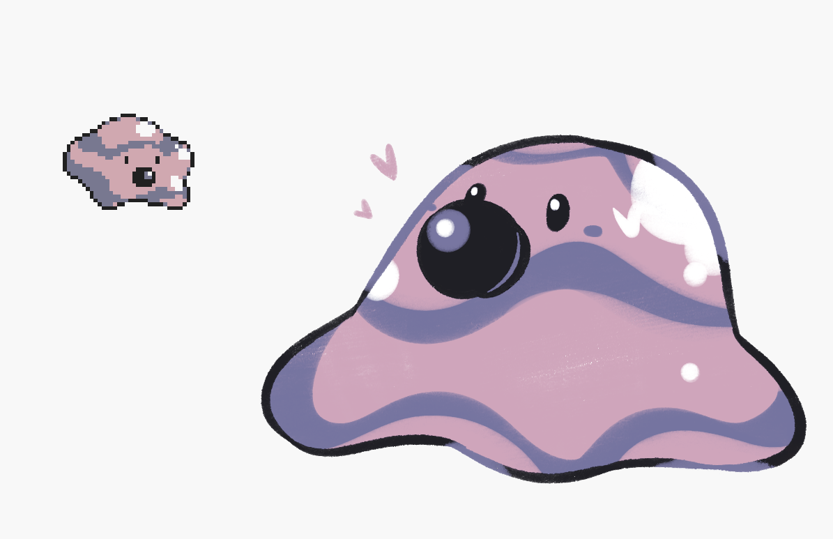
This baby evolution could be either a Grimer or Diglett baby.
Because for one, it has the eyes and maybe the nose of a Diglett. But on the other hand, it has the same slime pattern and shape as a Grimer, and maybe that nose is actually a mouth with one tooth. If this design was fully implemented the colors would easily make it readable as to who it was. We do know that the “beto” in Betobaby mean’s “stretch” in Japanese, so I’m leaning more towards the Grimer side
16 Gong the Fist Fighting Bear?
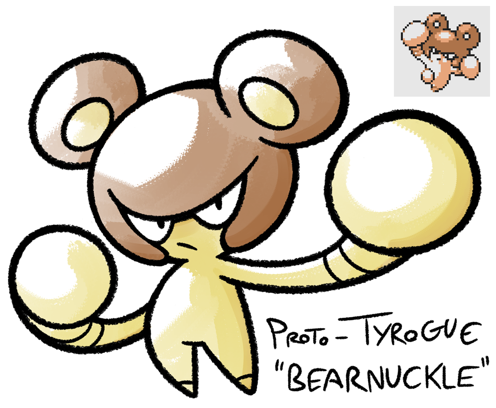
Man oh man, Gong is just such a swell design. This lil’ bear and his evolution seem to be their own separate designs but the evolution eventually became the design for Hitmontop. The clue is that its name is also Hitmontop, subtle I know. While Hitmontop is cool this design is also amazing.
Gong itself seems to be imitating the headgear boxers wear except that its headgear includes adorable ears.
The evolution, while cool, doesn’t make much sense. It grows legs from its ears gives up its legs? Sadly I think demo Hitmontop is the weaker design.
15 Alone In The World With A Little...Girafarig?
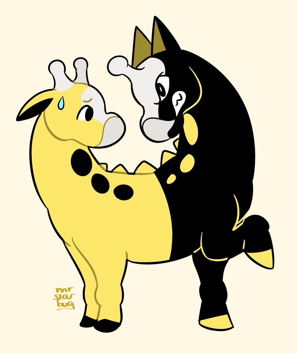
Girafarig was already silly because it’s a palindrome Pokémon with a talking behind. But with this Demo design Girafarig literally has a mischievous conjoined half.
Maybe Gamefreak canned this design once the cartoon Catdog came out since it debuted a year before G & S came out.
In any case, we already have Doduo to fill the multi-headed quota so Gamefreak must have changed the clone into the evil tail we know and love to this day. Sadly Girafarig still doesn’t have an evolution but if it did I think this design would work for it.
14 Norowara And Kyonpan Are The Voodoo Villains?
I wish this was in the game. Man do I wish. Generation II took a lot of inspiration from Japan/Asia visually. This is confirmed and obvious when you look around at the aesthetics of the game.
The first form is a literal sentient voodoo doll, and its evolved form seems to be the Panda version of a “jiangshi,” which is a Japanese zombie.
While these are strong designs they do feel a bit disjointed from the style of Pokémon usually.
13 Goldeen's Baby Needs To Turn That Frown Upside Down
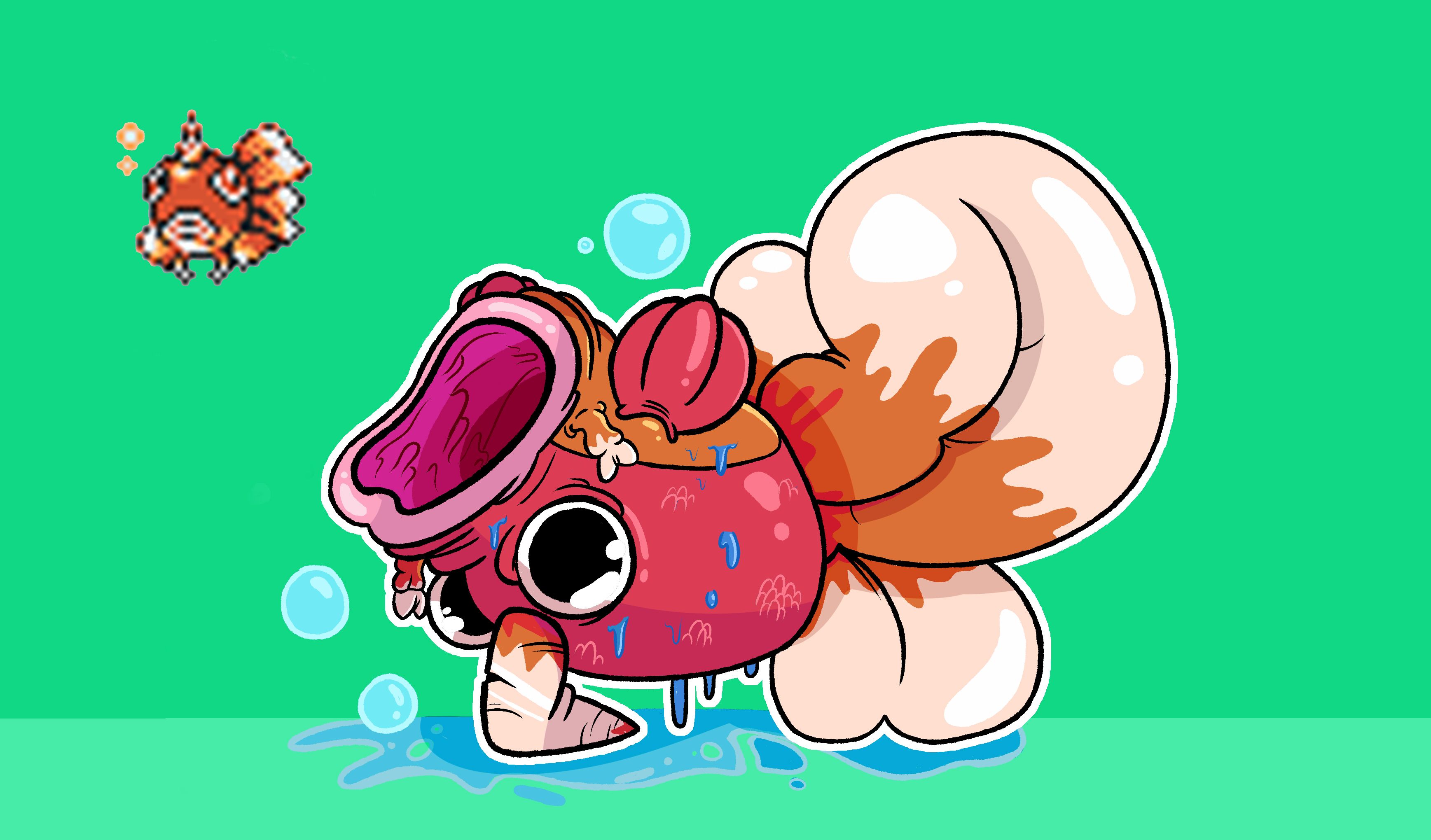
This design really confused me at first. I originally wrote all about how this was an evolution to Seaking.
But now, after some research and finding its name, it’s obvious this was the concept design for Gyopin, the baby evolution for Goldeen.
Personally, I think this lil' fish is really hideous. It's got an expression that just screams "I know you don't want to catch me." Plus it looks more like Seaking than Goldeen. Overall, as much as it's gross, its frown makes me want to hug it and cheer it up.
12 Rock, Paper, Scyther, and Scissors
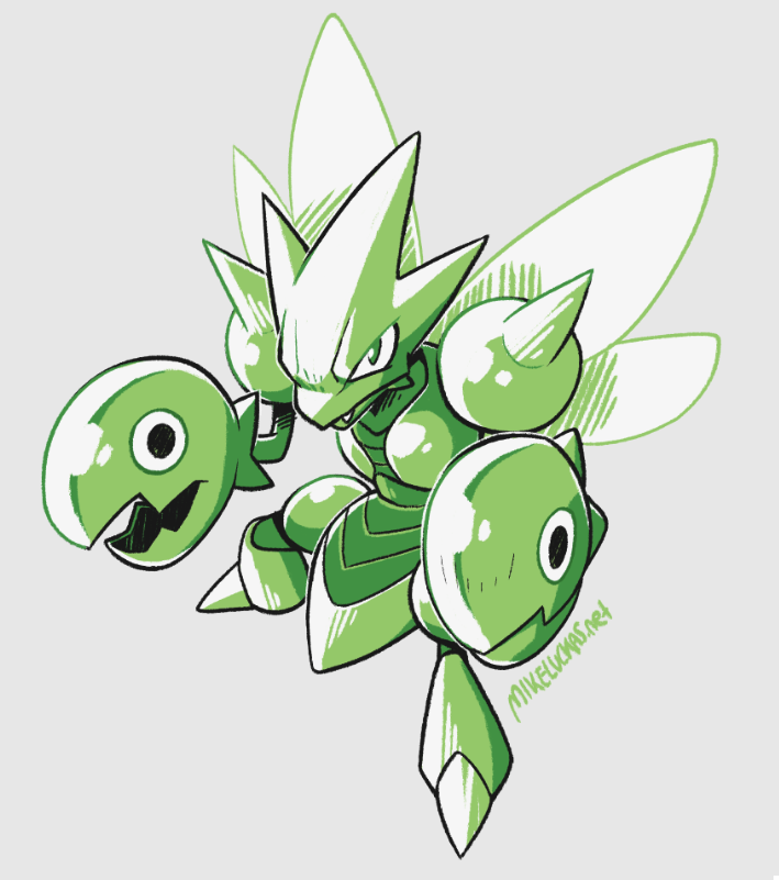
THOSE CLAWS. My gosh, look at them. They got googly eyes, they’re so amazing. I can’t stop loving them.
This original design for Scizor literally looks like it has metal fish for hands. It’s amazing, and honestly still a good design.
I get the feeling it was going to be a more comedic Pokémon because of the claws and its name being…Scissors. Scizor actually has those googly eyes in the final design, but they made the two circles into a sort of bolt instead. They also took away the fish tails and made them more flush with his arms.
11 Kotora & Raitora Are SHOCK-ingly Good Designs
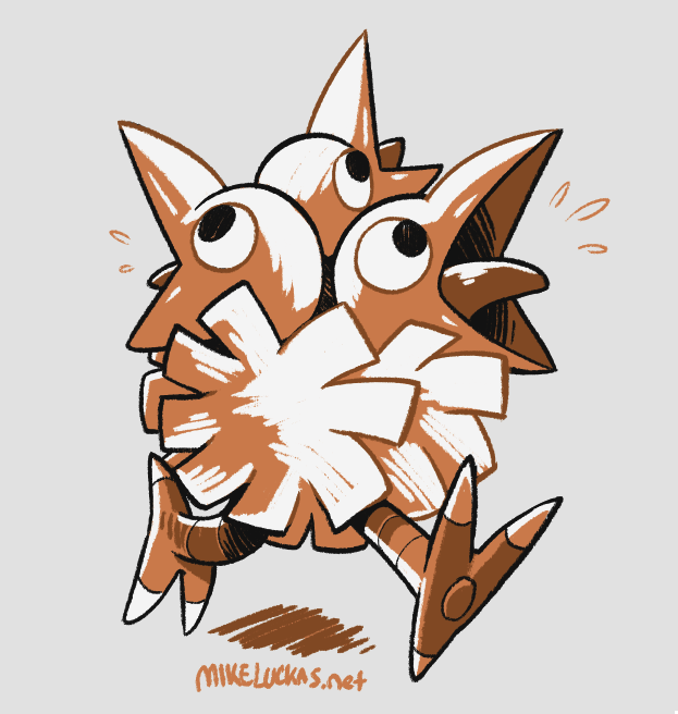
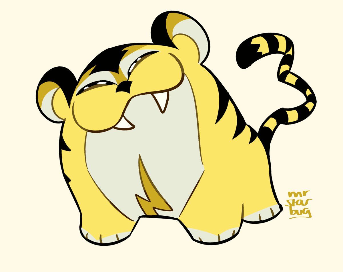
Look at this little puffball! It’s amazing! Why didn’t they use him?! Plus, he just evolves into being more excited. This demo design seems to be a sort of exaggerated electric tiger, if the lightning bolt on the stomach didn’t give it away.
Honestly, in my opinion, this is the perfect Pokemon design sensibility.
It’s based on a real world creature, but exaggerated, has a fantastical element included, and evolves into a better creature. My only complaint is that the evolution is too similar, it’s bigger and has more angular eyes, but it needed a little extra oomph to really make it a 10/10 design.
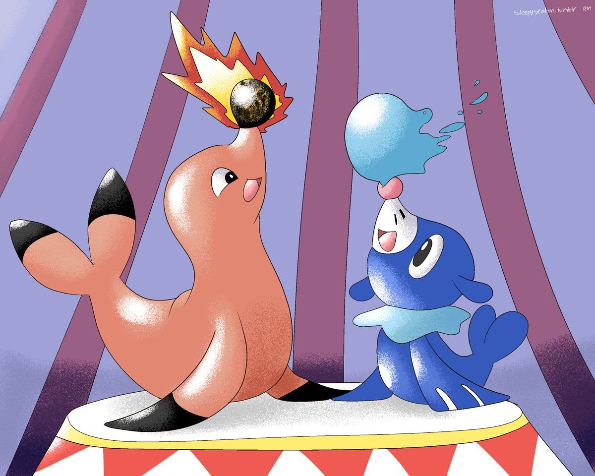
10 Bomshikar The Water/Fire Circus Seal
Seals are ocean creatures, right? Now, what’s the opposite of water? That’s right, fire. The opposite of Ocean? Lava maybe? That’s about as far as this design idea went for this cute little lava seal. And honestly, I don’t mind.
It’s literally just a seal balancing a little ball of cooled magma on its nose.
It’s among the most basic Pokémon designs like growlithe, farfetched, and Ducklett. But, people love those 3 Pokémon, they’re basically just normal animals, but with a slight kick. And giving a seal a ball of burning lava to play with? Just the kick it needed.
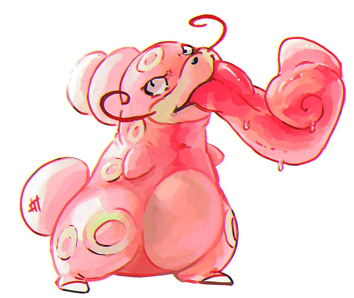
9 Lickitung Evolution Has A Weird Nameru
I’ll be honest and straightforward here. Lickilicky is my absolute favorite Pokémon, it’s a normal type that looks great and kicks behind. I know it’s an odd favorite to have but there it is. Now among these released designs, there’s a design for an evolution to Lickitung.
Even with my favorite being Lickilicky, I’ve got to say, this design is so fun.
Lickitung was already a weird design, but they just went extra absurd with it. I don’t have much more to say other than look at that mustache. If Lickilicky had that mustache, it would be a 10/10 design.
8 En, Sui, and Rai, Little Legendary Puppers
The legendary dogs are probably the most memorable Legendaries out of all of them, other than maybe Mew and Mewtwo.
Everyone remembers the 3rd Pokémon movie with Entei, the crystal game all about Suicune, and well, Raikou’s there too.
But originally they were much more, well, dog-like. These demo designs showed that the majestic legendary canines were much more puppy-like. These remind me a bit of Pansage, Pansear, and Panpour from X & Y. They’re essentially dogs with a bit of their element sprinkled in. I hate having legendary’s in my party, but these ones I’d allow.
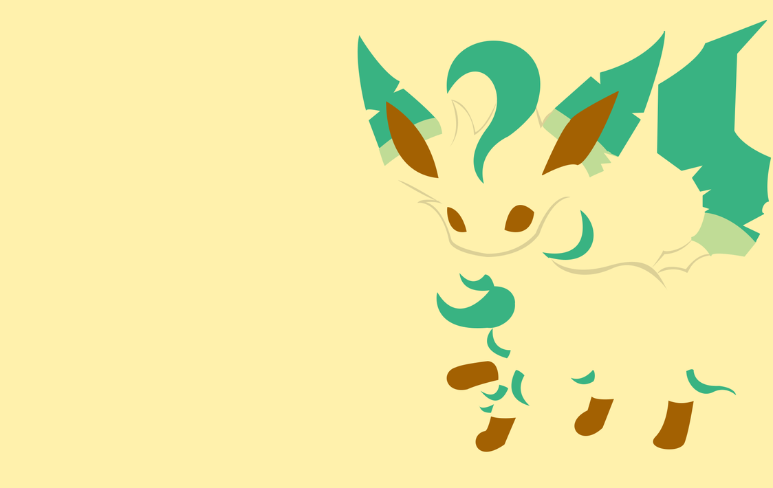
7 Leafeon Two Generation’s Early
Art by PokeTrainerManro on Deviantart
Now this one is really cool factoid-wise.
This is literally just Leafeon 2 generations early.
For those who don’t remember, Leafeon is an Eevee evolution that was introduced in Generation 4 along with Glaceon. Leafeon is my favorite Eeveelution and I’m sad I didn’t get it sooner. Just from a glance, I can guess they held off on using the design because they had Umbreon and Espeon who were perfect poster Pokémon for the Day & Night system the Gold and Silver games introduced. Plus, Leafy is just the most creative name I’ve ever heard.
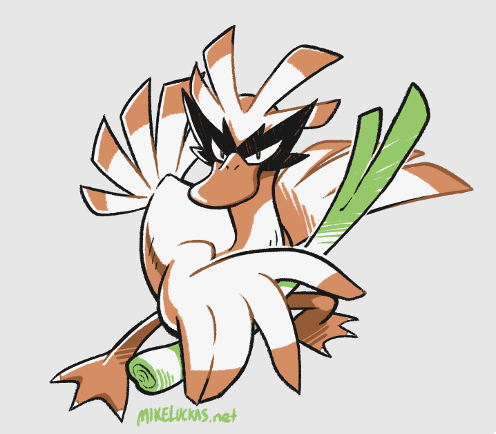
6 The Name Madame Is a Bit Farfetch’d
When I was little, and Red and Blue were the only games, my favorite was Farfetch’d. He was a silly duck who had nothing special but a leek in his hands and that’s kinda why I loved him.
He didn’t evolve and he wasn’t very good stat-wise but now I find out he could have been some great big beautiful swan?! Life’s not fair.
In all seriousness this design is slick and I love the little party mask. Obviously, they repurposed this design in later generations for Ducklett and Swana but Farfetch’d deserved it more.


