A major problem many long-time Pokémon fans had with the release of Sword and Shield was the apparent lack of graphical quality compared to many other Switch games at the time. While the mainline Pokémon series has never really had jaw-dropping graphics when compared to other games of its time, it seemed like the move away from a handheld console was the right time to change that.
There are some clear examples of the games having poor graphics, as shown in many screenshots of the original trailers for Sword and Shield. However, it is not consistently bad, and there are many examples that the quality has improved significantly since Sun and Moon.
10 Good Graphics: Hyper Beam

A lot of pressure was put on Game Freak when they claimed that the lack of a full Pokédex was the result of wanting to make quality animations and graphics, which many fans contested the legitimacy of. There are many moves out there with terrible graphics and animations, but one that stands out as still being amazing is the Hyper Beam animation. Compared to the likes of Double Kick, which has barely any animation to speak of, Hyper Beam might as well have come from another game with how awesome it looks.
9 Bad Graphics: Those Trees

One of the clearest examples of the generation eight games having bad graphics comes in the Wild Area, particularly with the larger models like the trees. For a while around the release of Sword and Shield, there were images circulating the internet comparing these trees to those from Ocarina of Time, and it's not hard to see why. Considering how Game Freak split up their development team so they could make Little Town Hero at the same time as Pokémon, a game whose overworld looks significantly better, it seems like maybe that wasn't such a good idea.
8 Good Graphics: Signature Moves

Time and resources may have been cut back on certain aspects of Sword and Shield's but one thing that looks great compared to many other moves are the signature moves, particularly those of the Galar starters and Eternatus.
Signature moves have, in recent years, generally looked great compared to more widely accessible attacks, but the degree of separation between these moves in generation eight is, unfortunately, a lot more noticeable.
7 Bad Graphics: The Grass

Like the trees that are comparable to games from the early 90's, the grass in Sword and Shield doesn't really hold up. It's entirely flat and lifeless, with only tiny sections that stand out to make it look a little less bland and is a quality one would expect from a GameCube game rather than a Switch game. Considering the Switch is capable of running games of high graphical quality like The Witcher 3 and, more recently, Crysis, there isn't a good excuse for how barebones this makes the overworld look.
6 Good Graphics: Ballonlea

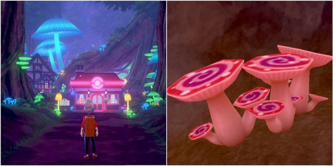
Many of the cities in Sword and Shield are pretty barren, with even the larger main hubs being nothing more than dull, brown brickwork, and a handful of colorful signposts to liven things up. Ballonlea, on the other hand, looks like it came from an entirely different game. Embracing the vibrant and spooky aspects of Glimwood Tangle, this small town looks like it would fit in more with a high fantasy game rather than the sci-fi-lite world of Pokémon.
5 Bad Graphics: The Water

Like the grass and trees, the water effects here are just plain bad. They are, in essence, a re-skinned version of the grass with very little in the way of making it seem like players are actually riding on water. There are even sections of the Isle of Armor where water flows downhill, seemingly from nowhere, and players are able to ride up it as if it were a normal grassy hill. In 2020, there's no reason why water effects should look this bad, even in a series that isn't known for its graphics.
4 Good Graphics: Dance Animation

Possibly the strangest, or at least the most unnecessary addition to the game, was the spinning dance animation which only really serves to evolve Milcery into Alcremie. It may only serve the one purpose and will only entertain players for a minute or so, but it's hard to argue against how good it looks.
For the most part, the characters in Pokémon are pretty bland and lacking any sort of emotions, sometimes making for some creepy cutscenes that focus on the player's face. However, this could possibly be the start of seeing some more expressive character models that haven't been seen in Pokémon before.
3 Bad Graphics: The Buildings

It seems like any structure that should have a degree of detail in Sword and Shield instead looks decidedly flat. While nowhere near as bad as the Nintendo 64 trees or the world's flattest grass, it's noticeable enough when focusing on it to see just how little effort was put into certain graphics. The ruins and, in particular, Glimwood Tangle, look so much better than any of the manmade buildings that it's hard to believe they came from the same game.
2 Good Graphics: Title Screen

It may be basic compared to the previous title screens, but you can't argue that it looks fantastic when compared to the rest of the game. The stadium itself is vibrant and dynamically lit, in contrast to the rather dull looking interior of the stadium in the actual gameplay. This isn't something players are likely to notice right away when playing the game, as they are more likely to be focusing on the battle that what the background looks like, so it's a shame that this couldn't have been what the stadiums actually look like from the inside.
1 Bad Graphics: Max Mushrooms

One of the most recent addition to the game which came with the Isle of Armor DLC was the Max Mushroom, which either gives or removes the Gigantamax form from a Pokémon that is eligible. It seems like Game Freak didn't spend much time on the design of these items, however, as they are weirdly flat and uninspired when viewed up close, and look as though they were scaled up to make them easier to see.