Here, right - what’s up with the state of contemporary console UI? I don’t mean to be disrespectful, and I can appreciate the immense effort both UI and UX designers go to in order to create a slick new look that screams “this is next-gen” as if they’re Leonidas punting loads of PS4s into a giant pit of death. But seriously - why is everything so loud and complex? Isn’t the integration of user experience and user interface supposed to facilitate easy, breezy functionality?
I love my Xbox Series X, but it’s just so unintuitive. Yes, I see the Game Pass icon, and yes, the Microsoft Store is over there on the right. Quick Resume is great, and I like that the first thing that comes up when I press the home button is a list of the games I’m currently running. But why are screenshots locked behind a million button presses? Why are there so many extra tabs that I’m never going to use, all of which could be included in one tab on a general settings menu that expands if I ever want to open it? Why are the squares and rectangles all different sizes? And why do the colors make me want to shut my eyes as if I’ve just been smacked in the face with a flashbang?
I already knew I didn’t like the snazzy new UI of the PS5 and Xbox Series X, but I didn’t care about it all that much either. Yeah, it’s ugly, but lots of games software stuff is perpetually suspended in that weird limbo between hi-tech digital infrastructure and “actually this looks like a discolored lava lamp.” It wasn’t until I started playing Modern Warfare 2 yesterday - yes, the 12-year-old game with Highrise and Terminal, which is still the best multiplayer shooter ever - that I thought, “Hang on - this is even worse than I thought.”

Modern Warfare 2 was remastered last year, but only partially. While you can play through the campaign with enhanced textures and improved resolution, the multiplayer element of the game - arguably its defining factor - was left on the cutting floor. So, when my pals asked me to play some OG Domination in Modern Warfare 2 last night, I thought, sure, let’s play the original version. As it turns out, the fact it wasn’t remastered is actually in its favor - it runs on the classic Xbox 360 UI, and my oh my, is it miles better.
The Xbox 360 UI is certainly sluggish by contemporary standards - receiving an invitation to a game and seeing it pop up at the bottom of the screen looks like it’s bugging out to my modern frame rate-attuned eyes. Still, it’s all so elegantly articulate. Sure, none of it is even remotely flashy, but that’s why the UI is able to pave the way for excellent UX, too, creating a perfect structure for strictly functional experiences. It’s so tidy and effective that it’s completely unobtrusive towards what you’re playing - even when it interrupts you by popping up mid-game, its rotating green light and incredibly brief text box make it feel more fleeting, somehow, and like less of an intrusion.
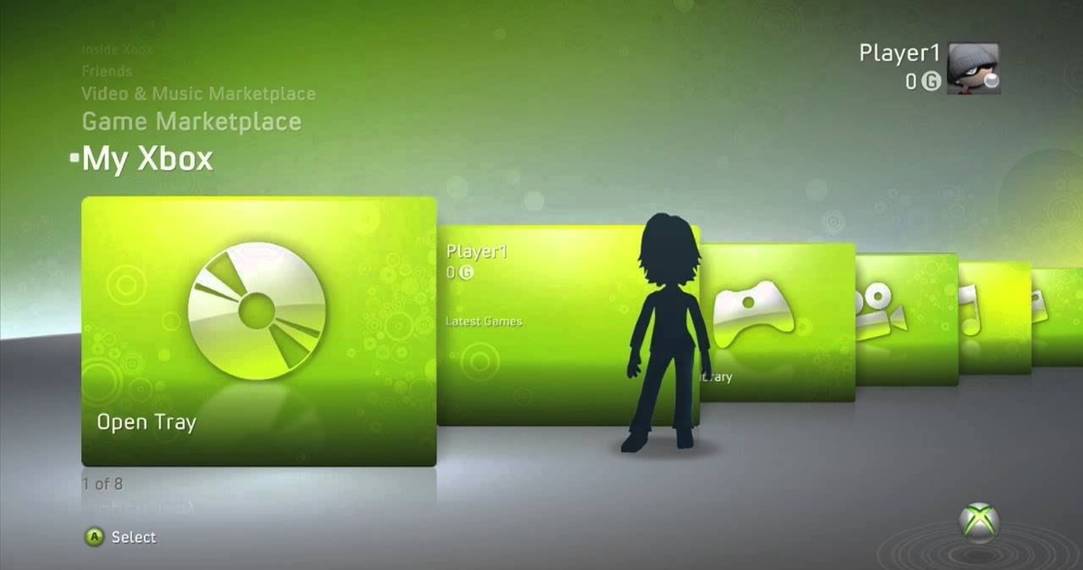
This encouraged me to go back and look at the rest of the Xbox 360’s UI, too, and as I expected, my hunch was correct. The folding cards were similar to the horizontal scroll of the PS4 now, but they were able to prioritize the featured card you were hovering over by relegating the adjacent ones to a sort of sidebar. It was focused at the expense of functionless aesthetic improvements - I would much prefer fast, effective, and dare I say mindless UI scrolling to something that looks fancy when it’s still but is an absolute pain in the arse to navigate once you actually need to use it.
Also the 360 had the best hardware design, hands down. Give me more curved columns with changeable face plates, please - and make sure you base their UI on the masterpiece that is the Xbox 360. Cheers.