When it comes to creating games consoles, most companies like to play it safe. They're almost always black, white, or something equally bland, designed to be as inconspicuous as possible. Sure, a black console might blend in seamlessly with all the other devices in your living room, but that's boring. The following consoles are proof that a splash of colour can seriously elevate the aesthetic of these devices, making them the focal point of a room rather than just another anonymous gadget.

Light Yellow PlayStation 2
In 2012, Sony celebrated producing 20 million PS2s by releasing a range of limited edition consoles it called the European Automobile Color Collection. Only 10,000 of these were made, coming in Snow White, Super Red, Astral Blue, Metallic Silver, and best of all, Light Yellow. While I love the classy, monolithic minimalism of the original black PS2, there's something incredibly aesthetically pleasing about this striking yellow variant. It reminds me of a Chris Foss spaceship.

Pearl Pink Dreamcast
The original light grey Dreamcast is one of the prettiest consoles ever made, but c'mon, look at this thing. That tasteful shade of candy floss pink is nice enough, but the subtly shiny pearlescent finish really makes it. This variant was only ever released in Japan, and could only be purchased via Dreamcast Direct, an online store operated by Sega between 1999 and 2008. Only 200 were produced, making it extremely rare. A true Dreamcast grail. There's a Pearl Blue version too, but it's not as nice as this.

Ceramic White PlayStation 3
The original PS3 is hideous, But this elegant Ceramic White model is absolutely stunning. If Sony had any sense it would have been the default colour. Only around 100,000 of them were produced, and exclusively in Japan, making them highly sought after by collectors. The Ceramic White model launched on November 11, 2007 for 40,000 yen—a reduced price reflecting the fact the PS2 backwards compatibility was removed. It's wild how much better this looks than the base model.

Spice Orange GameCube
The GameCube is design perfection. Chunky, practical, and fun. A console for playing games on, not looking pretty under a TV. Nintendo released quite a few colour variants during its lifespan, but nothing beats Spice Orange. It was only available in South Korea and Japan, but it's arguably the peak of the console's aesthetic. That vibrant, slightly fluorescent orange is a delight for the eyes, and perfectly captures the spirit of the console. Spice orange really should have become a Nintendo standard.

20th Anniversary PlayStation 4
In 2014, Sony released a 20th anniversary edition PS4 with a colour scheme inspired by the original '90s PlayStation. The combination of that classic PS logo, the muted grey finish, and the aluminium 20th anniversary badge makes this one of Sony's prettiest consoles. Get up close and you can see a subtle etched pattern made up of the PlayStation X, circle, square, and triangle symbols repeating across the console. Sony only made 12,300 of them, and I'm still annoyed I didn't try and get one at the time.

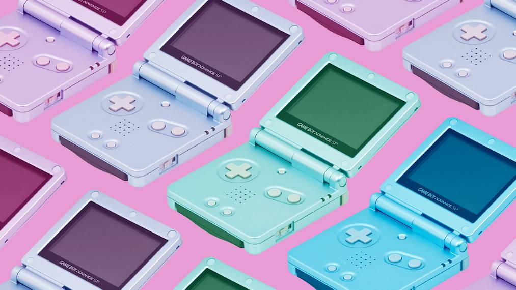
Pearl Blue Game Boy Advance SP
I love the GBA SP. This stylish clamshell handheld launched in 2003 in Platinum Silver and Cobalt Blue, which were nice enough, if a little cheap looking. Then Nintendo went wild with the limited edition colours, peaking with this classy Pearl Blue variant. Like the Pearl Pink Dreamcast, it has a premium-looking pearlescent finish that becomes visible when the light catches it. This model also had a more powerful backlight. If you want one, there are always a few floating around on eBay.

Black Wii
The standard Wii's white colouring was all part of its approachable, family friendly vibe. It didn't look like a piece of oh-so-serious tech; it looked fun and non-threatening. Nintendo also released a black model, presumably aimed at people who were insecure about owning a console that didn't look like a console. But I gotta admit, I love it. I've always been a fan of the Wii's wedge shape, and I think the black variant makes that silhouette look even better. It offsets the sci-fi glow of the disc slot nicely too.

Pearl White PSP Go
When the PSP Go launched 13 years ago, people weren't ready for a digital only console. This discless model of Sony's handheld sold terribly as a result, but it's a supremely elegant, beautiful little console. The glossy finish, the tactile click of the sliding screen, and its dainty size make it an aesthetic delight. The default Piano Black version is lovely, but as was the case with the original PSP, the Pearl White variant is on a whole other level aesthetically. The Go is peak handheld console design.