When Nintendo started out in the gaming industry many who had already established themselves doubted the company's ability to have any sort of staying power. This was understandable given the lack of experience that the company had, but soon they put the world on notice when they unveiled the Nintendo Entertainment System to the masses. It was an instant success and gave Nintendo the confidence it needed to continue on with the path it had laid out for itself. They had given young programmers a chance and, in turn, these same individuals stuck with the company, even when they were being pulled away with lucrative offers from competitors. It was a good thing too, because Nintendo knew that in a few short years it would have to produce another console or risk losing the consumers that it had just gained.
They wanted to create a console that was gamer friendly, but still in tune with what made their first full-fledged system a success. The company not only upgraded the hardware and software, but they also gave the Super Nintendo some of the best controllers ever created. What followed was a laundry list of great franchises and a whole host of new titles that made their mark thanks to the console. This continued success saw many fans of the system create their own games and some went so far as to completely redesign the system in their own way. We'll take a look at some fantastic re-works of the SNES, along with a few that seemed to miss the mark a bit.
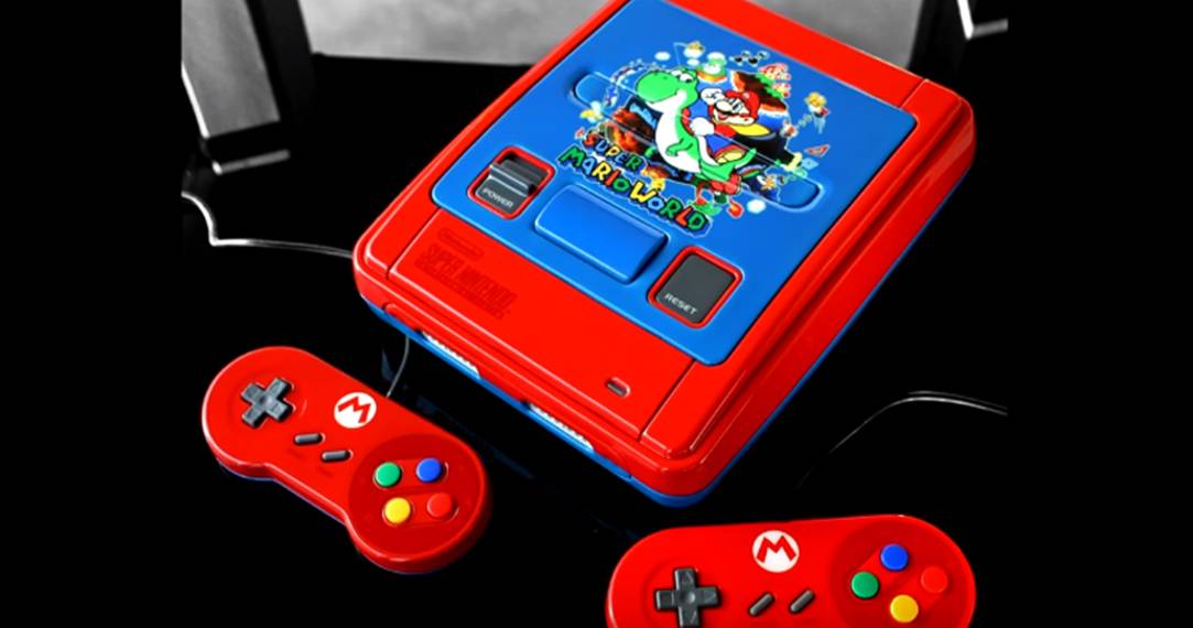
27 Lame: Plumber Problem

When I was looking at this particular design I knew that I recognized it from somewhere, but I couldn't exactly put my finger on it. Ironically, while thinking of that turn of phrase I was able to finally nail down where I saw something like this before. It was during the Mario 64 loading screen.
If you've ever played Super Mario 64 you no doubt know exactly what I am talking about and you probably spent countless hours messing around with Mario's face just as I did. As much as I enjoyed the feature, I don't think that placing it on a Super Nintendo was perhaps the best choice.
26 Dope: Into The Vastness Of Space

Even if I lose a few of my memories with old age, it isn't likely that I will ever forget where the phrase "Do a barrel roll" came from. After all, even for those who aren't exactly fans of the franchise, it's a saying that resonates to this day.
Many of the features present in Star Fox 64 were originally introduced in Star Fox 2.
I've been disappointed with the direction that the franchise has taken of late, but I am hopeful that Nintendo will get it on the right track once again. In the meantime, I'm going to add this custom variation to my long list of must haves.
25 Lame: Sorry To Burst Your Bubble

There is some sort of fascination with the use of paint spackle with art pieces and while it can certainly help bring the stars within space pictures to life, if you are not careful it can look like chipped paint. In looking at this next design, it's a bit of a shame because I think that had they not used such a technique with white paint, it would be one of the better-designed consoles on this list.
The color scheme selection is top notch and you can tell that the artist spent a lot of time deciding which shades of paint to use. I really like the way that they go from one color to the next and they do a fantastic job of blending things together. The white paint, however, ruins this by making it look as if the paint has chipped.
24 Dope: An Iconic Platformer

I recently picked up a copy of Castlevania: Lament of Innocence for the PlayStation 2 and after coming across this I am really itching to play it once more. For a long time I heard about how hard the NES version of the game was, but it wasn't until I purchased it for the NES that I really understood what people meant.
Like many NES platformers, it's not just the fact that you are defeated so quickly, but the fact that you have to be so precise with the controller to find success. While I came across more than a few designs related to the game, I felt that this one captured every element from the game in a fantastic way. I mean come on, the skull and bones are fantastically placed and it looks like something out of the medieval.
23 Lame: The Alien Mess

If you've never had the pleasure of playing Contra on any system, I strongly encourage you to do so. There are very few games on the planet where you get the heck kicked out of you and think to yourself, that was fun, I should do it again.
You might be thinking that I am exaggerating a bit here, but ask anyone you know who has played it before and they will tell you the same thing. It's as if the designers went out of their way to frustrate you and yet, it is still an enjoyable experience through and through. The artist behind this Contra-inspired design picked the correct colors, but they took a lot away from it when they added the random spatter.
22 Dope: Clearly Awesome
Through making a list like this one, you are bound to come across a few designs that you wish were mass produced by the company themselves. I imagine, like me, that this next one will be on the top of your list when it comes to that.
Creating a see-through system is certainly nothing new and game companies have been doing so ever since they decided to introduced limited edition consoles. With that being said, I think that had Nintendo created a see-through system like this one for the SNES it would be one of the most sought-after systems of all time.
21 Lame: Orange Overload

Don't get me wrong, orange can be a great color if used in the right way, but it just seems like this artist went a little overboard. Granted, I am rather impressed with the fact that they used so many different shades of orange in the design, but that's pretty much where my praise for it ends.
While the use of orange fits with Metroid, without the presence of Samus you really wouldn't know the theme.
I would have liked to see some added images on the console to help to bring it together. If there were a few more elements from the game placed around the console and if Samus was placed around them in a way that was customary with the games, I think this design would have turned out very well.
20 Dope: Green With Envy

Yoshi is one of those characters that we might not have had the chance to enjoy had it not been for Miyamoto's insistence that it be included in the Mario Franchise. In fact, Yoshi creator Shigefumi Hino got his inspiration for the character from the green dragon found in Miyamoto's Devil World.
It would take some five years before we had the chance to see Yoshi in action though, as it wouldn't be until the Super NES that graphical hardware would be advanced enough to allow it. This custom Yoshi inspired console does the character justice, making great use of the green background to superimpose that ever-iconic egg.
19 Lame: 8-bit Paint Job

Despite how effortless Bob Ross made painting look, it isn't easy. Thinking of an image is one thing, putting it onto a canvas is quite another. Even when you have a good idea of what you want to create and a good amount of source material to draw from, things don't always go as planned.
Selecting the right paint is key to getting the result you want.
If you don't choose the right paint, you will end up with something like we see above. You have to paint quickly on plastic before it dries and if you are adding multiple layers you have to be sure to use a paint that won't cause the sort of setting issues we see here.
18 Dope: Simply Fantastic

You may or may not like RPGs, but I'd be willing to bet that you've played at least one Final Fantasy game in your life. It's a franchise that has lasted over three decades and has seen its fair share of changes along the way, some good, and some bad. Like any good game company, Square has continued to challenge itself and introduce us to unique titles.
Sure, they haven't all be great, but there aren't too many that have been downright horrible either. That's hard to do over such a long period of time and speaks volumes about their dedication and hard work. The color scheme of white and black brings back memories of old and I really like the Chocobo button.
17 Lame: Far From Legendary

If you asked someone to create a Zelda theme for your console you would probably be taken back a bit if they didn't include the Triforce somewhere within the design. After all, it is synonymous with the franchise and its what the whole story revolves around. Putting all that aside, I don't think that the system above would be what you had in mind.
Originally, the Triforce was going to be three computer chips.
As iconic as the symbol is, I think the artist behind this design went a little bit overboard. Not only that, but the Triforce seems like it is forced into being a part of the design rather than being worked in.
16 Dope: Right On Time

Given how expensive the game is as of now, you probably aren't too surprised by the fact that I have never actually played the game in its cartridge form. It wasn't until I got a Nintendo Wii and I was able to download the digital version from the Nintendo store, that I finally sat down to play it.
The rise in cost for the game is in large part due to being able to play it with multiple players.
At the time and even now, there aren't too many RPGs that allow you to play with a friend, but Chrono Trigger was different in that it allowed two players to control a character at the same time. If I ever do manage to come across the cartridge version of the game, I think I'll invest in a console like this one too.
15 Lame: Spilled Paint

In looking at various custom consoles I often wonder if some of the artists really planned things out before they went about changing their consoles. In some cases, you can easily take the paint back off if you make a mistake, but in this case, it probably wouldn't be the best thing for the console itself.
It's not that blue and red can't go together at any point, but I can't honestly say that these two particular shades fit well. If the artist had brought in some sort of theme with these two colors I think it would have ended up being a decent customization, but as it stands, it simply looks like an unfinished design. Or, you know, an off-brand Spider-Man.
14 Dope: Prime Time

Nintendo has introduced us to many iconic characters over the years and Samus is certainly one of them. While the Metroid franchise has had its ups and downs over the years, it's not likely that the series will end anytime soon.
The choice to make Samus a female wasn't decided until the game was midway through development.
It was a decision that Nintendo was uneasy with, but one that they wouldn't regret. The rest, as they say, is history. It's thanks to her immense popularity that we get treated to great works of art like this Metroid inspired SNES. The only downside to this design is the symbol on the controller, but overall it is beyond impressive.
13 Lame: Perplexing Purple

I've always felt that game companies should give you the opportunity to design the outside of your console. After all, you are paying a lot of good money to get your hands on one. I'm not saying that they should offer this up front before you buy it, but I think it would be nice to be able to pay a little extra and have the company themselves design it for you.
Whether we will ever reach that point remains to be seen, but with both Sony and Microsoft offering options in the form of customized controllers, it is certainly not out of the realm of possibility. While the paint job is done well on this entry, there isn't really much else to be impressed by here.
12 Dope: Off To The Races

Ah, Mario Kart, a game that I will never get tired of playing for as long as I live. I've played many titles within the franchise, but there is just something about Super Mario Kart that makes it stand alone to this very day. I can still remember those days when I would have button outlines on my fingers from using the d-pad and the a and b buttons respectfully for hours.
Rainbow Road was considered by many to be one of the hardest courses ever created.
I certainly side with this notion as well, considering that I fell off of the road on that course more often than any other. This particular design might not be as flashy as others on this list, but it was hard not to place it on here given that the lettering placed on it matches so well with what is found within the game.
11 Lame: Crashing To Earth

EarthBound was one of those games that really pushed the envelope of what was thought of as possible with the SNES. Not only that, but it introduced the world to an RPG that was unlike anything else the gaming industry had seen at that point in time.
It has become one of the rarer titles for the system since its inception.
Getting a hold of a copy is easier said than done these days, but it won't be long before fans the world over are able to enjoy it in digital form thanks to Nintendo. Until then, fans continue to show their love for the title through all sorts of artwork. This EarthBound inspired console has the right color scheme, but it lacks any real detail work at all.
10 Dope: Magnificent Mega Man

You'd probably be hard pressed to find many gamers who haven't at least played a few Mega Man games in their lifetime. Sure, there were installments that left a lot to be desired, but that isn't to say that they were categorically bad. Even when you grew frustrated with the game at times, the soundtrack would draw you back in and make you want to give it another go.
While you will find a decent amount of custom consoles out their paying homage to the franchise, you won't find too many that showcase the character as well as romd_83 does here. They are able to add depth and detail to the character and console through the usage of a wide variety of blues and the color change on the cartridge slot is a nice touch.
9 Lame: Starlight Too Bright

I used to play Super Mario All-Stars all the time and I really miss having it for the Super Nintendo. I'm not sure what happened to my copy of the game, but it's one of those titles that I would like to have again. Despite my love for the game, I can't bring myself to like this particular design.
No, it's not the worst design I've come across on my search for custom consoles, far from it, but the usage of stars really makes it look tacky. I don't know why, but it reminds me of those old star stickers you used to get when you were in Kindergarten for doing a good job.
8 Dope: King Of The Jungle

When Donkey Kong was introduced to the world along with Mario as Jumpman in the arcade, I don't think that Miyamoto ever imagined that he too would become a commercial success just like Mario. Both characters have undergone a lot of changes since then and while we haven't seen a standalone Donkey Kong game for some time now, chances are Nintendo will be releasing another one very soon.
Given that the company has released a few consoles and controllers inspired by him, it really isn't a surprise that artists have started to do the same with every Nintendo system. I saw a few SNES variations on my way to making this list, but this one really caught my eye due to the presence of the bananas and in-game lettering.