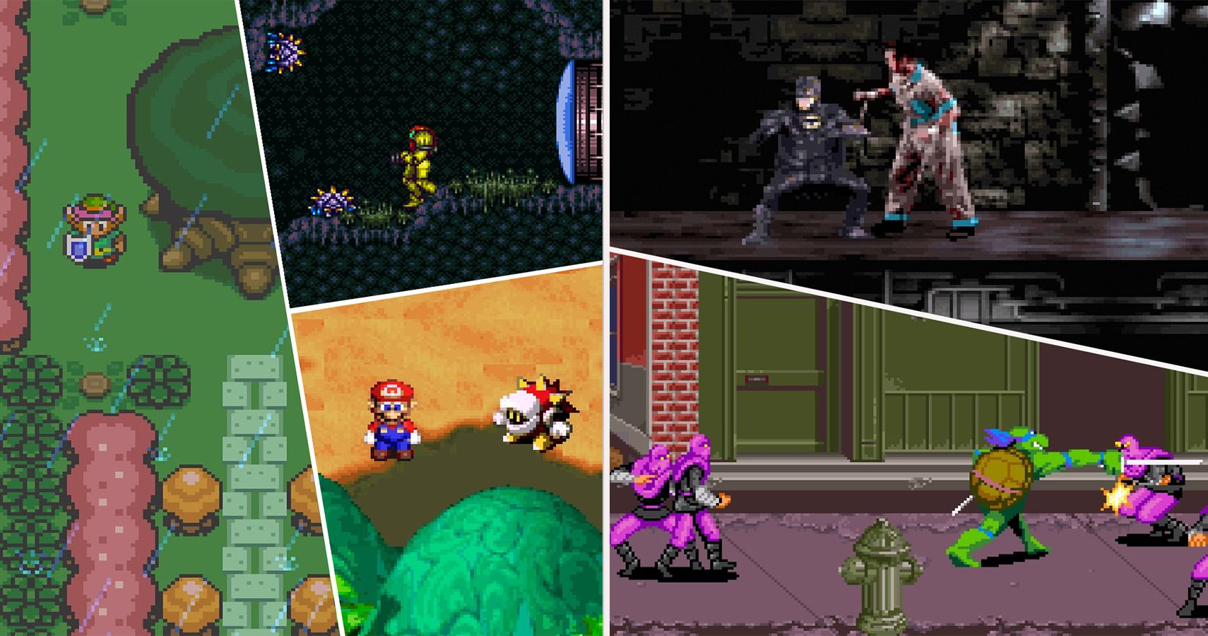
When it comes to choosing my favorite console, it gets pretty hard to decide. I have so many memories with all of them both good and bad. In terms of a system that changed my life, well, it has to be the Super Nintendo. I can still remember coming home from Kindergarten and opening up this as my Birthday present. It came with Super Mario World and a mail-in coupon to get Super Mario All-Stars, which my parents were savvy enough to do before I opened up the console. This was the first system I could call my own and it was a fantastic feeling.
While I think there have been some great strides in graphics since, obviously, to me, the SNES was the pinnacle of pixel art. That’s why so many games still hold up on a visual level. Not all games were created equally though. I sat down and thought hard about these games on both sides of the line and it was a lot harder than I thought especially since I tried to limit myself to selecting only one game from a series. I didn’t want to talk about Final Fantasy II and Final Fantasy III for example. That said Mario did make it on here a lot so I’m not perfect. Point is some of my favorite games look pretty cruddy nowadays, which was a difficult truth to swallow. So follow me on this journey through the best and worst graphics found on the good old Super Nintendo.
30 Amazing: Yoshi’s Island
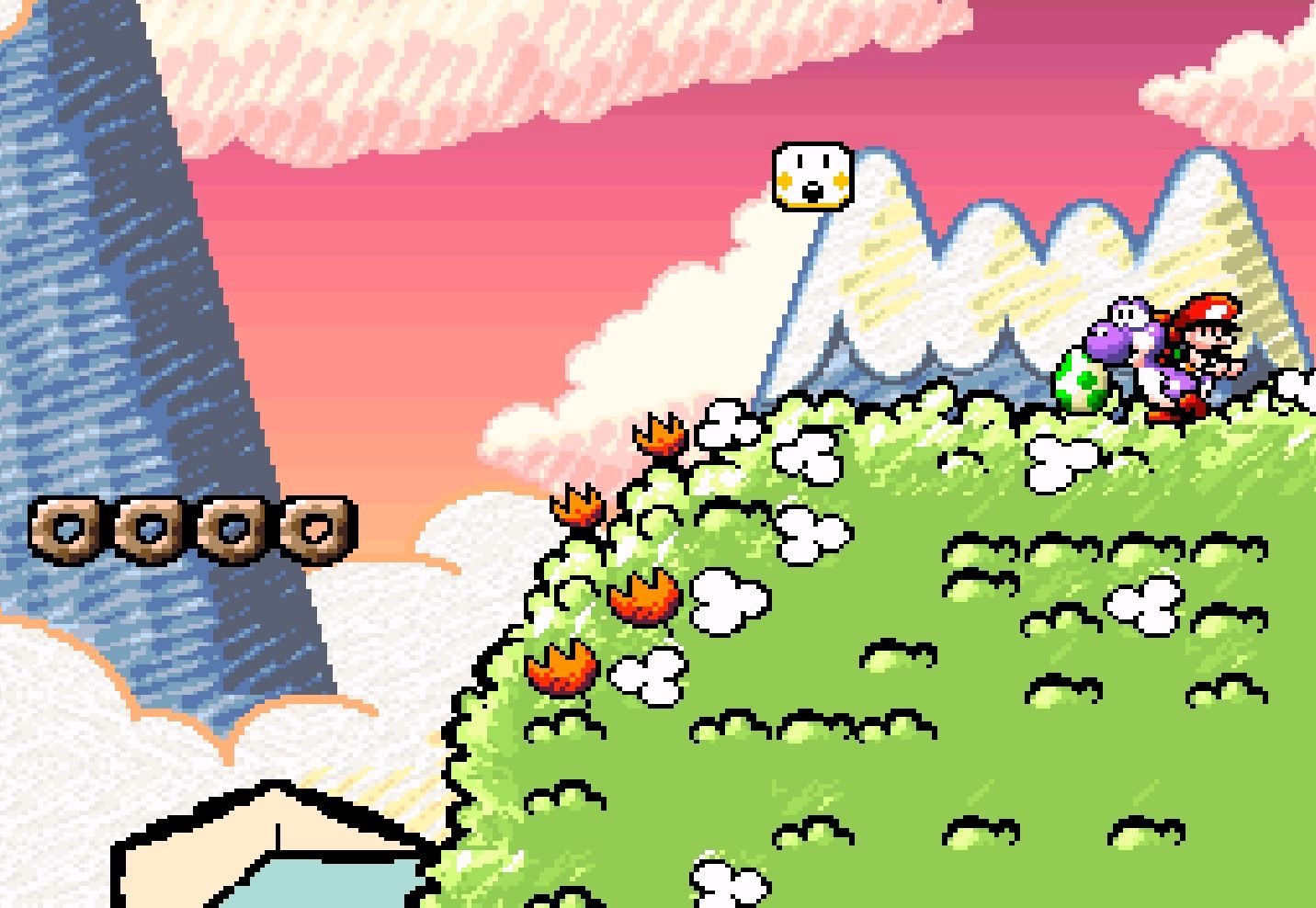
Super Mario World still looks fantastic and is probably my favorite game in the franchise, but its sequel, Yoshi’s Island, definitely has a more distinct visual style. It holds up incredibly well. You wouldn’t think a crayon aesthetic could work after a game like Donkey Kong Country came out. Actually, funny story, this was planned to adopt that graphical faux 3D style, which you can still see remnants of in the beginning cutscene. Thankfully the team negated that push and went whimsical instead.
29 Bad: Pilotwings
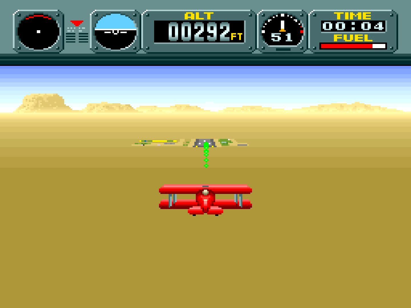
Pilotwings? What even is that? I know it is kind of a forgotten series that barely got off the ground, ha, at Nintendo. It was meant to showcase the Super Nintendo’s graphical capabilities. I still remember being amazed by my cousin playing it, jumping out of a plane into what I thought was the most realistic 3D landscape a 2D console could render. Going back to it now, well, let’s just say I feel pretty silly for thinking those things now.
28 Amazing: Chrono Trigger
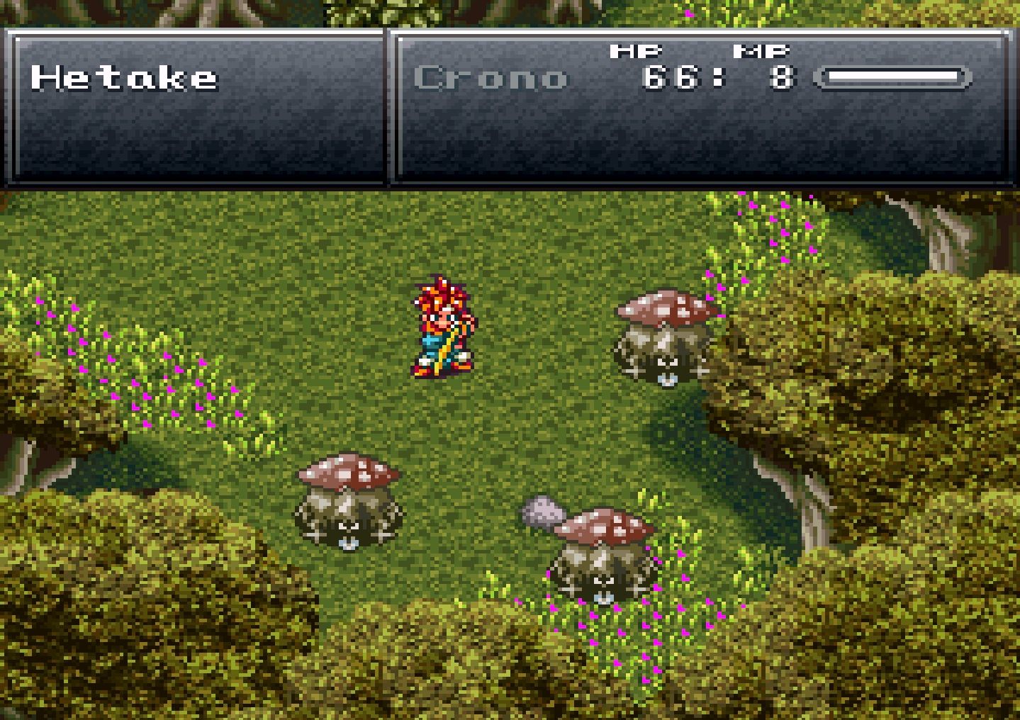
Pixel for pixel, I don’t think there is a better game on the Super Nintendo. It is the pinnacle of sprite art for the system and one that Squaresoft perfected to a fine point. Sure, Final Fantasy III also looks great, but compared to this it looks less amazing. I mean it doesn’t hurt that everything about the game is perfect from the story to the characters to the music to the gameplay and I could segue on and on. The point is Chrono Trigger is a masterpiece.
27 Bad: Star Fox
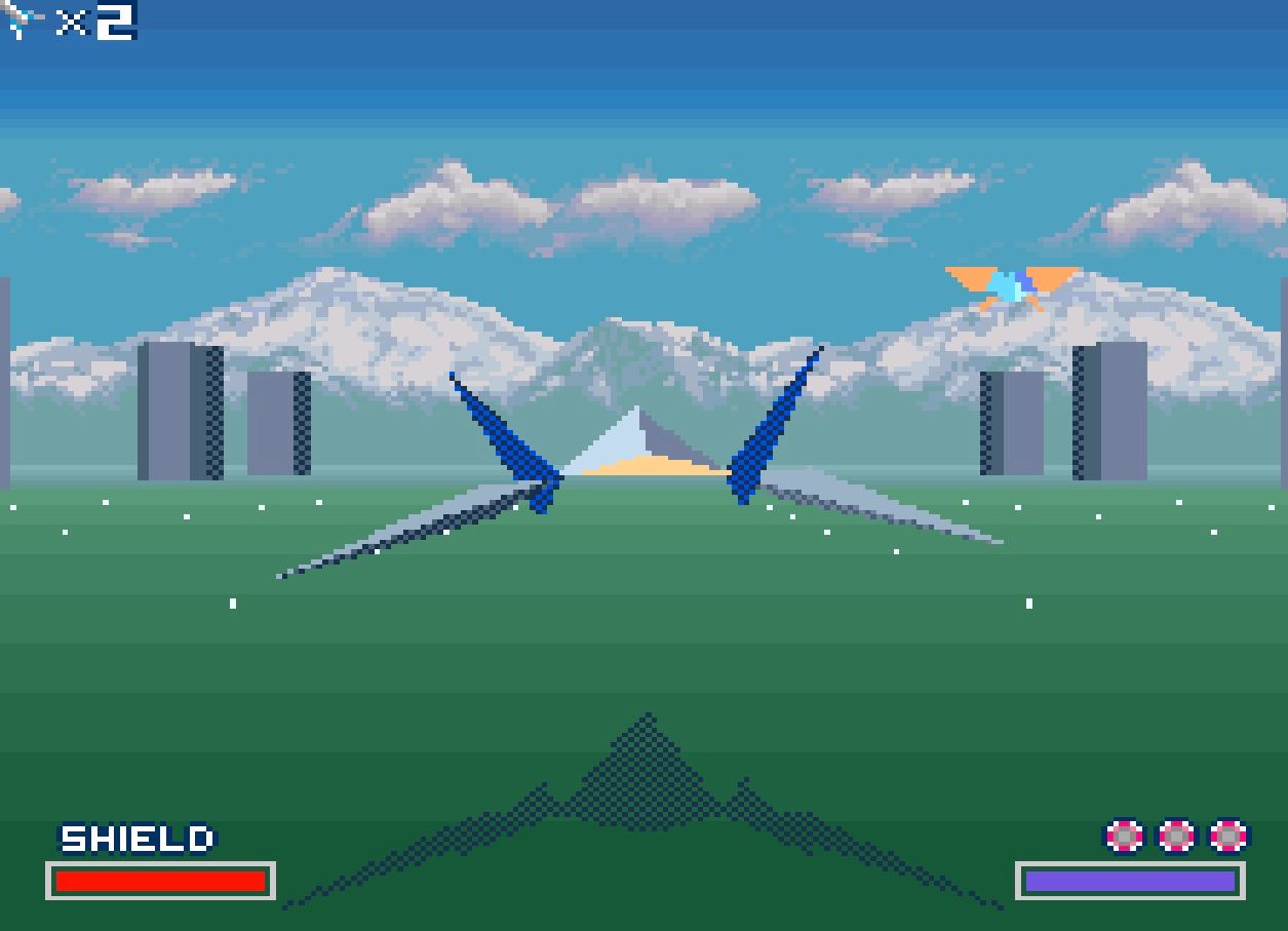
Another game that was celebrated at the time for pushing the graphical capabilities of the 16-Bit era was Star Fox. Here is the thing with that though. I never thought it looked good. Sure, call me a hipster child, but it is true. I had no concept of what a frame rate was at the time, but I knew it ran a bit choppy. Not to mention the ugly aesthetic of a bunch of triangles flying around each other. I couldn’t have been less wowed.
26 Amazing: Kirby's Dream Land 3
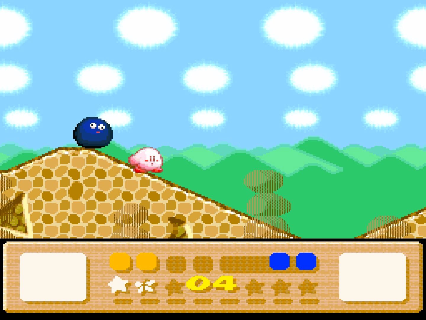
Kirby Super Star was my jam back in the day. While I still think it is great now, there is something about the visuals I don’t like. They kind of look like plastic if that makes sense. That’s why even though I think it’s a better game I went with Kirby’s Dream Land 3, which shares that crayon style found in Yoshi’s Island. It’s a lot less challenging, but it does have tons of adorable pets Kirby can befriend and who doesn’t want that?
25 Bad: Ninja Gaiden Trilogy
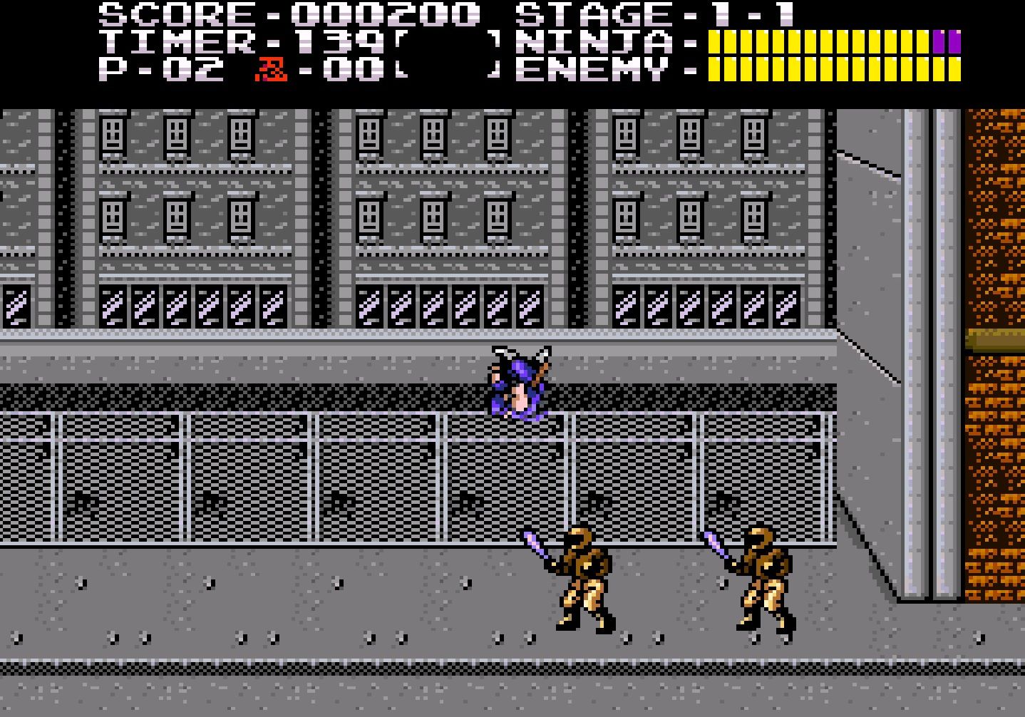
For the most part, remakes, or remasters are supposed to better than the original games, right? In the case of the Ninja Gaiden Trilogy, you could say they are better on an ease of use standpoint since they balanced the games a bit. Unfortunately, I think it looks less enticing than the NES originals. The music is also not as good. It’s a weird package all around. Now granted I do like being able to actually beat these games for a change.
24 Amazing: Super Street Fighter II
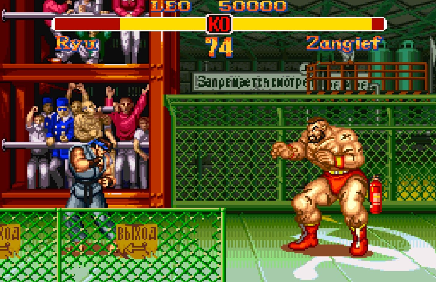
Speaking of Super Street Fighter II, well good buddy, let me apologize to you. I thought I wanted my fighting games to be visually superior and bloodier, but I was wrong. Of all the fighting games of this generation, this is the one I can easily go back to and have a good time with no matter what edition we’re talking about. For all intents and purposes this was the game that opened up the door for competitors. There were fighting games before this, but this was the one that perfected it.
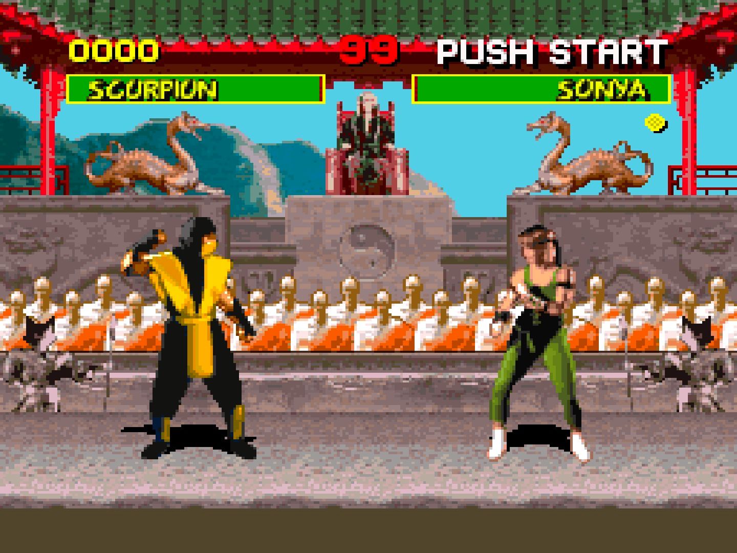
23 Bad: Mortal Kombat
Let’s keep this fighting game train going for another eye opening experience in the form of Mortal Kombat. What was better to me than 3D graphics? Real life models were put into my games. Yes, I, and collectively my generation, were fooled into thinking digitizing actors was the wave of the future. Oh how wrong we were. It is beyond ugly now. On a side note I would love to see Mortal Kombat XI pay homage to this style. That would be a baller move for DLC.
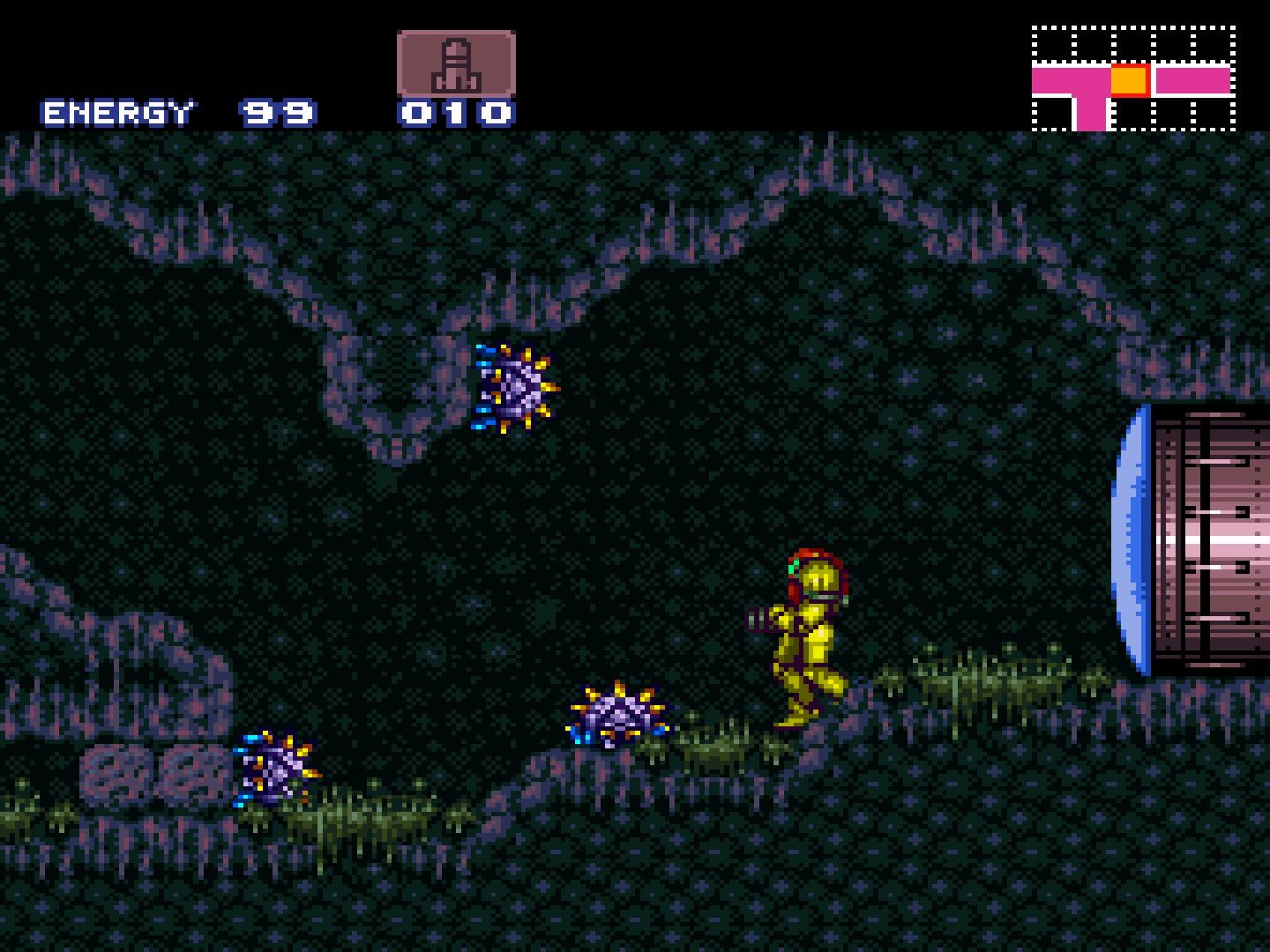
22 Amazing: Super Metroid
Hey Nintendo, I have an idea for you. Why don’t you make another 2D style Metroid game akin to Super Metroid? Why try and outdo yourselves? I know you think you hit perfection with this, which is true, and sure sales might not reflect reviews, but listen to us. Super Metroid is a gorgeous piece of art through and through. Personally I think the original’s remake is slightly better on GBA, but that’s only because it had the benefit in being able to take DNA out of Super Metroid to retroactively make itself better.
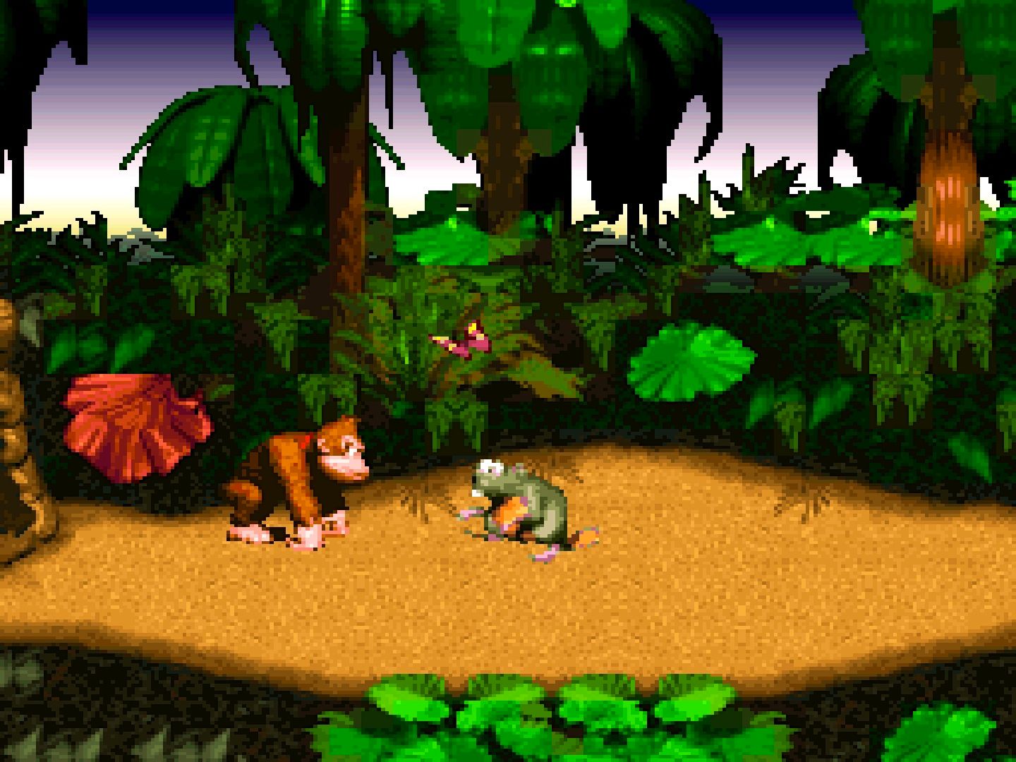
21 Bad: Donkey Kong Country
This is an example of a title that holds up with its gameplay, but not so much with its graphics. Yes, I’m talking about you Donkey Kong Country. It is truly a mesmerizing experience to recall playing this game as a kid, thinking it looked real and then to play it now. The results are obvious. It looks rough. Again, this is coming from someone who still likes the core, but the visuals are just nightmarish blobs of pixel trash pretending to be realistic.
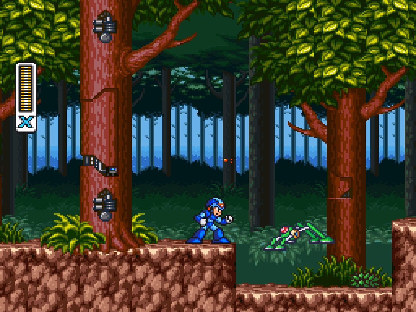
20 Amazing: Mega Man X
The jump from Mega Man 3 to Mega Man X was a world-shattering event. I know there were games after, but the third game is the last my family bought. The sentiment holds true in regard to any of Mega Man’s 8-bit adventures. Mega Man X is the prime example of how a company should evolve a franchise and not just with visuals either, which again, are truly powerful. Why can’t we get a sequel in the vein of Mega Man 9 for this sub-series? You can hear me dish some more if you’d like.
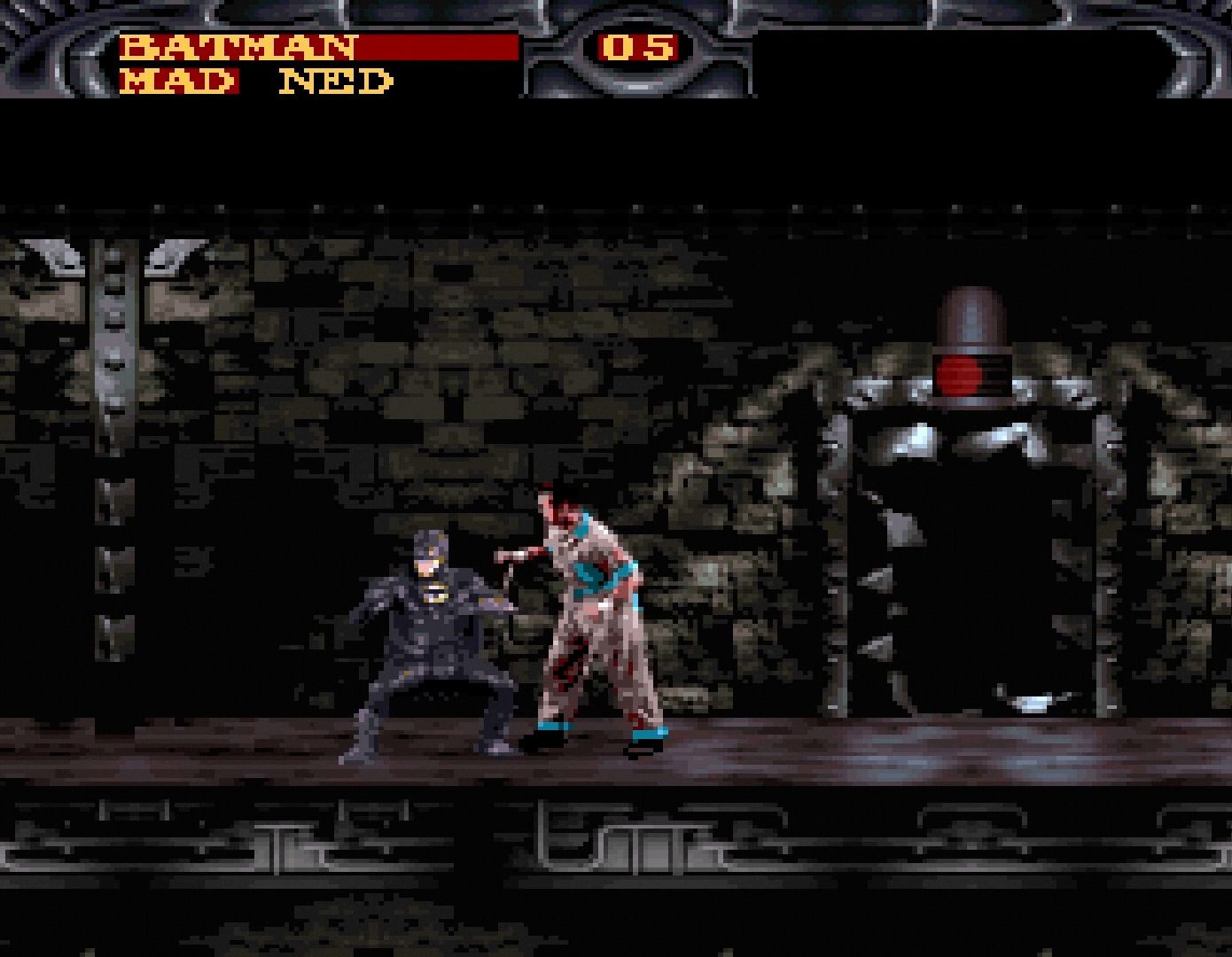
19 Bad: Batman Forever
I know what you’re thinking. Who the heck cares about Batman Forever in any regards whether it is the movie, or the game? Who even remembers it having a game? Well, I do because I rented games a lot as a kid and I ground my teeth against this one. It, like Mortal Kombat II, uses digitized actors instead of actual pixelated sprites. It also used a lot of dark backgrounds to try and mimic the film. Oh and it mimics the film all right. It nails exactly how bad it is minus the fun, zany humor.
18 Amazing: Terranigma
Terranigma is sadly a missing gem for those living in North America. That said it did launch in Europe after Japan meaning there is an official English translation. You just need the right cartridge. Anyway I don’t know why it was never brought over here because it’s another amazing action RPG. It looks on par with Secret of Mana, or maybe even better. If I had to remark on something I will say the environments are a bit drabber by comparison.
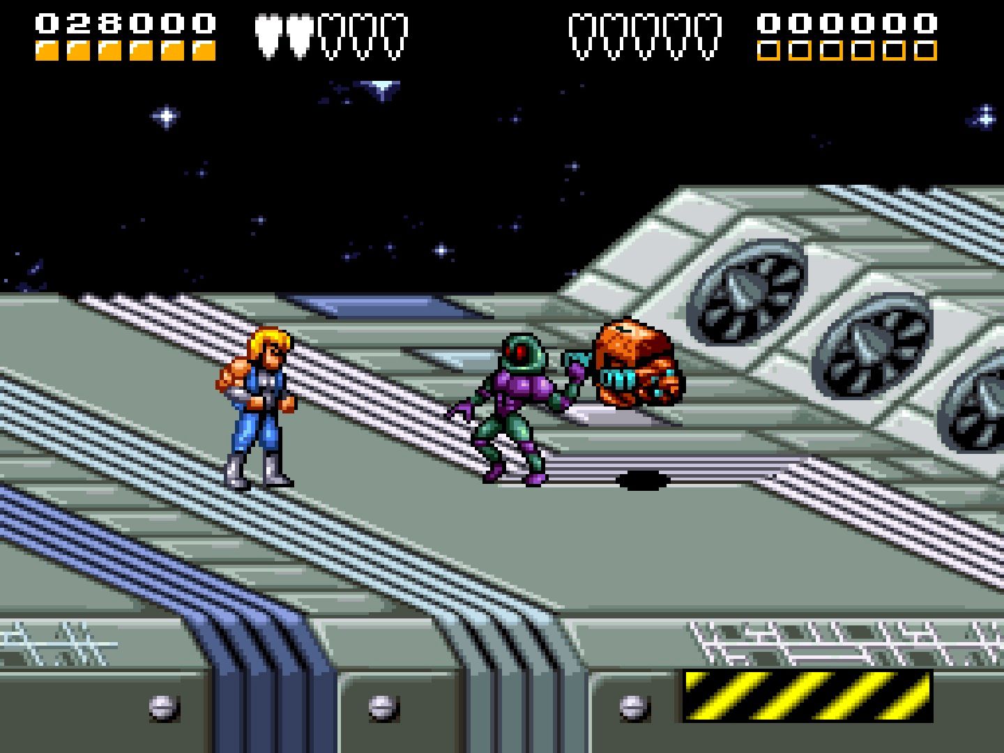
17 Bad: Battletoads & Double Dragon
With this entry let me just say that every Battletoads game and every Double Dragon game looks pretty awful. It’s not about the art, but the behind-kicking gameplay and that’s okay I guess. Point is as fun as this random crossover is, I don’t like the look of it. To me it looks like a flash game if I had to put it into a more modern context. I guess a phone game would be an even better description.
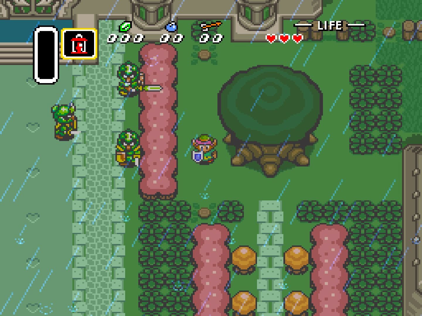
16 Amazing: The Legend of Zelda A Link to the Past
First of all, yes, it is weird that Link has pink hair in the game despite the images in the manual. So you could mark that against this game, but despite that one small nitpick, this game is a beautiful adventure through nostalgia and 16-Bit eyes. Breath of the Wild got pretty close to dethroning this as my new favorite game in the series, but it just wasn’t quite enough. My love for A Link to the Past trumps all.
15 Bad: Super Mario Kart
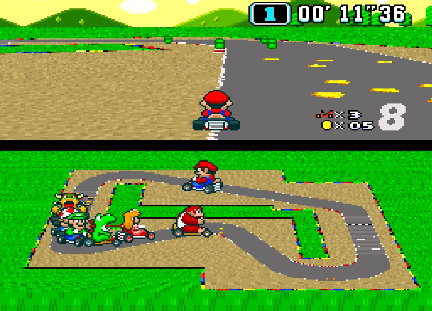
Super Mario Kart was a game I thought would still look great. In my memory, it was right up there with Super Mario World. Then I played it for the first time in over a decade via the SNES mini and boy was I surprised. This was developed by Nintendo? The entire characters look off model like this is some weird bootleg hack someone cobbled together overnight. It was a bit alarming, to say the least. It’s also not that fun anymore.
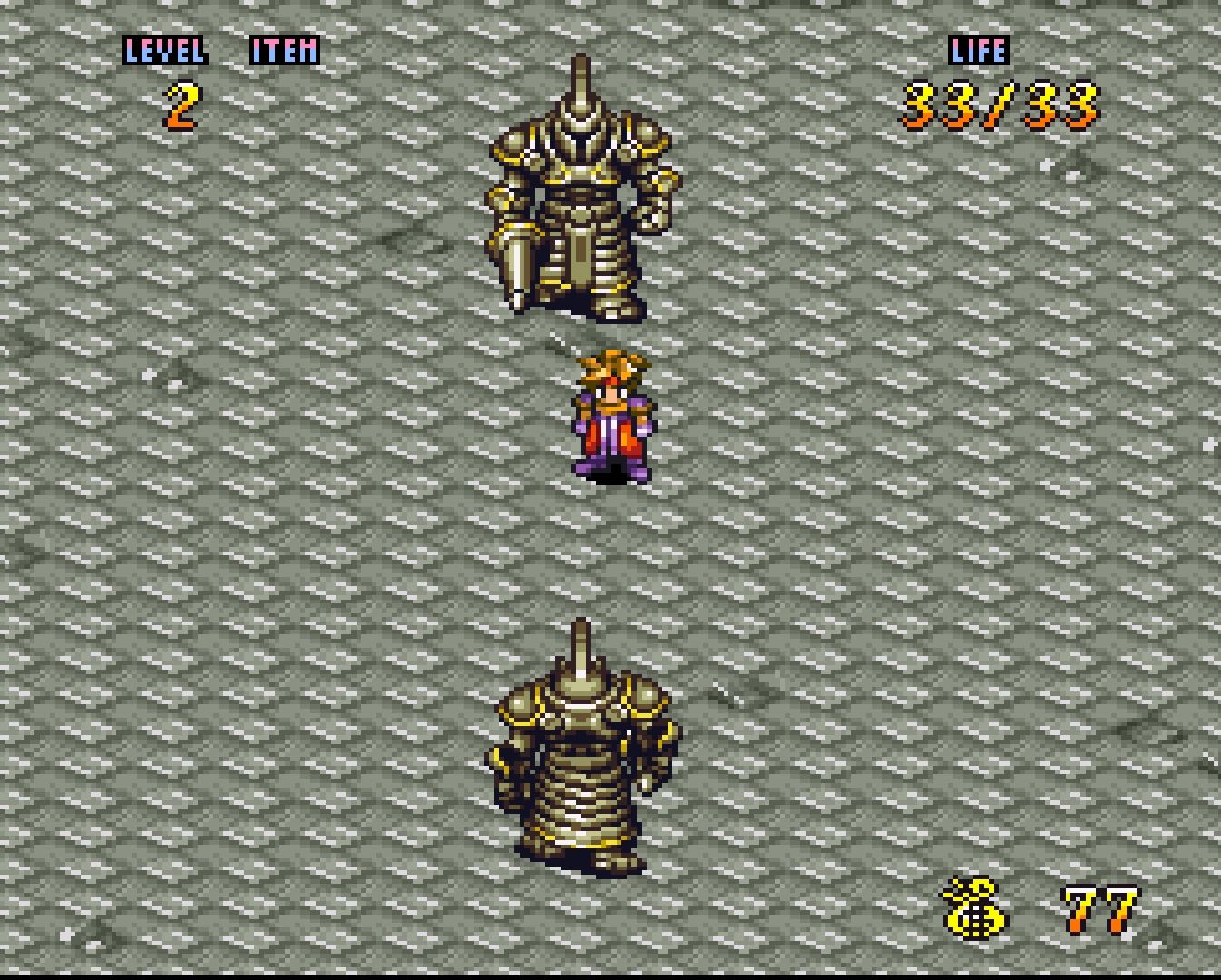
14 Amazing: Secret of Mana
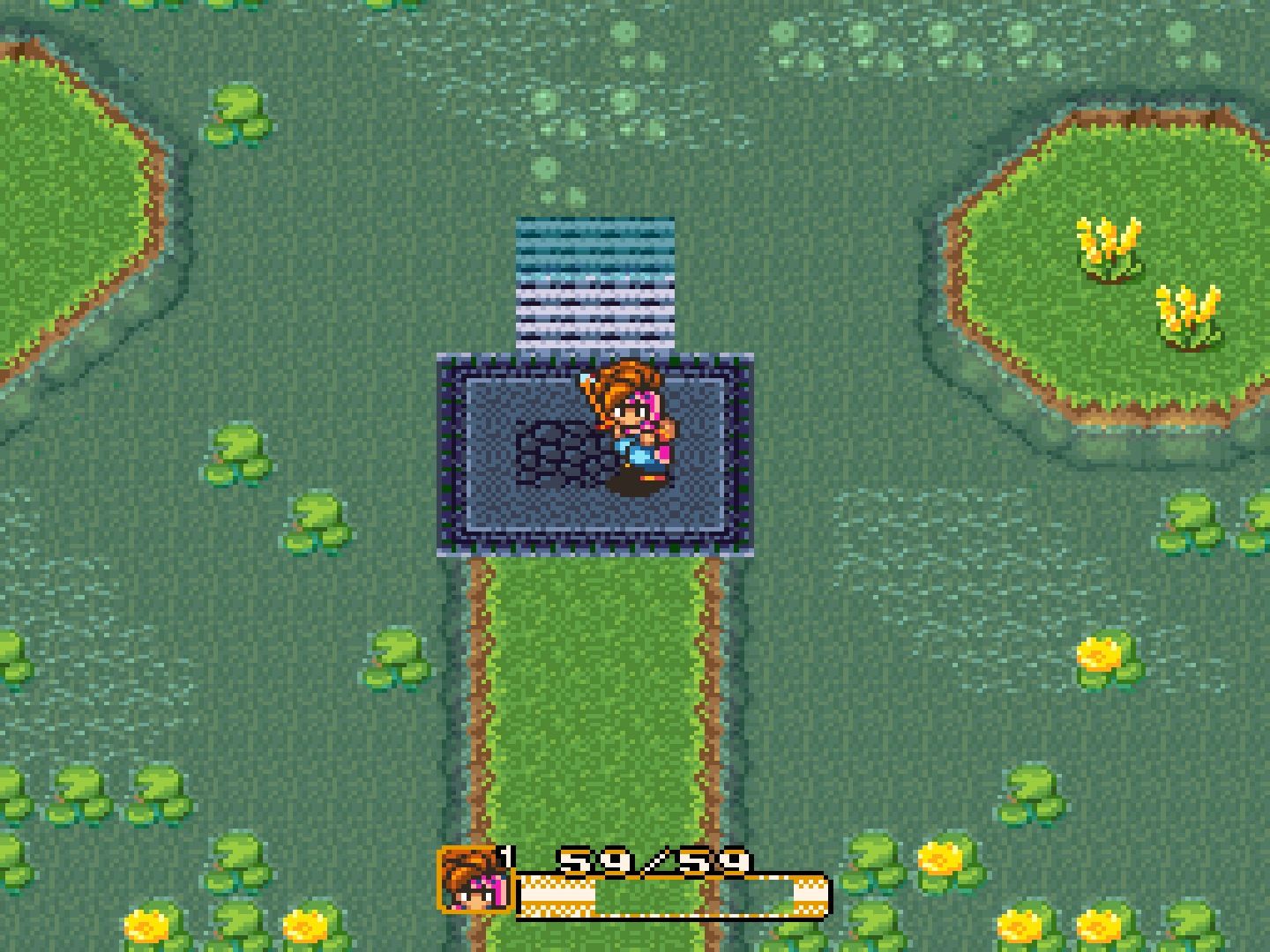
I think I’ve told this story before, but here it goes. Chrono Trigger is great, yes? Well, I desperately wanted a sequel and that’s when I saw this box on the shelf at FuncoLand, which would later become GameStop. The main character looked like Crono what with his red hair and general design and it was another Squaresoft title. This had to be a sequel! It’s not. It actually came out before Chrono Trigger, but I didn’t care. Don’t play that ugly PS4 remake. Play this SNES version instead!
13 Bad: Super Castlevania IV
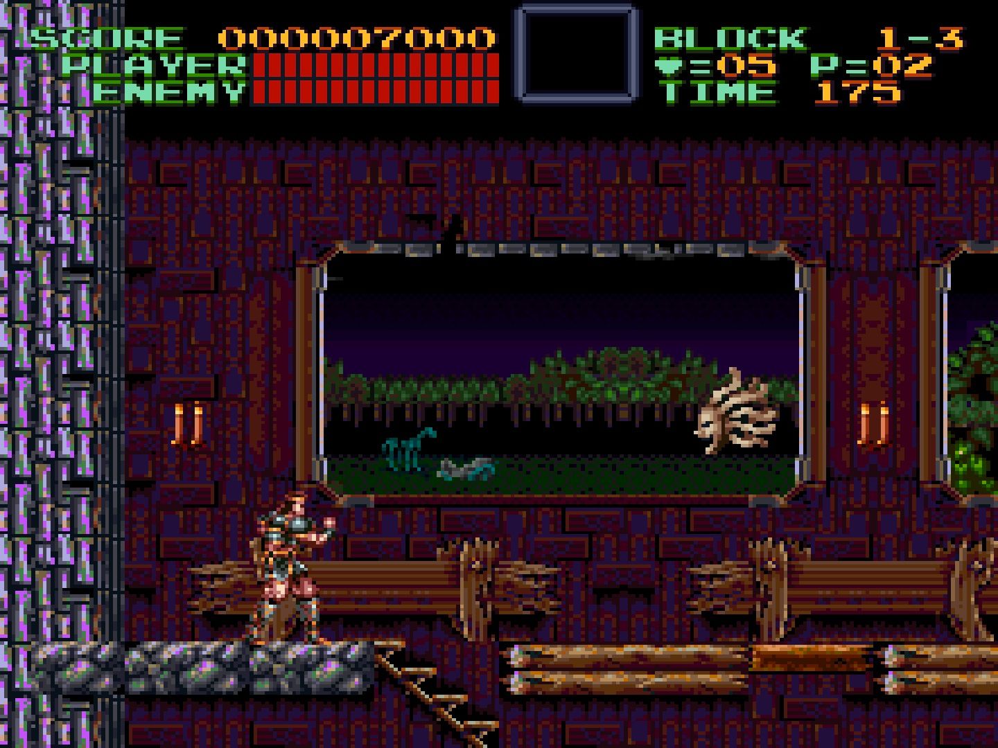
I can’t believe Castlevania is a series that everyone holds so dear. The first game was remade so many times. Did you know that this is also kind of a remake? It’s so weird to know that now. Thankfully a couple of years later we got Symphony of the Night and all was right again. Anyway, yeah, Super Castlevania IV, remake, or not, was never a game that impressed me. Your character was just too beefy and clunky. It was a disaster.
12 Amazing: The Legend Of The Mystical Ninja
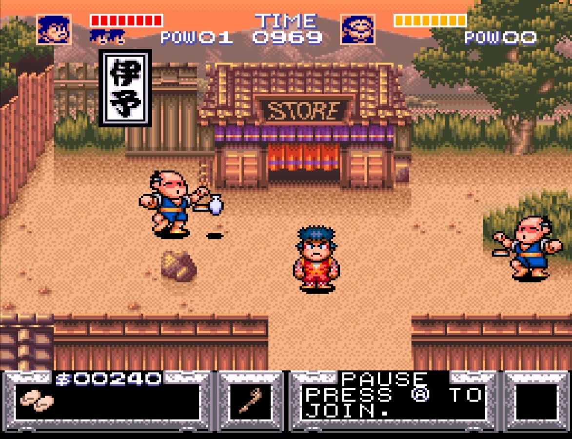
The Legend of the Mystical Ninja is a better Konami classic that you should pay attention to. It belongs to the long-running Goemon series, which never did that well outside of Japan despite the fact that this game, and the few others that were translated, was excellent. It is kind of like a level based Zelda game with more RPG elements. What really sells it is the art. Not only do the pixels look great, but also everything is so imaginative and full of expression. It’s such a quirky little gem. I have more to say on Goemon too if you care to watch.
11 Bad: Super Punch-Out
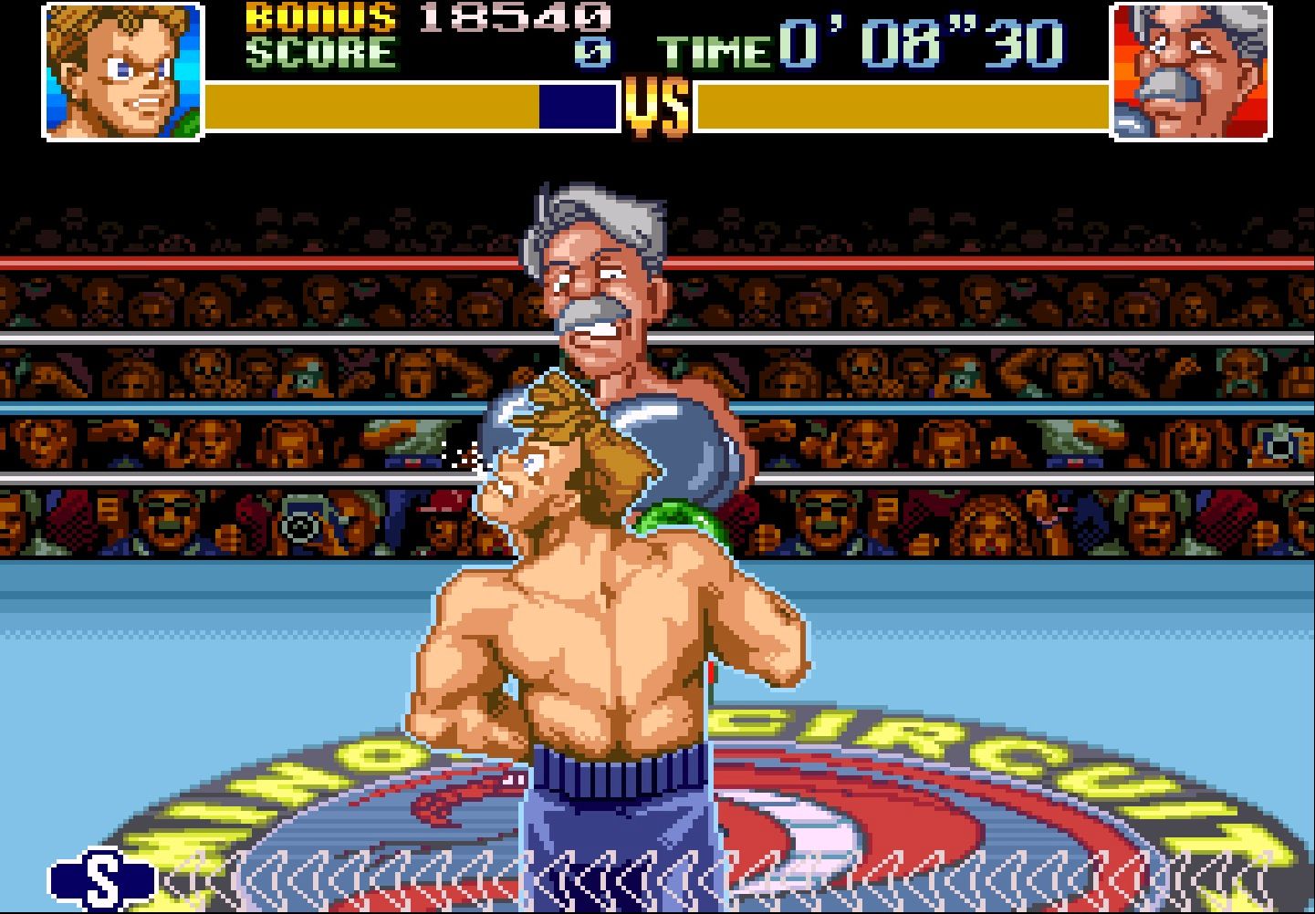
Super Punch-Out is nowhere near as ugly as a lot of these other categories. I think the big sprites actually look rather good for the system. That said there’s something just so lackluster about the overall package that I never really cared for it compared to the original game. I guess the animations lack that certain charm. The NES version had to be more colorful given the limited amount of graphics on the console. That limitation is what made that great and this just so so.

