Social media and modern advertising has changed the way video game consumers purchase games today. With the ability to go online, read reviews, or even watch people stream their games live, we often know exactly what we are getting when we purchase a video game. Yet times were not always that simple. Many gamers will remember earlier years scouring the aisle of Toys "R" Us or looking through toy store catalogues looking for the games we wanted to play with no way of really knowing which games were good and which ones were bad other than through word of mouth.
Because of this method of shopping for video games, many gamers were probably left disappointed due to what was shown on a product's packaging and what the video game content actually contained. Younger kids in the eighties and nineties would typically choose a game with the cover that popped out at them the most or was based on a popular franchise they enjoyed. While some box art hit the mark, many game covers were completely misleading and the games had little to nothing to do with the image displayed on the cover. With that said, let's take a look at some of the 15 most misleading video game covers to grace our store shelves.
15 Tetris

Tetris is one of those games that is so common that you can't see the name without picturing the seven tetrominoes falling down when you close your eyes. The title is so synonymous with gaming that you pretty much know exactly what you're getting. So lets take the Sega Genesis version of Tetris and rip the title off the box art. What do we get? Simply an image of St. Basil's Cathedral in Moscow. This may make sense if you are familiar with the Russian roots of Tetris as it has become an icon for the franchise, but it really makes little sense when advertising the core gameplay.
What's so baffling is that other versions already had perfectly good box art for the game. Though each iteration varies slightly from version to version, I'd say the original Gameboy and NES box art nailed it, with colorful tetrominoes falling to form lines, depicting in one simple image exactly what the game is. It's both flashy and informative and a similar art style would have served the Genesis version much better.
14 Night Trap

Night Trap is an example of the live action video trend that started skyrocketing in the mid-nineties. Looking at the cover, you might assume you're party of an army squad raiding a haunted mansion killing its demon inhabitants. That's not quite the case. You play as an agent stationed at a control panel monitoring various rooms in a house where a teenage slumber party is taking place, complete with teen girl shenanigans and a musical number that shares a name with the game. Though you're objective isn't to be a creepy voyeur, but to set off traps in different rooms when monsters are found who are harvesting the blood of the girls. Another version of the box art at least has the game's leading lady portrayed by Diff'rent Strokes' Dana Plato, pointing at the three vampire antagonists in the background. Although the cover would still be misleading, at least it features main characters from the game.
The game is actually being rereleased later this year digitally for Xbox One and Playstation 4. If you are actually a fan of the terrible box art, Limited Run Games is releasing the title on a physical format complete with your choice of terrible box art!
13 Catherine

Puzzle games seem to have a particularly difficult time depicting the in-game content. Usually, there's nothing flashy about falling blocks or bursting rainbow blobs, yet Catherine for the PlayStation 3 and Xbox 360 takes the standard puzzle game and spins it in a different direction. Even though the cover is appropriate to what the story involves, looking right at the two cover variants wouldn't have the consumer thinking this was a puzzle game but rather a dating sim or one of those strange sex games that are more common in Japan.
The game is split up between two different forms of gameplay, one type taking place during the protagonist Vincent's everyday life and the second during his nightmares. The nightmare segments are where the meat of the game takes place as Vincent must climb his way to the top of a tower while pushing and pulling different blocks the tower is made up of solving his way to the top. The two covers depict his two love interests: Vincent's long term girlfriend Katherine who wants to settle down and Catherine, a younger, seductive girl who lures Vincent into an affair. During the non-puzzle segments, you are living your daily life making decisions between conversations with your friends and both Katherine and Catherine affecting the overall plot of the story. Though the box art does the story justice, it really glosses over the puzzle aspect of the game.
12 Zillion

The Sega Master System has to be home for some of the ugliest box art in gaming history, maybe only beaten by the Atari. Most Sega Master System game covers followed a similar approach with a minimalist mindset in design depicting a single image that was meant to imply the game's subject matter. While most Sega Master System covers get the job done, when it comes to Zillion, I have no idea what I'm looking at. Is it a computer monitor? Or maybe a microwave? Your guess is as good as mine.
Zillion is actually a game based off an anime from 1987 of the same name, so you think that designing a cover for the game would be easy. The gameplay consists of being a side-scrolling platformer and is often said to be much like the original Metroid. The game wasn't bad by any means for the time, yet with box art like this, it might have been easy to pass by in the video game aisle of your local toy store. Its sequel Zillion II: The Triformation kept the minimalist design used in other Sega Master System games, but at least presented an image that was more accurate to the source material for the game.
11 Breakout

Another example of Atari covers gone wrong, Breakout is just as misleading as many of the other Atari titles, hosting an image of two people playing tennis, or racquetball, or ping pong, or whatever on the cover. So is Breakout actually one of these sports in video game form? Only if bouncing a dot off a paddle and breaking the ceiling above is your version of one of these sports, then sure.
This tennis cover would have made much more sense for Pong as similar game elements between the two exist, but it is a bit misleading for Breakout. Actually, this cover might even be better suited for the actual game Tennis for the Atari. Though you can see some missing pieces in the colored stripes on the cover, most likely resembling the ceiling that the dot breaks in the game, I probably would have just assumed the stripes were a variation of the Bolivian flag.
10 Home Improvement

Licensed games have come a long way since the nineties. Though games based off a typical franchise are usually frowned upon, it seems these days that major well-known developers are willing to take the time needed to craft a game deserving of the license its representing. Yet back in the 16-bit era, it seemed likely that if a show or movie was popular enough, it would get a game. Home Improvement, based off the popular show of the same name, fits into that category. How you make a game based off a popular sitcom is anyone's guess, but perhaps it could work as some sort of wood shop simulator? Not quite.
Remember in the sitcom somewhere around the middle of season two when Tim "the tool man" Taylor had to battle dinosaurs with his trusty nail gun or had to raid Egyptian tombs? Didn't think so, but I'm sure there is some good fan fiction on the games subject matter. Looking at this cover, you'd assume the game had something in common with the show, yet what we are left with is a standard run of the mill platformer that was all too common in this generation. For what it's worth, the game actually wasn't too bad for its time.
9 Home Alone 2: Lost In New York

Any kid who grew up in the early nineties knew that the Home Alone franchise was one of the best family films on the market. With the popularity of the first two films, it probably seemed natural for THQ to capitalize on the success of the films by making a video game about the films. You might suspect the game would be about setting booby traps for the wet bandits, Harry and Marv, yet this only happens in one stage.
The rest of the game has pretty much absolutely nothing to do with the movie and it might as well be called Home Alone 2: Manhattan Possessed as it seems that every human being and inanimate object imaginable as been taken over by some sort of demon overlord set out to kill our protagonist Kevin McCallister. The majority of the game is spent dodging crazy ladies with umbrellas, throwing killer necklaces at room service and maid staff, sliding under jumping suitcases and flying trash can lids, and pretty much just trying to survive the cruel streets of New York. Hell, the first boss is even a crazy chef that tries to kill a ten year old kid with butcher knives. Even though one portion of the game got it right, the rest of the game was typical licensed fodder that little resembled its source material and was all too common in games of the nineties.
8 Bust-A-Move 2: Arcade Edition

This is a game cover I can barely look at without getting mildly queasy. Looking like a scene straight out of Clockwork Orange, this looks more like a torture simulator than an actual puzzle game. Bust-a-Move 2: Arcade Edition for the original PlayStation and Sega Saturn is as kid friendly as it gets, yet the cover is quite misleading and the ESRB rating of "Everyone" looks just as confusing when it's hanging next to a picture of a man with his eyes pierced open, most likely screaming in agony.
Bust-a-Move 2 is simply a puzzle game featuring a ceiling of colorful bubbles that are shot at by the player from the floor. When shooting bubbles at the ceiling, bubbles of the same color will pop. Pretty much the only part the cover of this game gets right are the bubbles on the box art, feeling slightly ironic that such a gruesome image is forever tied to a game that focuses on something as playful as bubbles. Super Bust-a-Move has just as strange of a cover, with a close up of a freaky looking baby blowing a bubble while wearing sunglasses. At least the reflection on the sunglasses is a still image from the game, so you know what kind of game you are getting.
7 Forsaken 64

Every time I'd be browsing my local Babbages as a kid, the box for Forsaken 64 (also released for the PlayStation and PC just as Forsaken) would catch my eye. Perhaps it was the attractive lady on the cover? Maybe it was the appeal of another four player multiplayer Nintendo 64 game? Or maybe it was because the game was rated mature by the ESRB and I wanted to play games with more adult themes? Either way you spin it, the box did its job of enticing me, but there's absolutely no way of knowing what was actually in this mystery box.
Forsaken takes place in a dystopian future where the planet Earth has been desolated. It's a first person shooter with a single player campaign and a multiplayer mode where players battle robots and mercenaries left behind on the planet. Even though the girl on the box art never actually makes an appearance in the game, at least we know why she's crying.
6 Pac-Man

This list could have easily been composed strictly of Atari box art as the Atari's game catalogue hosts a myriad of titles with ridiculous covers. There isn't a gamer in the world who is unfamiliar with Pac-Man as he's made his way to just about every video game platform in existence, yet his appearance on Atari was a bit special as the port was poorly made and has the box art made by someone who was given a bit too much creative freedom.
There's no need to explain the core gameplay of Pac-Man, but this game's core mechanic would be lost on me if I knew nothing about the titular hero. Looking at this cover, I see a man with a binge eating disorder, guilt strewn across his face. He tries to eat as much as he can, yet he is always being chased by his personal demons, Guilt, Shame, Grief, and Remorse. Also, the demons are just people wearing colored bed sheets over their bodies I'd assume as ghosts typically float and these ghosts are running. Oh, and Pac-Man lives in a castle now. Then again, maybe this has been Pac-Man's background story the whole time.
5 Phalanx

Thank the maker that this box actually contains the tagline "The hyper speed shoot-out in space" because if it didn't I would be completely lost. Phalanx is a horizontal scrolling space shooter and a game that should have been easy to come up with a cover for, so one has to ask what the hell was going through the artists mind when making up this box art?
What could have been an action packed space battle is replaced by an old hillbilly playing a banjo, so one could only assume this was a banjo playing simulator or rhythm game. Interestingly enough, the developers Kemco have stated that they intentionally chose this box art as it would be something fresh and different than what was traditionally seen on the market. If that's the case, they succeeded in their goal.
4 Mobile Light Force 2

I bought this game for three bucks at Gamestop while browsing the wall for something new to play with a college buddy of mine. It was mislabeled, but the clerk honored the price that had me pick up the box in the first place. Everything about the cover screamed awful, but I figured for three dollars, it might be a few bucks worth of entertainment. I expected the game to be a crazy shooter featuring three Charlie's Angels-like protagonists, but was instead given a vertical scrolling shooter with not a single leather-clad babe in sight.
Strangely enough, the first game had the EXACT same box art as its sequel, minus the number "2" in the title. Oddly enough, both games weren't even really part of the same series as the first game was based off a title called Gunbird in Japan and the second was based off of a title called Shikigami no Shiro. From that point on, I learned the valuable lesson of looking at the back of the box before picking up a game based off its cover.
3 Metal Gear Solid

There's nothing actually wrong with the box art for Metal Gear Solid. I actually think it's elegant and its minimalist design with the shiny red logo across a plain white background looks rather nice. If you weren't familiar with the earlier games in the series, however, you wouldn't be able to have any idea what was inside this case other than "tactical espionage action" being involved. As far as what a Metal Gear was and why it was solid... that would have gone over my head.
The problem with this cover is that it was so plain that it was really hard to stand out at a store aisle at the consumer. Luckily, it came at a time when the internet and gaming magazines were becoming more mainstream, so word of mouth about this amazing title caught on rather quickly and it sold extremely well. Plus, television advertisements were heavily improved upon for video games with the decade prior. Regardless, if I didn't read video game magazines as a kid or never got my hands on a demo disc with the game on it, this is a video game case that would have easily skipped my radar while at the store.
2 Final Fantasy XIII-2

Final Fantasy XIII has been one of the more controversial games in the Final Fantasy franchise, as it steered the series in a more linear direction than previous installments. It wasn't bad by any means, but it left many fans yearning for a more classic Final Fantasy feel and to add salt to the wound, we got two sequels to a game that was met with tepid reception from its fanbase.
Final Fantasy XIII-2 fixed a lot of what people disliked about its prequel with a more open world and a whole new time travel element. Naturally, you'd think the game would follow the path of our heroine Lightning from the previous game, but despite the game's cover art, Lightning barely has any screen time in this thirty hour or so long adventure. The game actually follows the adventures of her sister Serah, who spent most of the original game comatose in a crystal. Not only that, but it completely changes the story, practically disregarding the ending of the last one. For fans that were looking to see where Lightning's adventures take her next, they might as well skip to Lightning Returns as this game focuses completely on Serah.
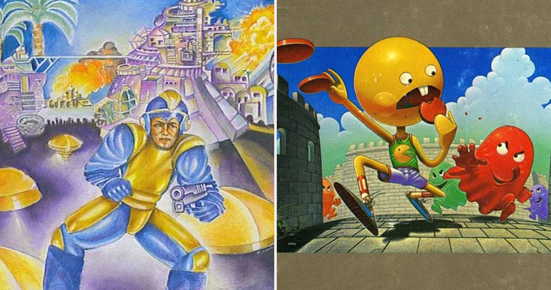
1 Mega Man

It took a bit of time for Capcom to really find Mega Man's signature look, and he has gone through quite a few embarrassing game covers leading up to that point. It wasn't until Mega Man 3 that we started to see something that somewhat resembled the titular blue bomber that we know today. The first game in the long running series Mega Man had some of the worst box art in gaming history and is notoriously known for it. Its sequel gets the box art a bit better, albeit still tacky, but the original game is so far off from the Mega Man we've grown to love today.
What looks like something off the cover of an eighties sci-fi novel, we see a man in a blue and yellow jumpsuit standing in front of a backdrop of what looks like could be a city straight out of Tron. No evil robots, no Dr. Wiley, and pretty much nothing relevant to the actual game. The only thing this cover tells me about the game is that shooting will mostly likely be involved, due to Mega Man's pistol. Speaking of which, everyone knows that Mega Man uses the Mega Buster, a powerful weapon that's attached to his arm. This mistake would not be remedied until the cover of the third title in the series. The box art has become so infamous, a similar style was later used in the retro releases of Mega Man 9 and 10.