.jpg?q=50&fit=contain&w=1140&h=570&dpr=1.5)
The Batman has been one of the biggest movies of the year, and while it had the obvious advantage of having an iconic titular character, it also had the weight of the stop-start DCEU dragging it down, as well as the pressure of existing in its standalone universe and having to carve out a niche for itself amongst so many Batman adaptations - good and bad - over the years. I spoke with production designer James Chinlund to see why this niche ended up being 'grungy '90s', and how it came to be such a success.
"That started with Matt [Reeves, director] and his take on the material," he says. "We had worked together on the two previous Planet of the Apes films before this, and we were both exploring the same idea, which is taking something that's far-fetched and a fantasy, and figuring out [how to] make sure that it felt like it was actually happening in our world. The contrast of those two ideas is really exciting to us."
The Batman is a very dark film - literally. Like a lot of '90s era investigation shows (particularly The X-Files), The Batman is shot in darkness and shadows. This lends an evocative, edgy noir feeling to the movie, but also means the production department needs to overcome new hurdles.
.png?q=50&fit=crop&w=740&dpr=1.5)
"Matt and Greig Frasier [cinematographer] were both interested in pushing the edge of the camera tools and seeing how dark they could go and still have a legible film," Chinlund says. "I think they did an amazing job. In terms of its effect on the design, we're spending a lot of time thinking about how to light the sets practically and building light into the sets, so that Greg had tools available to him to turn up and down."
One of the elements of Batman's iconography that changes the most across different adaptations is the Batmobile, having been a camp limousine and a military grade tank previously. Like everything else in The Batman, it's extremely grounded and realistic. Chinlund tells me that a lot of the world design started from the Batmobile out.
"Going in it was one of the first pieces of design that we attacked, and it was the key into the design for the rest of the movie," he tells me. "I think Matt was really excited about building something that reflected Bruce's character and showed him as a do-it-yourself, built from the ground up sort of hero. Our hope was that the audience will look at the car and say, 'Gosh, I could build that'. That really was the access point for the design for the rest of the film."
-13.jpg?q=50&fit=crop&w=740&dpr=1.5)
From here, the realism echoes out across the rest of the film. The Riddler wears a trenchcoat and a tactical ops mask. Catwoman wears a balaclava. Even Batman has abandoned the classic utility belt or cutting-edge billionaire tech for something much more grounded.
"We did everything we could to integrate between those pieces of design, like for example, the cowl is made out of leather, and you can see the stitching," he says. "There are Chrome aspects in the suit. We were really trying to do a similar thing with the car where you'd see like the leather wrap on the wheel, all the choices were made materially function-first. Like, 'What would Batman actually need to get the job done?' - less a piece of design and more of a piece of equipment to execute this mission. If coincidentally it's intimidating, all the better."
While The Batman reinvents a lot of the classic iconography of Batman, it brings with it a new visual that has quickly become a crucial part of its legacy - Batman and Catwoman on the rooftops at sunset, bodies bathed by silhouette shadows, with the orange glow behind them. I asked Chinlund how this visual came about.
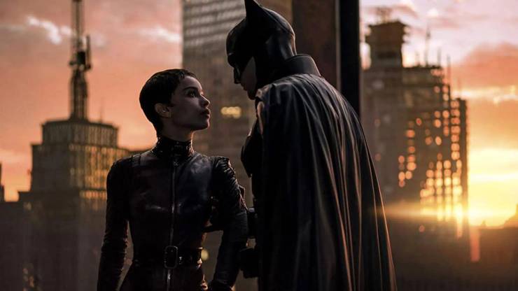
"That is an amazing convergence of so much technology and design," he says. "That was the place where we use the LED volume. So we were actually able to design the city landscape, and prep, and see it shot live on onset, which was amazing. That was the first time for me on a big digital extension like that. In terms of the design, we certainly tried to identify all the landmarks of the city, you can see the bridge outside the Iceberg Lounge, and Falcone's in the distance. You can see Wayne Tower, you can see City Hall, we tried to bring all those things together so the audience could really feel the fabric of Gotham laid out in front of them. And that was super important to us to create a city that felt cohesive and complete."
While Chinlund says the city had to feel complete, Gotham is very clearly not complete. In that shot in the sunset, we see scaffolding, half-finished buildings, and a constant cycle of construction and destruction. That's not typical of how we think of Gotham, which is usually an established, if often highly Gothic, metropolis. Chinlund explains why those elements were a key part of The Batman's visuals.
"I think we're looking at Gotham as a place that is stunted, or frozen in time. The corruption of the city has stalled out its progression. In a lot of ways, you see that in the technology, you see that in the condition of the city. We were hopeful that that would be transmitted to the audience that like, Gotham is a place hopefully, somewhere in America, that you could go visit. But it just hasn't fully developed. We were doing that in the design of the skyline where you'd see stalled pieces of redevelopment projects. Unfinished skyscrapers dotting the skyline helped us reflect this Gothic language. I think it's really about a tree high up on a mountain that just grew more slowly than the rest."
The Batman is available to own on Digital Download from May 23 and 4K UHD, Blu-ray and DVD from June 13