The best thing, by far, about the Peter Jackson Lord of the Rings trilogy is the wealth of behind the scenes features that accompany the special edition. To this day, there is no better documentary of how films are made and the work that goes into them from legions of people in every possible department. 26 hours of footage cover everything from props workers delicately slicing rubber hosing to make chainmail, to the actual forge used to make weapons, to the room-filling ‘bigatures’ of Minas Tirith and Isengard, to the cutting-edge CGI technology used to create the Balrog and other beasties too big for Weta’s incredible workshop.
There’s more, too. In total we have five versions of the films’ extended editions; the Jackson Cut (he actually prefers the theatrical release, but I wanted to make that joke) and then four with commentaries dubbed over the top. There’s the banter of the cast commentary, where the Hobbits joke around and Viggo Mortensen details his numerous fishing trips. You could choose the director’s commentary with Jackson, Boyens, and Walsh which mostly follows editing choices and the challenges of adapting Tolkien (and the insight that Mortensen broke his toe kicking that Uruk-hai helmet). Then there’s the production designers with Weta’s mastermind Richard Taylor and a host of others including Alan Lee and John Howe, which goes further into the practical side of things from concept to screen. The final option is the driest, and the only one I don’t rewatch annually, because the producers and visual effects gurus just don’t interest me as much as the others.
The same behind the scenes features are available on the extended editions of The Hobbit, which not only salvage an incredibly disappointing trilogy, but also show exactly where it all went wrong. Months of pre-production time instead of years, a reliance on digital effects in lieu of the practical mastery that Weta Workshop pioneered a decade before, and a stressed out crew pulling all-nighters to hit deadlines show clearly that crunch doesn’t create great art, it inhibits it. Nearly every questionable decision was a time saving device, and it shows.

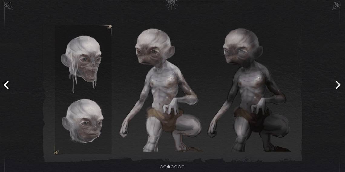
If those behind the scenes features can entice me to load The Hobbit DVD into my Xbox, the digital art exhibition that comes with the special edition of The Lord of the Rings: Gollum can do the same. While only a few pages of content instead of hours of documentary, the artwork builds on the one positive aspect of Gollum: the character designs.
Gollum is uninspired in every other aspect of its being. The gameplay is stale and decades out of date, the graphics would have looked bad ten years ago, and the glitches show signs of a game both rushed and unfinished. However, its character designs shine brightly through it all.

If the behind the scenes documentaries are the best part of the Jackson trilogy, its shadow over subsequent Tolkien and fantasy adaptations is its worst. Every Gandalf looks a bit like Ian McKellen, every Sting has that Elvish swirl running down its blade. No matter whether the work is affiliated with Jackson or not, it takes inspiration from him, due to the immense success of the trilogy and the recognisability of its iconic actors, sets, and props. Protagonist aside, Gollum diverges from Jackson’s interpretation in nearly every way.
Gandalf and Thranduil are the best examples. The former’s hat alone distinguishes him from any Jackson parallels, and his shabby, layered robes give him a more weathered look like the hermit he is. The concept art in the digital exhibition gives us a closer look at his sword, Glamdring, which didn’t catch my eye in the playthrough. Glamdring is fairly nondescript in the books and as such is pretty boring in the ‘00s trilogy. Gollum’s dark, creepy Mirkwood Elves offer an alternative perspective though: why wouldn’t weird Elves create weird weapons? Glamdring is ornate in the game, curved almost like a scimitar and uses plenty of Middle-Eastern inspirations. I love it.

Thranduil, too, feels taken from the page rather than the screen. His crown immediately caught my eye, symbolic headwear that in the books changes with the seasons. I would have loved to see a springtime cherry blossom crown, but the antler-like branches fit Tolkien’s description well. If anything, the concept art for Thranduil shows that the final design is toned down. I would have loved to see the Midsommar-esque flower cone to befit the game’s folk horror woodland Elves, but Gollum played it safe.

From Elven haircuts to the Mouth of Sauron’s almost House Harkonnen look, the concept art for Gollum shows that this team cared about the work it was adapting, and constantly referenced the books instead of resorting to the safe known entities that are the Jackson, Walsh, and Boyens films. There’s a wealth of beautiful designs in Gollum, and it’s a crying shame that the game was so bad that they’ll likely be forgotten. But let it be known that this game didn’t fail because it took risks with its interpretations of Tolkien, it failed because it’s boring, glitchy, and a decade behind the times.