Designing video games requires a lot of work. With every idea under the sun having been done before, character artists have a heck of a time trying to design unique and fresh characters that’ll appeal to the widest audience.
So how do companies narrow down character ideas? Basically, they hire a bunch of concept artists and let them go crazy.
But a lot of these designs don’t ever see the light of day. Either due to the company’s privacy policy, or the designs were just too unique. But the ones that do, are circulated around the web forever. There’s something so alluring about looking at what could have been especially in regards to a well-established franchise. I personally love looking at concept art, it’s a great way to read the energy of the game development and see what the team really wanted to aim for. And honestly, a lot of the time, the concepts beat the final product. This is usually due to the fact that concept art is allowed to be painted, complex, and hyper-detailed while in-game models have some restrictions. Unfortunately, these characters are usually so good because they’re unique and different, and those two traits are risky for hitting the widest demographic. So the businessmen in suits step in to streamline the designs as much as possible. But those images never go away, and gamers will always be able to see just how much stronger designs and games could have been if companies just took more of a chance. So here’s my list of 30 Unused Video Game Concept Art Designs That Would’ve Changed Everything.
30 Mass Effect Franchise - Tali Behind The Mask And The Goo

Mass Effect is one big ol’ romantic mess. The franchise is known for its memorable characters, Tali’Zorah being one of them. For those unfamiliar, Mass Effect is a story heavy, third person shooter, all about space adventures with your rag tag crew full of romantic possibilities.
Tali’Zorah is an alien whose race is hyper-susceptible to disease/sickness so 99% of the time they’re in suits filled with essentially cold medicine.
In the third game we’re finally given an opportunity to see Tali’s face in her tragic ending, it’s alluded to all throughout the franchise, the reveal is incredibly dramatic…aaand it turns out to be a poorly photoshopped stock photo. Of course fans were outraged! But now, through a couple of official concept art pieces, we can see what might have been in all the different iterations of our beloved Tali'Zorah nar Rayya. Though it’s too little too late.
29 Super Mario Strikers - Mario Shops At Gap

Surprisingly I only have two Nintendo property’s on here. I thought half of this article would have been Nintendo’s concept art. But believe me, I chose the best two to include.
Just LOOK at these Mario Strikers concept pieces.
Super Mario Strikers is a classic Mario sports game, this one’s about soccer. Overall they’re actually really great soccer games and have a much more extreme artistic style when compared to almost every other Mario game. They feature lots of flames, movement limes, and black outlines in their art. But these concepts are just too extreme. First of all, lets talk about hoodie Mario, this design is so 90’s it might as well come with a Go-gurt. I wish there was a world where this Mario design was a reality. And I’m not even gonna talk about Capri shorts and flame hat Mario. Nintendo messed up by not using these.
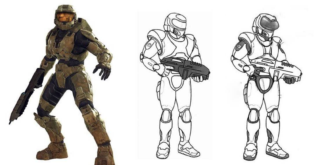
28 Halo Franchise - Master Chief Essentially A Starship Trooper

Master Chief was probably the most recognizable protagonist between 2001 and 2009.
The Halo franchise was internationally successful and the super soldier design for the Chief here has been expanded upon ever since.
But that same slick design could have been much…rounder. In the concept art for Master Chief, we can see his suit was originally much more rounded and form-fitting. Honestly, it looks to me like a simplified Doomguy design. Or quite possibly an 80s space marine with an Oculus Rift over his eyes. I think this design is much more suited for a different generation and would have been a great action figure for kids in the 70s. Now in 2016, a Reboot of the famous Doom franchise was released and basically brought back the hyper-aggressive aesthetic. So if Bungie or 343 want to circle back around and see if this’ll take off, now’s the time!
27 The Legend Of Zelda: Breath Of The Wild - Link Riding Motorcycles In Space?

Needless to say, Legend of Zelda: Breath of the Wild is one of the top selling games of all time, and is probably the highest selling Zelda game of all time as well. That said, these versions of Link and Zelda are going to be the most recognized designs moving forward. Both Link and Zelda in Breath of the Wild look pretty different from other iterations of the dynamic duo.
But we now know thanks to an interview with the Art director, that Link could have looked out of this world.
And by that I mean there was originally a concept design where our Green Tunic Hero was in an emerald spacesuit! But that’s nothing in comparison to teenage Link in his hoodie and motorcycle. It’s honestly a wonder the design team got from these designs to the one they ended up using. I want them as DLC now.
26 God Of War 2018 - Valkyries Wouldn't Have Been Clones

God of War 2018 is a breath of fresh air for a franchise that’s had almost annual releases since its inception in 2005.
Kratos finally gets the opportunity to just kick back and relax in Norse mythology.
But of course that doesn’t last long and our iconic unstable anti-hero Kratos with well…his boy, travel around the realms fighting an all lexicon of mythical beasts. Among those are the Valkyries, normally ethereal angels that have somehow been given physical form. These fights are the hardest bosses in the game by far and honestly a blast. But thinking back they do blend together and all feel like the same fight with minor variations. After fighting all of them I felt like they all had one or two unique moves and their own cool helmet. But we see in the concept art that the Valkyries were originally going to be much more individual.
25 Kingdom Hearts Franchise - Chainsaw Wielding King Of The Jungle

Kingdom Hearts is an enigma of a franchise.
If I told you there would be a global hit all about traveling between Disney Worlds saving hearts from shadow monsters, one where Goofy and Donald Duck fight Cloud from Final Fantasy you’d zip me up in a straitjacket.
But it’s true! Kingdom Heart’s is a mess in its plot, its games are too spread out and convoluted, and there’s holes in every script, but its designs are top notch. Sora especially, being one of the most memorable designs out there. And that goes double for the Keyblade. But it turns out that Sora was originally going to be a bit more ferocious, as a little lion boy. We can see that this design was a “bit” fluffier but not very iconic. Overall it’s a more unique design but I’m glad they stuck with our clown shoed, more streamlined hero.
24 Mass Effect 2 - The Illusive Man Eludes Clothing

Now let’s jump back for a minute to Mass Effect.
In the second game, protagonist Shepard has a tragic accident and is rebuilt by the Cerberus organization, headed by the Illusive Man.
We know nothing about the organization or it’s leader for a good portion of the game. But at one point we’re attacked by an assassin of the organization, Kai Leng. Who, in the game, look basically like Nightwing from Batman? Both way, Cerberus and all involved with it were originally going to look much different. Kai Leng seems to be missing an extra limb or two in this art and isn’t wearing his trademark eye cover. The Illusive Man seems to have gotten a half off haircut and took in a bit too much Reaper energy. And finally we have a concept design for a Cerberus grunt which is just SO perfect. I love you bubble boy.
23 BioShock Franchise - Alvin And The Little Sisters

BioShock as a franchise is full of icons, you have the Big Daddies, Elizabeth from BioShock Infinite, and of course the Little Sisters who are the surrogate children for the Big Daddies.
These little girls run around and literally climb through the pipes of the submerged Rapture to harvest the Plasmid goo from the defeated splicers.
They’re a staple of Rapture as a setting, but it turns out their design process wasn’t cut and dry. There are a number of concept designs for these adorable little tot’s. Some more horror themed designs, some sci-fi ones, but my favorite of all is the idea that they would be giant chipmunks. These concept drawings for them are both hilarious…and sort of terrifying. The picture in my head of the imposing Big Daddy, stalking through Rapture holding hands with a squeaking chipmunk in a dress? Priceless.
22 Final Fantasy 15 - Looks Like Dev Team Went A Bit Nuts

Final Fantasy 15 is a story 10 plus years in the making.
The game was being developed off and on over a 10 year period and was originally pitched as Final Fantasy 13!
But now that it’s out and has been getting consistent story based DLC since its first year. What’s the verdict? Most say it still feels incomplete, and one has to wonder if that’s because we saw almost nothing of protagonist Noctis’ home. Noctis is the prince of Insomnia, a land constantly at war with their neighboring kingdom, the Empire. And while we see a lot of the city in the concurrently released CG movie, players actually don’t take a single step into the city until the final chapters! Now thanks to glitches and bugs we can explore a hastily rendered version of the city, but it's nothing compared to what we were shown & promised.
21 Injustice: Gods Among Us - Tried To Be Brave But Played It Safe

Say what you want about the Injustice franchise as fighting games, I can see both sides. But I personally think a lot of the designs they went with are weak. NetherRealm has always had a hard time with more delicate facial features, especially with their female designs. You can tell because they put every single female in a facemask for Mortal Kombat 9 and it wasn’t until MKX that Mileena could finally speak without a face cover.
But in these concept pieces we can see that originally NetherRealm was attempting some really unique designs.
I’ve never seen a Nightwing/Robin quite like this one or a Raven so...red. Unfortunately in the end most of the designs were played safe, and were just realistic versions of the comic crusaders. But it’s nice to see that somewhere along the process they wanted to really change it up.
20 Sonic The Hedgehog Franchise - Just Kidding It's Sonic The...Rabbit?

Sonic the Hedgehog is an icon, this isn’t up for debate. There’s Mario, Mickey Mouse, And Sonic. At least as far as video games are concerned. Sonic’s design is the definition of a mascot and obviously must have been workshopped plenty before they arrived at the prodigal blue bolt.
Sonic originally had a number of design concepts, but the most surprising one is that he was at one point going to be a rabbit.
Honestly this design is still pretty good, and it’s obvious Sonic team used parts of it for Cream the Rabbit in later iterations. Honestly this rabbit design looks more aerodynamic than the hedgehog one and rabbits are much more known for their speed than hedgehogs. That said, I can’t even imagine a design like this taking off in the way that Sonic’s did. Sonic would have faded into obscurity and the gaming landscape would have changed!
19 Overwatch - Junkrat Was On The Bomb Defusal Squad

Overwatch has A LOT of unused ideas. Honestly I could have done 30 just about Overwatch, and there’s only 28 characters. That said, Junkrat and Pharah probably had the most drastic differences between their concept and final iterations.
Junkrat in particular seemed to have been originally planned as a bulky, bomb defusal traitor with a rocket shoulder.
Honestly I personally adore bulky designs so I like this better though I have to admit the color in comparison to the final design is much weaker. Then on the left we can see Blizzard getting closer with Junkrat looking much more like himself, save for again a rocket launcher on the shoulder and a sweet goatee. Out of all the small changes they could have made, proto Junkrat’s goatee takes the cake. For some reason it makes his design so much stronger that I almost wish I didn’t see it.
18 Street Fighter 4 - From King Cobra To Rufus

So as any fighting game fan knows Rufus was introduced as a brand new playable character in Street Fighter 4.
Now I’ll be honest, I personally find Rufus to be an awful design.
The dev team were obviously trying to subvert expectations with a heavy set character that was uncharacteristically agile. They wanted a breakdancing fighter, but they used Rufus instead of a leaked design for the originally planned King Cobra. King Cobra would have used a mix of Kung Fu and breakdancing, similar to Rufus, but with an infinitely stronger design. King Cobra really fits the definition for a “Street Fighter” with his cold stare and serious demeanor. Unfortunately, it was stated in an interview with the team that the staff felt Rufus fit the “over the top” aesthetic better. But imagining that serious Cobra face breakdancing, really seems to fit the “over the top” style to me.
17 Spyro The Dragon - From Children's Drawings To HD Remaster

Now I know what you’re thinking. “Hey! That’s not fair! You can’t use random kid’s drawings and call it concept art.” And you’re right, that wouldn’t be fair. Good thing this is actual, official, Insomniac studio’s concept art.
Spyro the Dragon is our final 90s animal mascot.
His games were probably the least popular out of the three we’ve talked about, but with the Remaster coming in September 2018, that’s about to change. But while we’re all excited for the HD 4k 60fps dragons let’s take a second to look back, way back to the initial design phase. Now according to one of the lead designs, these designs weren’t warm up drawings or first pass concepts, but second stage designs. Can you even imagine if any of these made it as the final design? Because I sure can’t, and I’m glad I don’t have to.
16 Jak & Daxter Franchise - Jak Less Rad And More Refined

I’ll be honest, Jak and Daxter are hideous. Weird exposed feet, Super Saiyan hair, and random green eyebrows? I loved these games, they made up a pretty decent chunk of my childhood, but come on. It wasn't until Bonesaw57’s speed run at Awesome Games Done Quick in 2016 made me remember my love for the series. And in this early art, we can see much more of a concrete theme for the design.
While Jak’s final design screams “cool” to 90s kids, his concept design speaks more on the setting of the game.
He’s much less attitude and much more class, and I personally think this is a stronger design. But while it is stronger, it definitely has no edge to it, and that same edge is most likely what got the Jak & Daxter franchise off the ground in the first place.
15 Persona 5 - Old Morgana Design Tell's New One To "Go To Bed"

After Persona 4, Atlus wanted another money making mascot for Persona 5. This time around it was a shadowy thief cat Morgana.
Now the final design is the one in color at the bottom of the image, and it has the trademarked "giant head, small body" that is required for mascots.
Morgana is for all intents and purposes, a mischievous, super thief. One that hides in the shadows and steals the hearts of evil-doers. And I personally think these concept designs are much more representative of those traits. The spiral eyes and tapered off features are great design traits and just look at that charismatic smile in the bottom right! This Morgana runs laps around the design they actually used. If Morgana looked like this in game, I’d have actually used it and wouldn’t have minded it telling me to go to bed, every, single, night.
14 Infamous: Second Son - Was Planned To Be More Comic Book Fantastical

The Infamous franchise might be my favorite series of games ever. It’s 100% biased and I know they’re flawed games. But the story of Cole and Zeke lasts half as long, and it’s twice as bright.
I adore these games, and while Infamous: Second Son is at the bottom of the list, it’s still a great game.
It was supposed to be the poster game for the new PS4 console, and was built to push the hardware to its fullest. Unfortunately a lot of what we saw in trailers didn’t make it into the final product and seeing this concept art hurts even more because I never knew how fantastical they had planned the setting to be. An authoritarian society covered in alien structures or massive floating airships could have really pushed the infamous franchise into the limelight. But I guess that, like Desmond, is all up in smoke now.
13 Crash Bandicoot Franchise - Concept Crash Fell Short, Real Short

Out of all the biggest gaming mascots out there, Crash Bandicoot is my favorite. His design in one of the simplest, but has the most character. Naughty Dog knew even back then that what makes a mascot great is how expressive and charismatic they are. Crash Bandicoot has a very obvious personality that doesn't need to be covered up with accessories. They slapped some shoes on pants on the guy and called it a day.
But early on Crash Bandicoot was just a fantasy, and instead, there was Willy Wombat.
Naughty Dog wanted their own animal mascot like Sonic and came up with Willy to fill the slot. Thankfully there was a lot of back and forth between Sony and Naughty Dog and eventually, they found their perfect design in Crash. While Willy is adorable and expressive just like any mascot should be, he has none of the attitude fans love from Crash.
12 Overwatch - Pharah Could Have Been A Mech, Dinosaur, Or Frenchman?

The gigantic Art of Overwatch art book released last year. Which meant fans of the international hit made by Blizzard Activision finally got an in-depth look at the design process for their favorite heroes.
And honestly? A lot of the concept designs are straight up better than the finals.
Don’t get me wrong, the final designs we see in the game and even in the newly released heroes are awe inspiring. But they’re designs that were built in a lab to appeal to literally everyone. It seemed like Blizzard had to appeal to the widest demographic with their designs and had to simplify because of it. Pharah was a necessary sacrifice and while I do like her design in game, the number of unique and quirky designs here are insane. She could have been a dinosaur with wings or a tiny mustached bomber! So many concepts down the drain now!
11 Legend Of Zelda Twilight Princess - No Shortage Of Midna Designs

Legend of Zelda: Twilight Princess is somewhat polarizing among the fans, some aren’t into the grim dark atmosphere and more photorealistic style. While others love the contrast between the dark tone with hilarious moments such as the chiseled, stoic Link blasting by on his gigantic Beyblade spinning top.
But every fan of Zelda can agree, Midna is one of the most memorable characters in the franchise.
Probably one of the most creatively designed mainline Nintendo characters as well. But it turns out Midna’s memorable design was actually one of many. The tiny tot went through a lot of concept designs, each one just as strong as the final in my opinion. Can you imagine the tiny red gremlin design riding on top of Wolf Link, face filled with Glee? Or the cow skull design having a solemn and tragic moment? Just give me all the Midna’s!