There are lots of video games with terrible front covers out there. The original Mega Man and Virtual Chess 64 are some classics of the genre, while Crash Tag Team Racing and Resident Evil 6’s giraffe show that the modern era lacks for taste too. And who could forget Okami including the IGN logo, or Resident Evil Revelations being misspelled on the DS? However, this month sees the worst cover of all time turn ten years old - I’m talking about Batman: Arkham City.
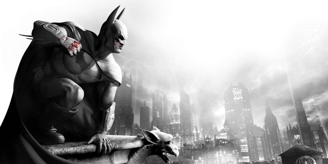
The Arkham series is an iconic part of recent gaming history, and I believe Arkham City to be the best of them. While the game itself looked similar to Arkham Asylum only on a bigger scale, the cover had a distinctive tone. It was grey and white, occasionally peppered with splashes of red. It gives it a unique comic book vibe, and it’s a shame this isn’t replicated across the game, although I do love the broody, rain-soaked vision of Gotham at night we got, so what do I know?
This all sounds as if I like the cover, and I do. However, I think it has aged poorly. Not in the ‘well that never used to be racist!’ sense but in the ‘10s era ‘trying too hard’ of it all. I’m not a major fan of the current zeitgeist’s inability to take anything seriously, and fully blame Joss Whedon for this mess, but in Arkham City’s day, everything smacked of effort. The colour scheme is intriguing, but the serious pose looking out across the city feels a little too desperate to be edgy, and Batman doesn’t need to try so hard.
That alone wouldn’t make it the worst cover in history. But, as those Arkham City super fans may be aware, that cover is 11 years old, not ten, as Arkham City came out in 2011. In fact, last year I wrote in praise of the game as it turned ten. However, a lot of people loved Arkham City, so much so that they awarded it Game of the Year, and that’s where the trouble started ten years ago. As with many titles crowned Game of the Year by someone or other, Batman: Arkham City released a Game of the Year Edition. Take a look below for yourself.
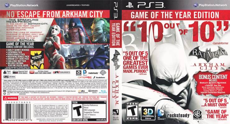
This is the most obnoxiously terrible cover I have ever seen. The art shows a close up of a gurning Batman wiping bloody snot on his sleeve, but that’s not even the half of it. As well as the big red ‘GAME OF THE YEAR EDITION’ banner, there’s a huge ‘10 out of 10’ from Game Informer, which is bigger than the game’s title and almost as large as Batman himself. Three other generic comments dominate the cover, including one that just says ‘Game of the Year’, just in case you missed the ridiculous banner at the top. The logos running along the bottom are also far bigger than they need to be.
The one bit of useful information, the bonus content features, is crushed by all the accolades, and is impossible to decipher, unless you read it like a grandma, holding the box close to your face while you squint and move your glasses down your nose. The edition was worth picking up too as the packed in DLC was a fantastic addition to the game, but all anyone saw when they picked up the box were the scores. You might think that’s a good thing, as a mark of high quality, but again, it reeked of trying too hard.

Thankfully, this trend has died off now. We’ve moved towards a more minimalist design, and with covers needing to work both physically and digitally, critic quotes are a thing of the past - and are even banned on Steam. Ten years on, nothing has eclipsed Batman: Arkham City, and I don’t think anything ever will. The game might be a 10/10, but the cover gets a 0/10 from me.